Install the app
How to install the app on iOS
Follow along with the video below to see how to install our site as a web app on your home screen.
Note: This feature may not be available in some browsers.
You are using an out of date browser. It may not display this or other websites correctly.
You should upgrade or use an alternative browser.
You should upgrade or use an alternative browser.
The photos of the day!
- Thread starter BlueCurl
- Start date
starzsgirl
Captain
WhosLaughingNow
+ I like the composition and how the eyes can easily travel around the photo.
- There are a few spots (around the faces and arms) that are washed out.
Amy777
+ The composition is very nice. I like how the butterfly pops even though the flowers is brightly colored.
- The flower in the upper left is a bit distracting, my eye tended to follow the line to it.
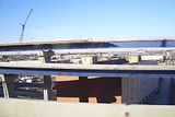
Here's mine for today, more random construction.

Amy777
Rookie
Wolfsgamergirl I understand what you are feeling with having a more inexpensive camera, I also don't have a digital SLR camera. Sometimes I feel that so many people who submit pictures here are so much above me in ability. I have a program that helps me after I get me photos on the computer, if you want PM me and I can tell you the name and a very good book that really helps me overcome some of the obstacles of having a cheaper camera.
wolfsgamergirl
+ interesting subject matter, the crane is placed in the photo in a good place.
- the photo looks a little washed out to me, but then again it could just be my personal taste.
Here is my contribution, I took this picture at a zoo just before Christmas.

wolfsgamergirl
+ interesting subject matter, the crane is placed in the photo in a good place.
- the photo looks a little washed out to me, but then again it could just be my personal taste.
Here is my contribution, I took this picture at a zoo just before Christmas.

starzsgirl
Captain
Thanks for the offer...I'm doing fine with the program that I have. Sometimes people are just over picky and it starts to get repetitive.
[a]Amy777[/b]
+ The lighter blue of the water helps nicely to pop the color of the fish.
- It might be because he is sideways, but I found myself tilting my head and trying to see more of the fish.
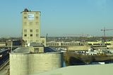
Here's mine for today, random building I found to be interesting.
[a]Amy777[/b]
+ The lighter blue of the water helps nicely to pop the color of the fish.
- It might be because he is sideways, but I found myself tilting my head and trying to see more of the fish.
Here's mine for today, random building I found to be interesting.

For haing a cheap camera.. I can adjust a lot and I sometimes do but many many times I use the automatic button! Since I know what kind of photos it takes on doing that... Photography is more than just a camera... It is how you put your subject on the photo! A very important thing is to see the lines that are there!
@wolfesgamergirl
+ Indeed a nice building for photography! Nice pick!
- If you see a building you love. Get upclose or move around a bit until you have a nice angle and everything fits. You have so many other details and other things on the photo that the subject does not get the attention it needs...

Amy777
Rookie
Bluecurl
+ the picture is sharp, I like the close up of the normal every day object that you look at differently when you see it up close like this.
- not really a negative, I tend to gravitate toward bright colors, this one looks like it is black and white.
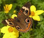
mine for today, I took this one when I went on a hike last year, there were so many kinds of wild flowers. The sad thing, there was a road washout this winter on the way up and now you can't get within 10 miles of the trail head. It is a picture of a Tiger Lilly.

WhosLaughingNow
Lab Technician
Amy777
+ I love the colors and how the yellow pops out from the green and then how the redish spots also stand out on the yellow.
-My eyes keep meandering over to the second flower.
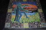
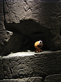
I took this picture at the ROM (Royal Ontario Museum). The wall was part of their Egypt exhibit. The little orange guy is Jesse the one eyed freakazoid... He was not part of the exhibit though

starzsgirl
Captain
Blue Curl
+ I really like how you took a simple object and made it the center of a photo and it looks amazing!
- The top of the strap is lost a bit as the top. And as I looked back it got just a bit fuzzy.
Amy777
+ I love the brigh colors and how the flower pops.
- The second flower is still sharp enough to command attention.
WhosLaughingNow
+ I like the over all concept, the Egypitans were always an interest to me.
- The little orange guy is nice and adds color, but I keep trying to see what is behind him. There are hints of something back there.
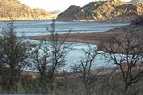
I took this photo on a trip to Quartz Mtn in Altus, Oklahoma. Went to visit a friend who was stationed at the Air Force Base there. An actual city used to be where the lake is now, just a bit of history for the day.

Amy777
Rookie
Wolfsgamergirl
+ Nice picture, the contrast of shadows and bright sun is interesting and add depth to your photo. The lake's curving coastline is picturesque and interesting.
- I don't know the "lay of the land" so this could not be possible, the trees in the foreground are a little distracting in that they are slightly blurry. If you could have gotten up higher and taken the picture at a higher angle, or taken the picture from in front of the trees, would have made this picture better.
I keep getting comments that background images are taking away from the subject in my pictures, so here is a picture that I took last year in a show rose garden


starzsgirl
Captain
Amy777
+ The coloring is very nice and bright, helps draw the eye to the center of the Rose.
- The leaves in the lower right corner are a bit distracting, since the ones in the left corner are not popping as much.
The trees were the edge of the cliff...so trying to get any closer at that spot wasn't going to happen.
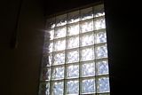
Took this randomly on a walk one day.

WhosLaughingNow
Lab Technician
wolfesgamergirl
+ I really like the contrast between the darkness around the window and then the window w/ the light coming through and the blue from outside.
- Maybe you could have moved over a tad to the right so that thing isn't in the shot(On the wall on the left hand side). I keep trying to see what it is exactly.
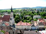
My picture for today. I think I took this while in Vienna... or Germany. Wish I could remember.

Amy777
Rookie
WhosLaughingNow
+ Composition is good, the cross of the bottom 1/3 made by the churches steeple and the row of building makes it look very good.
- The steeple is slightly leaning; a small amount of straitening would help.
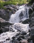
Mine for today, I took this picture a couple of years ago. That year I went an several hikes, but never finished even one. I would hike until I met an impassable hazard, take a picture of hit, turn around and go home. This was one of the impassable hazards.

starzsgirl
Captain
WhosLaughingNow
+ The composition is very nice and the coloring works well.
- Don't know where the foacal point is supposed to be. And as Amy pointed out the spire is indeed leaning a bit.
Amy777
+ The zig zaging water works well, helps draw the eye down the photo.
- The foliage is a little distracting as it's a different color than the rest of the objects.
Here is mine for today, I took a photo of the pre show set up when I worked on the she Escanaba in Da Moonlight. So please keep in mind that this is a set for a play; the set walls and other pieces don't line up because that is what the director wanted.


CalleighD
Lab Technician
wolfesgamergirl
+I love how warm this pic is, it's really inviting I also like that the table is slightly off center, I find I'm looking at the whole picture rather than just the central object.
-The bottom of the picture is a little empty, but that was probably just the way the set was, and apart from that I can't find anything negative about it.
This is from oh, 3 years ago now (I can't wait for my new camera, I'm sad to be using old pictures). This is my friend Tasha on a beach in Dubai in '05. It was our first holiday with no parents and we were just being silly *we actually took lots of pics like this* I;m just sorry I didn;t take more pictures of the actual country but meh, I was young lol.

LeAnne
+I love how warm this pic is, it's really inviting
-The bottom of the picture is a little empty, but that was probably just the way the set was, and apart from that I can't find anything negative about it.
This is from oh, 3 years ago now (I can't wait for my new camera, I'm sad to be using old pictures). This is my friend Tasha on a beach in Dubai in '05. It was our first holiday with no parents and we were just being silly *we actually took lots of pics like this* I;m just sorry I didn;t take more pictures of the actual country but meh, I was young lol.

LeAnne
starzsgirl
Captain
CalleighD
+ The colors are very nice and the waves are rolling in, gives the feeling that the viewer is standing there as well. As well as the slight reflection of the legs.
- The building off to the far right catches the eye a bit. Also getting a bit closer on th person so there isn't so much negative space in the photo.
I took this photo of the mosaic on the entryway floor to the resturant. It's on top of Quartz Mtv in Altus Oklahoma.
