The photos of the day!

Gaelen

+ Love it, just an altogether great pic
- maybe it just me but it's slightly blurry in parts

I'll add one in later hopefully if I can find one in my folders, sorry I jumped in so eagerly without a photo
 
Last edited:
^That's alright Soph :)

It might be a little blurry in some parts but in my defence, it wasn't me! :p It was them cheetahs running for their food. Can't exactly tell them to freeze in mid air now can I? :lol:
 
^^I know it wasn't your fault but I had to put something negative down and that was all I could think of at the time :p

Anywayz I'll hopefully have something up soon...I haven't got any of my photos on my laptop so as soon as I get a chance to go on my Dad's PC (which has all my photos on it) I'll have something up :)
 
Shazza_018 has not posted a photo yet so I will review Gaelan's photo and post one of my own.

Gaelen
+ Good action shot, it gives me a chance to see something I would ordinarily never have a chance to see. Good contrast, so much is nice and sharp, you can see the individual markings on many of the cheetahs.
- Maybe it is just me, but I get the feeling that the photo is cut off. I think the cropping is just a little bit severe, if you had pulled back just slightly I think it would make it better.

Mine for today, I took this picture in a butterfly exhibit. It is a Zebra Long-wing Butterfly.


Gaelen
+ An amazing shot. You captured the movement of the Cheetahs extremely well and they're really sharp
- The crop is a little tight. A little more foreground and background would have done wonders, at least so the shadow of the front most cheetah wasn't cut off.

Amy777
+ Beautiful. Really clear, concise and effective shot. Is that bokeh natural or made with the Gaussian Blur tool?
- Some of the flowers seem a little blown out.

 
Since Showtime hasn't posted a picture, I'll review Amy777's. :)

+ Very nice, tight and focused composition. The difference in depth makes the picture stunning.
- The picture's a little unbalanced; it's top and right heavy. Adding a little more negative space there would have been nice.

Here's mine for today:

 
Sorry I'm a few days late with this....still getting stuff back on and working for my laptop.

Gaelen
+ The overall composition works very well. The light and dark contrast very nicely.
- At first glance I didn't notice the people, but the kite stood out. Perhaps focus more on the people....I think they were meant to be the focal point. Please correct me if I am wrong about that.

This photo goes back to Easter, and there will be a few. :lol: My aunt's house is always good for photos.

 
Wow it has been a long time.
Wolfsgamergirl
+ Nice bright colors, interesting subject.
- re-arranging the eggs could have made a better composition, the center "divider" breaks up the picture slightly.

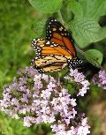
Mine for today, another butterfly. The tulips will start soon. Now that it has stopped raining (or snowing) and the sun has decided to show it's face the tulips are happier now.

 
Amy:

+ The colours are really bright, and its so sharp, you can pick out all the details!
- There's almost too much colour with the butterfly and the purple flower, they detract from each other.


I have several photos of mine that I'm proud of - here's the first one for your comments, "Sunny Spot" :)

 
lunalupi
+ The overall composition is very eye catching and the small burst of the flower color works well.
- It's hard to find what should be the main focal point. The eye can only focus on one point at a time and there are quite a few points in this photo. Perhaps try different croppings or angles when taking the shot.

Another back-dated Easter photo form me. I swear you guys are going to throw eggs at me. :lol: My aunt's cat tends to me a bit, mischevious.

 
Wolfesgamergirl
+ I really like the framing of the cat, and how one of its ears peeks out from from the handle
- I wish you had gotten a bit lower so you didn't cut off the other ear, and panned out a bit so we could see the left of the basket too.


Self-Crit:
Blown out on the top left corner, colours are dull. A bit less dead space would be nice, too.
 
Showtime
+ The Dasiy pops nicely from the rest of the background.
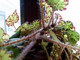
- The entire photo is fuzzy as well as the left and top edge leaves are cut off. And the flower being off center throws off the entire composition.

 
Wolfesgamergirl
+ Interesting subject with interesting lighting
- The DOF is a little tight and it's out of focus.. Had this been taken facing an empty wall the background wouldn't be so blown out and we wouldn't recognise that the photo is crooked.

 
Back
Top