Install the app
How to install the app on iOS
Follow along with the video below to see how to install our site as a web app on your home screen.
Note: This feature may not be available in some browsers.
You are using an out of date browser. It may not display this or other websites correctly.
You should upgrade or use an alternative browser.
You should upgrade or use an alternative browser.
The photos of the day!
- Thread starter BlueCurl
- Start date
starzsgirl
Captain
Amy777
Rookie
Wolfsgamergirl
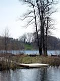
+ Beautiful picture, great composition and use of the thirds both with the tree and the wat on the bottom.
- Increase the contrast just slightly would make it just that much more striking.
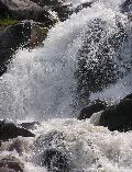
Mine for today, I took this one a couple of years ago when every time I wanted to go on a hike, I headed out, hit an impassable hazard, took a picture of it, and turned around and went home. This was one of those hazards.

starzsgirl
Captain
Gaelen
Coroner
wolfesgamergirl
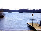
+ I'm a killer for pastel colours, and that was the first impression I got from your photo.
- There are a few distractions which we see too little of for it to seem part of the photo; the small pier, the reeds on the left, and the buildings on the far right are just too cut off. I think your crop may have been too severe.
Here's mine for today: (I took it when visiting a ghost town, known for its diamond trade, near the coast of Namibia)

allmaple
Judge
Amy777
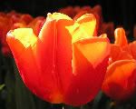
+ the light hitting the tops of the petals is beautiful, makes the colour pop
- the one tulip off the the right (in the midground?) is a bit distracting. if you could have positioned so that only the background tulips showed it would have showcased the front center tulip better
heres one of a baby possum at a rescue clinic i volunteer at practising her climbing skills:

starzsgirl
Captain
allmaple
+ The Possum looking directly at the camera helps to bring the focus to the subject.
- Perhaps try cropping a bit closer as after a while the eye tends to wander to the rest of the photo and forgets about the subject.
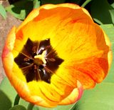
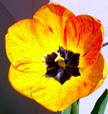
Here's mine...took a tip form Amy and was photographing the Tulips in the side garden of the house.

Amy777
Rookie
Wolfsgamergirl
+ I like that picture. beautiful colors, interesting point of view, taking us into the flower not what we normally see. Good job.
- The 'stem' in the middle is what your camera is focusing on, if you backed up just a little and pointed you camera over to one side you might be able to get more of the flower slightly sharper, but it is really a good picture.
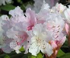
mine for today. One of the few flowers that were actually blooming at the Tulip Festival this year. All the late snow caused some problems.

starzsgirl
Captain
Amy777
+ The coloring works very well, and the lightness of the flower flows well with the green of the leaves.
- Some of the flower are cut off at the side edges. Perhaps a different crop might keep that from happening. And some of the petels start to blur out near the back.
Another random photo for today.

Wolfesgamergirl
+ I like the concept. Cutting off the plate works well and your eye slides around the photo easily
- Spoon and fork are both cut off and watch the focus - none of its completely crisp but the water (?) drops on the plate are more clear than the utensils.
Another abstract - the side pannels of a bus.

Last edited:
starzsgirl
Captain
Amy777
Rookie
Wolfsgamergirl
+ Beautiful colors, I like that the center of the flower is off center, it really makes this picture more special.
- Watch that focus, all the flower looks slightly blurry to me, it could be the resolution. But really nice composition.
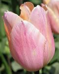
Mine for today. Thanks for the help Wolfgamergirl, I love the tulip pictures you are getting, keep them coming.

Wolfesgamergirl
+ As Amy said, good composition
- The subject is obvious but being out of focus the picture is rather flat.
Amy777
+ Love this. The composition is spot on and the detail and bokeh are perfect.
- I suppose the crop is a little tight, but it hardly takes away from the picture. Lovely.
I got a new SLR about a week back and took it to the zoo. My favourite from that day:

Showtime
+ Fantastic picture, I like how the bird is off centre and the bright colours of the bird are really eye catching. Well done.
- Maybe a little closer cropping of the bird, as the background can be a little distracting.
Here's mine:

A little self criticism, it looks a little blurry when viewed large.
+ Fantastic picture, I like how the bird is off centre and the bright colours of the bird are really eye catching. Well done.
- Maybe a little closer cropping of the bird, as the background can be a little distracting.
Here's mine:

A little self criticism, it looks a little blurry when viewed large.


