quoth_the_raven
Corpse
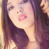
WillowsWannabe asked me to explain how I do the coloring in my icons here!
It's not hard at all! If I want to make a pic look brighter and more vibrant, I go to image>adjustments>brightness/contrast. From there you can adjust the brightness and contrast of the pic to your liking") Sometimes after the pic looks a little fuzzy too, so I sometimes blur it just a tad to make it softer.
Sometimes after the pic looks a little fuzzy too, so I sometimes blur it just a tad to make it softer.
Now to add coloring, you can add a fill layer to make the entire pic a different color. Go to layer>add layer>fill layer and choose your color. I pic whatever color I think is right for the pic, then set it on soft light.
To add coloring like in my banner, I went to image>adjustments>hue/saturation and tweaked the saturation and hue levels until given my desired colors.
And voila!
It's not hard at all! If I want to make a pic look brighter and more vibrant, I go to image>adjustments>brightness/contrast. From there you can adjust the brightness and contrast of the pic to your liking
Sometimes after the pic looks a little fuzzy too, so I sometimes blur it just a tad to make it softer.Now to add coloring, you can add a fill layer to make the entire pic a different color. Go to layer>add layer>fill layer and choose your color. I pic whatever color I think is right for the pic, then set it on soft light.
To add coloring like in my banner, I went to image>adjustments>hue/saturation and tweaked the saturation and hue levels until given my desired colors.
And voila!