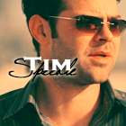
csifann1, great icons. I really love that first Tim one. Would you mind telling me how you get that white glow around the words? I've tried and can't seem to get quite that particular effect. :lol:
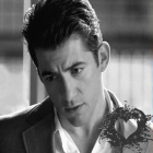
egeria, all the Ryan icons are stunning.

I'd try to pick a fave, but heck I love them all.
In your second set, I really love the one with the tiny text and light brush.
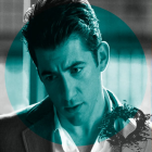
GNRF, you've really improved in you icon making, I love the Ryan icons! The blue swirl icon is gorgeous.
Thanks.
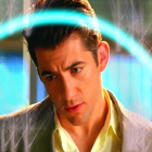
I'm still having problems coloring dark caps though. But fortunately, this particular Ryan cap was brightly colored already, so it wasn't too much of a problem.
On dark caps, I always forget to use that tutorial. :lol: I need to practice that pronto.
Especially since most of my own personal caps from VLC player come out kind of dark. :lol: The blue swirl was one of the effects in a program called dreamlight.
H_Miami_fan, I love that "Stets" icon.
The Calleigh one has pretty coloring. I like the cropped Natalia one (with just the top of her head), very cute.
And of course you already know I love the Valera one.
The Speed one is great. And naturally, I love the Ryan ones.
But, all of the icons are wonderful.
Shazza, those Calleigh icons are gorgeous. I think the first one is my fave.
I would just say I prefer the 100x100 ones - for me atleast they look more crisp and sharp! When making the bigger ones you wanna try and use the blur and sharpen tool especially if your working with low quality images!
For me, making bigger icons is easier cause I have more room to work with and the images come out clearer when the cap is low quality. But I may have to try this tip.
There's a few particular pics that I made 100x100s of and there was very little color in the caps at all and they was dark. It took me forever (nearly an hour) just to get the darkness out of each of them and I used three different programs trying to add color, but it still didn't work well as the 100x100. I went back to edit the 140x140 versions and got some better coloring on them and they don't look quite as grainy. I think I made over ten versions of each icon/each size trying to get decent coloring it, but then that just wasn't working (at least the 100x100 ones), so I just said screw it and gave up on those particular caps. :lol: But, I've been using jpgs cause resize2mail.com won't resize pngs, but then I found another site that would... so I think now I'm going to start making all of my icons in png... they should be a little clearer when I do.
Hopefully. :lol:
Another note on resizing, I tried to resize using PS and PSP, but whenever I would put in 140 as height or width, it would not let me match the other to that size.
Florry, that Calleigh icon is so pretty.
Love the pink tones in it. Just beautiful.