Install the app
How to install the app on iOS
Follow along with the video below to see how to install our site as a web app on your home screen.
Note: This feature may not be available in some browsers.
You are using an out of date browser. It may not display this or other websites correctly.
You should upgrade or use an alternative browser.
You should upgrade or use an alternative browser.
CSI Icons #6: Showcase, Links and Requests
- Thread starter CSI_Kat
- Start date


starzsgirl
Captain
Awesome icons, everyone.
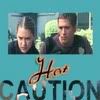
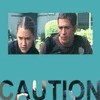
Here is one of mine from the 1v1 challenge.

Here is one of mine from the 1v1 challenge.
Axelsonfire
Pathologist
happyharper, that Warrick icon is absolutely gorgeous!
Smokey, love the Cath icon and the one with Nick in the sunglasses.
GNRF, the Cath rainbow ones are cute")
Ankeila, love the third icon
Something_Wicked, love the first Cath one :thumbsup:
Mine from the For Warrick challenge:


140x140
1 vs 1 Challenge
Smokey, love the Cath icon and the one with Nick in the sunglasses.
GNRF, the Cath rainbow ones are cute
Ankeila, love the third icon
Something_Wicked, love the first Cath one :thumbsup:
Mine from the For Warrick challenge:
140x140
1 vs 1 Challenge
Last edited:
Speedystokesgirl
Judge
PrincessJ88
Coroner
speedy, love your three Nick/George icons. Do you mind if I snag them?
Last edited:
addictedtoSpeed
Judge
My 1vs1 challenge icon of Nick:
Speedystokesgirl
Judge
speedy, love your three Nick/George icons. Do you mind if I snag them?
By all means and thanks!
Great icons, everyone.


happyharper13
Pathologist
Wow, I haven't been here in a while.
Smokey- the sunglasses one was definitely one of my favorites from the b&w challenge. Awesome idea, and awesome execution! The cap was a perfect one, and it's perfectly cropped and colored, even with the b&w. I always have trouble trying to do the channel mixing to make the b&w icons work quite right, and you really showed how it's done
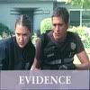
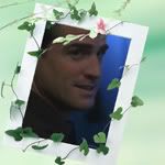
GNRFan- I love all of the cool effects you used on the Cath icons! The lyrics on the Greg one are awesome and so very appropriate and the picture itself is very droolworthy ;P For the Hair Pullers one -- what an appropriate caption!! I think you already know how I feel about those two :adore:. I love the texture you used there. The 'evidence' version is also really good. It's nice and understated, and very appropriate. The framed Nick one has a very pretty effect as well. I love the balance of the green on the frame with the blue in the background behind Nick. Awesome choice on the three b&w Greg icons! I love what you chose to light up. It works really, really well. And the picture itself... *thud*
Ankeila- Wow! Those are gorgeous, and not just because of a certain gorgeous man involved. I'm not normally a big Nick fan, but your Nick icon is so very hot. You have the most gorgeous subtle lighting that works beautifully. And I absolutely love your icon, btw.
Something_wicked- I think I already commented on those in the Fanart Critique forum, but those are still absolutely fab. I especially love the second Cath one. The texture kicks major butt and really fits with the cap without overwhelming her. I'm especially envious of the way you made a relatively large crop work without losing the details in Catherine's face.
Starzsgirl- Poor Greggo ;( The caption is perfect and so nice and hopeful. Even on a sad cap (in terms of content, like what happened during that episode), it makes me hopeful and happy. It just seems so perfectly hopeful and happy, yet still very cap-appropriate, and the font works very well. I also really like how you brought out the light blue in the pillow; it really brings home the more dream-ish mood of the icon.
Axelsonfire- I love the first one. Gorgeous effect with the rainbow. I really like how you used the rainbow to incorporate more color without detracting from the more somber mood of the whole event (and, IMO, of Cath in particular). As a Yo!Bling shipper, I especially love it. The text is small and appropriate, and doesn't distract from the icon itself because Catherine's facial expressions really convey the whole message. I love the coloring and lighting on the Nick and Griss & Warrick ones as well.
SpeedyStokesGirl- Wow Those are awesome! I absolutely love the effects and the aesthetics and the lighting (okay, let's just go with everything ) on the second one. Very hot and what a very appropriate caption. I'm fairly certain that I voted for that one. The first one really captures Cath's beauty in a very classy way. Very appropriate background, and awesome use of color. I love how her dress almost looks colorful, despite the b&w, yet it isn't too colorful. Very much like Cath -- she's vibrant and colorful without being tacky, if that makes sense. It just seems very character-appropriate. And the lips are done gorgeously. I also really admire how your whole set really fits together. They feel like a set, which seems especially cool and difficult with challenge entries.
FallenForFlack- Awesome job on the Nick icon! The brushes are so well placed, and the font and brush choices fit perfectly! I love how the first 'S' loops down. Nick's face is very well sharpened and colored and I almost feel like he's going to jump through the screen at me, albeit in a melancholy fashion. He looks very reflective, yet still like he's about to move. I also love how his face seems to be more sharpened than everything else, so that, even though the shirt is there and it's a different color, it's his face (and the brush) that stands out in just the right ways.
OLE- I am always jealous of your beautiful coloring and general mad icon-making skills! Awesome job! Beautiful natural coloring, and awesome effects. It's always especially nice to see some good Brass icons! That man is so under-appreciated, and you really did an awesome job with him. It always seems like he's one of the more difficult characters to use in fanart, but you did an amazing job at it! I especially like the cool effect on the second one posted here (#93 on your LJ), and #92. I love how it looks like the light is coming out of the text.
Smokey- the sunglasses one was definitely one of my favorites from the b&w challenge. Awesome idea, and awesome execution! The cap was a perfect one, and it's perfectly cropped and colored, even with the b&w. I always have trouble trying to do the channel mixing to make the b&w icons work quite right, and you really showed how it's done
GNRFan- I love all of the cool effects you used on the Cath icons! The lyrics on the Greg one are awesome and so very appropriate and the picture itself is very droolworthy ;P For the Hair Pullers one -- what an appropriate caption!! I think you already know how I feel about those two :adore:. I love the texture you used there. The 'evidence' version is also really good. It's nice and understated, and very appropriate. The framed Nick one has a very pretty effect as well. I love the balance of the green on the frame with the blue in the background behind Nick. Awesome choice on the three b&w Greg icons! I love what you chose to light up. It works really, really well. And the picture itself... *thud*
Ankeila- Wow! Those are gorgeous, and not just because of a certain gorgeous man involved. I'm not normally a big Nick fan, but your Nick icon is so very hot. You have the most gorgeous subtle lighting that works beautifully. And I absolutely love your icon, btw.
Something_wicked- I think I already commented on those in the Fanart Critique forum, but those are still absolutely fab. I especially love the second Cath one. The texture kicks major butt and really fits with the cap without overwhelming her. I'm especially envious of the way you made a relatively large crop work without losing the details in Catherine's face.
Starzsgirl- Poor Greggo ;( The caption is perfect and so nice and hopeful. Even on a sad cap (in terms of content, like what happened during that episode), it makes me hopeful and happy. It just seems so perfectly hopeful and happy, yet still very cap-appropriate, and the font works very well. I also really like how you brought out the light blue in the pillow; it really brings home the more dream-ish mood of the icon.
Axelsonfire- I love the first one. Gorgeous effect with the rainbow. I really like how you used the rainbow to incorporate more color without detracting from the more somber mood of the whole event (and, IMO, of Cath in particular). As a Yo!Bling shipper, I especially love it. The text is small and appropriate, and doesn't distract from the icon itself because Catherine's facial expressions really convey the whole message. I love the coloring and lighting on the Nick and Griss & Warrick ones as well.
SpeedyStokesGirl- Wow
Those are awesome! I absolutely love the effects and the aesthetics and the lighting (okay, let's just go with everything ) on the second one. Very hot and what a very appropriate caption. I'm fairly certain that I voted for that one. The first one really captures Cath's beauty in a very classy way. Very appropriate background, and awesome use of color. I love how her dress almost looks colorful, despite the b&w, yet it isn't too colorful. Very much like Cath -- she's vibrant and colorful without being tacky, if that makes sense. It just seems very character-appropriate. And the lips are done gorgeously. I also really admire how your whole set really fits together. They feel like a set, which seems especially cool and difficult with challenge entries. FallenForFlack- Awesome job on the Nick icon! The brushes are so well placed, and the font and brush choices fit perfectly! I love how the first 'S' loops down. Nick's face is very well sharpened and colored and I almost feel like he's going to jump through the screen at me, albeit in a melancholy fashion. He looks very reflective, yet still like he's about to move. I also love how his face seems to be more sharpened than everything else, so that, even though the shirt is there and it's a different color, it's his face (and the brush) that stands out in just the right ways.
OLE- I am always jealous of your beautiful coloring and general mad icon-making skills! Awesome job! Beautiful natural coloring, and awesome effects. It's always especially nice to see some good Brass icons! That man is so under-appreciated, and you really did an awesome job with him. It always seems like he's one of the more difficult characters to use in fanart, but you did an amazing job at it! I especially like the cool effect on the second one posted here (#93 on your LJ), and #92. I love how it looks like the light is coming out of the text.
addictedtoSpeed
Judge
Thanks so much for the feedback and comments happyharper!!
cathwillows
CSI Level Three
I second that!Gorgeous icons everyone! I wish I'd have the time to comment individually...
And LivingEnd, I'm not a fan of rounded icons, but yours are gorgeous!