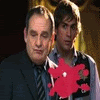
Speedystokesgirl
Judge
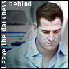
Speedy I'm totally snagging your lines iconProps given in my profile
Snag away. I'm glad you like it! Ah, those lines in his face. :drool:
Follow along with the video below to see how to install our site as a web app on your home screen.
Note: This feature may not be available in some browsers.
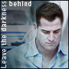
Speedy I'm totally snagging your lines icon
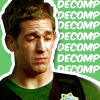
The second one looks like Greg is in a straight jacket! :guffaw:
HappyHarper, I love the placement of the text on your Sara one. And the Greg one with the bug is so cute and matches his expression.
Well, HappyHarper, I don't know if this will help, but I like all of them.
First I love the text, especially after what happened.
I like your last version very much, kinda looks like an old photo and it really drives the point home.
They're all really good!

 The Nick ones are pretty too. Love the coloring. The Warrick one is nice too.

^Those are awesome Nikky I adore the coloring! I would love to know how you did that!


We use essential cookies to make this site work, and optional cookies to enhance your experience.