Install the app
How to install the app on iOS
Follow along with the video below to see how to install our site as a web app on your home screen.
Note: This feature may not be available in some browsers.
You are using an out of date browser. It may not display this or other websites correctly.
You should upgrade or use an alternative browser.
You should upgrade or use an alternative browser.
Misc LIMS #3-Challenge 6-Decades. Final Challenge-VOTING!
- Thread starter Urban Legend
- Start date
Urban Legend
Captain
Re: Misc LIMS #2: Challenge 4-Supernatural Quotes 'VOTING'
Misc LIMS #2: Challenge 4 "Supernatural Quotes" Voting!
Voting Rules: (Please read)
~ Absolutely anyone may vote! You don't have to be an 'expert'")
~ Vote for the Top 2 of least quality, and the Top 2 of best quality. This round you must vote for the top 2 of least quality and the top 2 of best quality in both categories ie icon and text icon!
~ Votes for least quality Must have a reason, or they will not be counted. Reasons for best quality are strongly encouraged
~ There's a difference between "constructive criticism" and plain out rude remarks when it comes to voting for an icon, choose your wording carefully Remember to pm either me or one of the mods if you have any issue with voting.
~ And for this category I'd have to suggest don't vote for a quote because it's one of your favorite Supernatural quote if you're a fan of the show. This is to judge on the icon itself I hope this post makes sense I'm half asleep
Example:
Icon Category:
Least:
99 (reason)
77 (reason)
Best:
50
75
Text Icon Category:
Least:
14 (reason)
23 (reason)
Best:
24
88
(The votes will be added together to decide the outcome)
(the following examples may have been "borrowed" from other sources)
Good Examples:
34: Text is oddly placed
50: Icon is over sharpened
62: Image is too blurry
Poor Examples:
96: I don't like the colour (personal preference)
52: Tiny text/decorative brushes are unreadable (it's supposed to be that way)
Icons Entered:
9/10
1 skip used
E/C Lover, FallenForFlack and happyharper13 disqualified for not submitting an icon. Sorry ladies Jacquie can you add those names to the first page Thanks!
- - - - -
Icons:
01:
 02:
02:
 03:
03:
 04:
04:
 05:
05:
 06:
06:
 07:
07:
08:
 09:
09:
Text Icons:
A:
 B:
B:
 C:
C:
 D:
D:
 E:
E:
 F:
F:
 G:
G:
 H:
H:
 I:
I:
If you have any questions please ask
Misc LIMS #2: Challenge 4 "Supernatural Quotes" Voting!
Voting Rules: (Please read)
~ Absolutely anyone may vote! You don't have to be an 'expert'
~ Vote for the Top 2 of least quality, and the Top 2 of best quality. This round you must vote for the top 2 of least quality and the top 2 of best quality in both categories ie icon and text icon!
~ Votes for least quality Must have a reason, or they will not be counted. Reasons for best quality are strongly encouraged
~ There's a difference between "constructive criticism" and plain out rude remarks when it comes to voting for an icon, choose your wording carefully
Remember to pm either me or one of the mods if you have any issue with voting.~ And for this category I'd have to suggest don't vote for a quote because it's one of your favorite Supernatural quote if you're a fan of the show. This is to judge on the icon itself
I hope this post makes sense I'm half asleep Example:
Icon Category:
Least:
99 (reason)
77 (reason)
Best:
50
75
Text Icon Category:
Least:
14 (reason)
23 (reason)
Best:
24
88
(The votes will be added together to decide the outcome
)(the following examples may have been "borrowed" from other sources)
Good Examples:
34: Text is oddly placed
50: Icon is over sharpened
62: Image is too blurry
Poor Examples:
96: I don't like the colour (personal preference)
52: Tiny text/decorative brushes are unreadable (it's supposed to be that way)
Icons Entered:
9/10
1 skip used
E/C Lover, FallenForFlack and happyharper13 disqualified for not submitting an icon. Sorry ladies
Jacquie can you add those names to the first page Thanks!- - - - -
Icons:
01:
08:
Text Icons:
A:
If you have any questions please ask
luf100
Coroner
Re: Misc LIMS #2: Challenge 4-Supernatural Quotes 'VOTING'
This is so hard.
Icon Category:
Least:
01: It's dull, could use some more colour or a little something extra. Also looks a little oversharpened.
09: Too oversaturated and dark.
Best:
02: Nice colouring, texture, and text.
04: Like the text.
Text Icon Category:
Least:
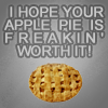
D: I love the quote but the text and background are just... grey. It need to pop a little more. And the pie looks more like a cookie.
I: It doesn't have any effects or anything to it, it looks like it could have been done in Paint.
Best:
B
C
Awesome job to everyone, this voting is getting harder. D:
This is so hard.
Icon Category:
Least:
01: It's dull, could use some more colour or a little something extra. Also looks a little oversharpened.
09: Too oversaturated and dark.
Best:
02: Nice colouring, texture, and text.
04: Like the text.
Text Icon Category:
Least:
D: I love the quote but the text and background are just... grey. It need to pop a little more. And the pie looks more like a cookie.
I: It doesn't have any effects or anything to it, it looks like it could have been done in Paint.
Best:
B
C
Awesome job to everyone, this voting is getting harder. D:
Re: Misc LIMS #2: Challenge 4-Supernatural Quotes 'VOTING'
Icon Category:
Least:
01: The colouring is a bit dull/faded. Needs a bit more contrast
08: Not enough contrast. I find the images hard to see, and the text is hard to read.
Best:
02: Great colouring, nice text!
04: Same as above
Text Category:
Least:
F: The colour of the text is too similar to the background, making it hard to read at some points.
C: It is difficult to make out some of the letters where the text and image meet.
Best:
B
D
Re: Misc LIMS #2: Challenge 4-Supernatural Quotes 'VOTING'
Icon Category:
Least:
06- His face is a little too blurry.
09- He's a little too dark.
Best:
03- Nice coloring.
07- Love the text.
Text Category:
Least:
D- The bg color doesn't allow the pie & text to stand out much.
C- Overall icon is a little blurry.
Best:
B- I just love everything about this icon.
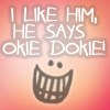
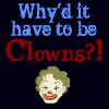
I- I just really like this one. The colors blend nicely and the little clown face is cute.
Great job, everyone. Voting was really hard.
Icon Category:
Least:
06- His face is a little too blurry.
09- He's a little too dark.
Best:
03- Nice coloring.
07- Love the text.
Text Category:
Least:
D- The bg color doesn't allow the pie & text to stand out much.
C- Overall icon is a little blurry.
Best:
B- I just love everything about this icon.
I- I just really like this one. The colors blend nicely and the little clown face is cute.
Great job, everyone. Voting was really hard.
cathwillows
CSI Level Three
Re: Misc LIMS #2: Challenge 4-Supernatural Quotes-VOTING UP!
Icon Category:
Least
01 - Not enough was done to the icon regarding coloring, saturation, etc.
09 - Oversaturated and as a result too dark
Best
02
07 - Nice coloring
Text Icon Category:
Least
I - maybe a black background isn't the best base to start off with. Also, you should have used two different fonts, a simpler one for the "why'd it have to be" might have worked better
D - The text should stand out more
Best
B - Just DUH!
C - Really cool.
Re: Misc LIMS #2: Challenge 4-Supernatural Quotes-VOTING UP!
Icon
LQ
08 The whole icon appears washed out
01 The background is flat and could use something to brighten it up a bit
BQ
04
05
Text Icon
LQ
F-the background is too washed out
A- some of the lines are too close in colour to the background and make them hard to see
BQ
D
H
Icon
LQ
08 The whole icon appears washed out
01 The background is flat and could use something to brighten it up a bit
BQ
04
05
Text Icon
LQ
F-the background is too washed out
A- some of the lines are too close in colour to the background and make them hard to see
BQ
D
H
egeria
This mod is Ready for the Laughing Gas!
Re: Misc LIMS #2: Challenge 4-Supernatural Quotes-VOTING UP!
Icon Category
Least
05 - The icon is dark and the red is bleeding into the background (pardon the pun!). Overall the saturation seems off.
09 - Castiel's face looks orange and the icon is quite dark.
Best
02 - The crop is fantastic and the colour well balanced. The text and light twinkle match the icon perfectly.
06 - The icon is sharp and beautifully coloured.
Text Category
Least
A - The font colours blend into the background in some places, making it hard to read.
D - The kerning on the font makes the text hard to read, it's also too similar in colour to the background.
Best
G - I love the shadowing around the font, really makes it stand out.
E - I love the colouring and texture, it really suits the quote you've chosen.
Re: Misc LIMS #2: Challenge 4-Supernatural Quotes-VOTING UP!
Icon
Least
05 - Too dark and the red seems misplaced...might have been better on the face.
01 - Could be a little sharper and brighter.
Best
08
04
Quote
Least
B - The teeth are a good idea, but maybe too big? I couldn't tell what it was at first.
C - The image overpowers what is to be a text icon.
Best
E
F
Re: Misc LIMS #2: Challenge 4-Supernatural Quotes-VOTING UP!
Icon.
Least:
05 - The icon is kinda dark and the red somewhat takes away the effect of the b/w icon and is a bit distracting.
06 - The crops works well, but it appears with such a close crop the quality of the image has been lost and it looks a little blurred.
Best:
08
07 - They're both just altogether great icons.
Text:
Least:
B - The background pic kinda takes away from the effect of a text icon.
D - It's a bit dull, it doesn't really "pop", the text doesn't really stand out from the background.
Best:
F
A - Both simple, yet effective.
Great icons everyone, it was really difficult to chose this round!
Urban Legend
Captain
Re: Misc LIMS #2: Challenge 4-Supernatural Quotes-VOTING UP!
You can leave your vote as is, but let me repost my restrictions in the opening post of the challenge:
Restrictions:
We'll be doing one regulare icon, what you wish to do to this icon is up to you. And then for the second icon, where you can use any Supernatural quote you wish from any source and make a text icon out of it, for this icon you can use texture/brushes/text just no caps.
So everyone had a chance to use any sort of a brush / texture (and this appears to be a stock texture) so there is nothing wrong with it. Just as long as you don't use a Supernatural cap of any sorts you will be fine, so I don't really see your reason to be a valid one ... when using textures (or stock textures) was available to all. Especially when icons C, D, E, H and I all contain brushes/textures/images etc.
Then again I'm not telling you to change your vote I'm just pointing out that more than one icon used images
B - The background pic kinda takes away from the effect of a text icon.
D - It's a bit dull, it doesn't really "pop", the text doesn't really stand out from the background.
You can leave your vote as is, but let me repost my restrictions in the opening post of the challenge:
Restrictions:
We'll be doing one regulare icon, what you wish to do to this icon is up to you. And then for the second icon, where you can use any Supernatural quote you wish from any source and make a text icon out of it, for this icon you can use texture/brushes/text just no caps.
So everyone had a chance to use any sort of a brush / texture (and this appears to be a stock texture) so there is nothing wrong with it. Just as long as you don't use a Supernatural cap of any sorts you will be fine, so I don't really see your reason to be a valid one ... when using textures (or stock textures) was available to all. Especially when icons C, D, E, H and I all contain brushes/textures/images etc.
Then again I'm not telling you to change your vote I'm just pointing out that more than one icon used images
fo_poozle
CSI Level Two
Re: Misc LIMS #2: Challenge 4-Supernatural Quotes-VOTING UP!
Icon Category:
Least:
1- is a little dull, could use a little bit more contrast
5-its really dark, especially over his face, could maybe used a little more contrast
Best:
2
7
Text Icon Category:
Least:
F- the fonts is really hard to read in certain spots, especially towards to center of the icon. the text blends into the background a bit.
A-some of the text also blends into the background a bit, especially the 1st and 3rd lines of text.
Best:
B
C
Joycie84
CSI Level One
Re: Misc LIMS #2: Challenge 4-Supernatural Quotes-VOTING UP!
Icon Category
Least
# 4: The text is oddly placed. It looks like it's coming from Sam's head
# 8: It's hard to see the pictures
Best
# 6: Nice colors, great cropping
# 2: Very nice! Also love the colors on this one
Text Icon Category
Least
# G: A bit to plain. Love the quote though
# H: There's so much going on. It's hard to focus on one part
Best
# C: Awesome!
# A: Great background color, nice quote and I like the way you arranged the text
This was hard. All the icons are great, I would use 'em all. Well done everyone :thumbsup:.
Miss_Undercover
Judge
Re: Misc LIMS #2: Challenge 4-Supernatural Quotes 'VOTING'
Icon Category:
Least:
05 - very dark, contrast is missing
09 - too oversatured, looks a little to dark
Best:
06 - great colouring and cropping
08 - wonderful photo frame effect, like the text and font
Text Icon Category:
Least:
A - Some parts of the text blends in the background, is a little difficult to read this
D - text and background have nearly the same greytone
Best:
G - like the text effect
F - really funny !!
LivingEnd
Lab Technician
Re: Misc LIMS #2: Challenge 4-Supernatural Quotes-VOTING UP!
Icon Category:
Least:
01 - The icon is kind of dull, there could have been done more in terms of coloring. Although it is oversharpened in places.
05 - It is a little too dark and contrast is lacking. Also the red doesn't really add anything to the icon.
Best:
03 - The text is a little overpowering, but the coloring is just beautiful.
06 - The icon might be slightly blurry, but the coloring is really nice.
Text Icon Category:
Least:
I - The black background is somehow not working very well and as it has already been mentioned, a different font for the first part of the quote would have worked better.
A - Some of the text blends into the background and is therefore hard to read.
Best:
F
D