Talk LIMS #7: FINAL RESULTS!

Re: Talk LIMS #7: Challenge Five ~ Bobby

Voting Rules:
~ Absolutely anyone may vote! You don't have to be an 'expert' ;)
~ Vote for the Top 3 of least quality, and the Top 2 of best quality.
~ Votes for least quality Must have a reason, or they will not be counted. Reasons for best quality are strongly encouraged

(the following examples may have been "borrowed" from other sources)

Good Examples:
34: Text is oddly placed
50: Icon is over sharpened
62: Image is too blurry

Poor Examples:
96: I don't like the colour (personal preference)
52: Tiny text/decorative brushes are unreadable (it's supposed to be that way)

No one is using a skip this round, so we've got all 19 icons :)

01
Bobby01.jpg
02
Bobby02.jpg
03
Bobby03.png
04
Bobby04.jpg
05
Bobby05.jpg

06
Bobby06.png
07
Bobby07.jpg
08
Bobby08.jpg
09
Bobby09.jpg
10
Bobby10.png

11
Bobby11.png
12
Bobby12.png
13
Bobby13.gif
14
Bobby14.png
15
Bobby15.png

16
Bobby16.png
17
Bobby17.png
18
Bobby18.png
19
Bobby19.png


If there are any problems, please let me know ASAP!
 
Re: Talk LIMS #7: Challenge Five ~ Bobby

No skips, that's awesome! Makes it hard to choose between so many...so here goes.

Least:

11. The icon is really dark, and the text is hard to read.
8: The concept doesn't really work, the coloured section is too orange, and the circle seems oddly placed for a picture-in-picture. One or the other would have worked with the scratchy texture, but not both together.
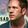
4. The colour is really yellow on Bobby's face, and the distracting background texture doesn't compliment him.

Best:

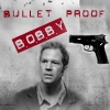
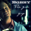
3. The small crop, black and white colouring with red text is really stunning, the different elements all work well together.

15. The icon is nice and bright, with the crop clean and simple, but the background texture really makes it stand out.
 
Last edited:
Re: Talk LIMS #7: Challenge Five ~ Bobby

Least
8 - the colored crop part looks too sharply cut off
12 - the edges of Bobby (hair especially) look odd
3 - the gun looks a bit out of place...just text would have been good

Best
10 - I love the colors and the clean lines of the letterbox!
5 - Nice background, and the font is perfect!
 
Re: Talk LIMS #7: Challenge Five ~ Bobby

Least:
4 - the colouring is odd make Bobby's face very yellow.
8 - The circle and b/w effect doesn't really work for me, Bobby's face is waay too red in the coloured section. I do like the idea of this icon but it just does seem to work in this instance.
11 - too dark and the text is hard to read.

Best:
14
15
 
Re: Talk LIMS #7: Challenge Five ~ Voting!

Oy, this will be difficult - as always! (and I have to admit that I didn't even know who Bobby was *coughs and hides*)

Least:
08 - lovely idea and very creative thoughts, but sometimes less is more: the coloring of the circle-picture doesn't fit, it's just too reddish. Also it's a bit too big for an picture-in-picture so that it's covering too much of the background picture. The scratchy texture alone would've made a great effect on the b/w picture.
04 - very distracting background, also the colors of the background make Bobby appear very yellow.
19 - again a very creative idea, but the combination of background texture, a not fading in small cut of Bobby and the brushes make it look - for me - a bit overcrowded and not harmonic.

Best: (short notice: there are way more than 2 that I would have wanted to vote for, great work!)

10 - great coloring, you managed to let Bobby stand out from the background and the black bars make it look like a movie scene - well done!
16 - very creative! I love it how the orange color from Bobby's safety goggles reappear in the texture around the circle, and love the text and its font :)
 
Last edited by a moderator:
Re: Talk LIMS #7: Challenge Five ~ Voting!

LQ
04 - too yellow
11 - too dark
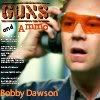
01 - oversaturated and the text is distracting

HQ
14 - love the placing of the text
16 - absolutely adore the colors and the texture
 
Re: Talk LIMS #7: Challenge Five ~ Voting!

Least:
11 - Too dark
04 - His face is too yellow
08 - The colouring in the circle is too red, and it is placed oddly

Best:
03
15
 
Re: Talk LIMS #7: Challenge Five ~ Voting!

Least:
04 - too yellow and the background doesn't really fit
11 - I like it but it's too dark
08 - the two parts of this icon are strangely placed and the one in the circle is too red

Best:
15
05
 
Re: Talk LIMS #7: Challenge Five ~ Voting!

Least:

04: Strange colours in the background, and Bobby looks really yellow.
09: Too much text. Just the tiny text or the "Guns and Ammo" would have been better alone.
11: Really dark and the written text is unreadable.

Best:

10: Awesome colouring, and the black bars make Bobby the center of attention.
16: The circle texture looks interesting and the text is nice too.
 
Re: Talk LIMS #7: Challenge Five ~ Bobby

Least
04 - His face is a little bit too yellow and the texture doesn't fit too well with the rest of the icon.
19 - the combination between black&white and the icons itself is a little bit odd and Bobby's face is too red
03 - Bobby's figure is too small considering the rest of the icon. Maybe yo should have put the gun or the text & not both ;)

Best
15 - The colouring is great, the texture is brilliang & te text is perfect.
05 - Great texture and great combination with the brush & the rest of the icon.
 
Re: Talk LIMS #7: Challenge Five ~ Voting!

Least:
4: Bobby is yellow and the colors in the background don't work well with the rest of the icon.
8: The insert of Bobby is orange as well as being oddly placed; also the scratch texture is distracting.
11: The overall icon is dark and the secondary test is hard to read.

Best:
3: Creative and the text works very well.
2: Simple but very clean.

:eek: Amazing job everyone!
 
Re: Talk LIMS #7: Challenge Five ~ Voting!

Least
04 - the background is very distracting and Bobby looks a bit grainy
08 - I really like the idea but as it has been said before, the smaller circle is too big and Bobby's face is to reddish
19 - It is a bit over-saturated and it would have looked better if the smaller pic had been rounded

Best
03 - very cool! The b/w effect goes very well with the concept of this icon
16 - Great! I like everything about this icon
 
Re: Talk LIMS #7: Challenge Five ~ Voting!

Least
11 - too dark
19 - too contrasted
04 - odd coloring

Best
09
06
 
Re: Talk LIMS #7: Challenge Five ~ Voting!

LQ:

4- Bad colouring, too dark.
9- Too much text/tiny text.
11- Nice icon, unfortunately too dark.


BQ:

10- Nice and simple.
16- Good composition.
 
Re: Talk LIMS #7: Challenge Five ~ Voting!

least:
11 - it's a bit to dark
08 - I do like the idea, but the colored pic is to red en the texture is a bit to much
04 - the colours are a bit off ..

best:
03 - lovely compostion ! it stands out from the crowd.
15 - pretty colours and texture use :)

great job everyone !
 
Back
Top