Random Fanart Critique

Something_Wicked, I really don't know what to say about those :lol: They are all fab, great coloring, crop, use of textures/text...
Maybe #1, 2 & 3 need to be sharpen, they look a little bit blury, I think! But, they are all really awesome, don't know what more to say :bolian:

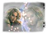
Here are some stuff that I made, I would really love to hear what I can improve on these:
(click to enlarge)

1
2
3
 
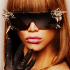
Those all look great, but on the third header the texture blends too much with her face. Try either erasing parts of it or using another that doesn't overpower where her face is :)

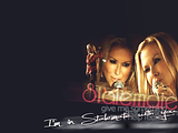
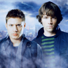
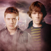
Thanks for the words on mine, but Supernatural caps are the world's worse to work with. They're just so dark :( However I think the second one looks blurry because I had that image in my head when I did it, it was supposed to appear like you're just getting a glimpse at Sam through a peek hole of some kind, but maybe the cap was too dark to do that with and maybe I used the wrong texture :)

I don't really like my larger items : Headers, Wallpapers etc. So I'd like some insight on these as well :)


http://i91.photobucket.com/albums/k292/nicole_eads/New Icons/jsquared1.png

I'm no good at blending :( my only downfall in photoshop.
 
Something_wicked - your blending fine, at least in my opinion. I like the 1,2 and last graphics. On the Supernatural Dean/Sam one. The colouring is a bit too dark. I would have liked to see it lighter so they both stand out against the firey background. I don't know why but to me they just seem to blend in too much.

Some icons from me, I've been apply as a maker in a few communities, and was rejected after doing a few trial posts so I really want some constructive critism to improve my icons:
christinaaguileraicon05.png
meganfoxicon16.png
tumblr_kqol80LTmZ1qa2qlfo1_400_larg.png

a banner example.
 
I like those icons :) The third one has a nice contrast and I really like how her hair comes out against the coloring of her skin, the flowers and the green background. I do however think a lot of your cropping is a little 'centered' but maybe it's just because I lean a little bit more towards the close up crops these days :shifty: even though I don't think that I'm that good at cropping myself. I hate the communities that you have to apply to in order to get excepted, half of the time the icons posted there aren't really that good to begin with :rolleyes:

I'd really like some critique/feedback on these:

ja1.png
ja3.png
jp1.png
smallvilles1.png


Johnny Depp1
Johnny Depp2
Dean Winchester
Jensen3
Jensen4
Jensen5
James Marsters
 
Great stuff, the colouring is awesome. Love the variety of cropping, colouring etc.

Thanks for your advice. I did do close up crops but I found people don't really like that. They want to see more of the subject but I'll definately experiment more with it.

I also wanted to ask about textures - since I got photoshop I stopped using them cause I'm so clueless on how to do so and which how some of these work I really need some help like a basic guideline or something :lol:.
 
Halloweentown_NeRd - Those are nice! I like the first one, great coloring and great text, but maybe that red text doesn't really fit with the rest of it, or maybe it's just me. The second, I think it needs a little more of coloring, and better crops, they are a little centered, but it can be just me ;) And we have the same problem, the text color doesn't fit, maybe softer colors ...

Well, I really need help! I had an idea in my head, and I tryed to make it, but it didn't turn out what I wanted !

(don't notice the bad pic quality, I don't better ones yet :lol:)
 
Great stuff, the colouring is awesome. Love the variety of cropping, colouring etc.

Thanks for your advice. I did do close up crops but I found people don't really like that. They want to see more of the subject but I'll definately experiment more with it.

I also wanted to ask about textures - since I got photoshop I stopped using them cause I'm so clueless on how to do so and which how some of these work I really need some help like a basic guideline or something :lol:.

if you still wants some help, i'd me more than happy to try and explain some things if you'd like. if not here are some pretty good guides(removing backgrounds and overall how to use some textures)

erasing a background
another for cutting out a background
overall guide, i used this one alot when i first started with photoshop

Mrs.Devil, i actually really like that how it is. i think the blending is pretty good and the coloring is beautiful and i love how you layered the textures. i don't know if i would change anything, i think it look fantastic!

Halloweentown_NeRd i agree with Mrs.Devil about the text, i think the colors are a bit off. but as for the rest. i really like the coloring on the first one. especially. and the second, could maybe be a little brighter(but that just might be my preference). also i really like the font you used in the 2nd one!
 
Haven't made many icons lately, just wanting some feedback for these please :) :
1.png
5.png
8.png

All in the bigger size, might do so in 100x100 later.
 
Haven't made many icons lately, just wanting some feedback for these please :) :
All in the bigger size, might do so in 100x100 later.

Oh I forgot about this :shifty: ... I really have been in a slump myself lately, I need some insight!

Icon 1 - Interesting coloring, but I think the crop is a bit centered.
Icon 2 - This one has a very nice warm coloring, I'm a stickler for browner colors in icons.
Icon 3 - I really like the difference in the black and purple! Although, I think it could use some contrast to make the black pop a bit more.

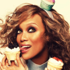
Here's some from me:

2aahi7p.png
110is9h.png
1zdohfq.png
e71ij4.png
 
Last edited:
shazza_018
01. you could have added a bit more magenta so the lips would be the absolute center of the icon. I don't know which program you use, but you can add more magenta with selective coloring in Photoshop.

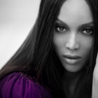
02. Absolutely lovely, the coloring makes it even more retro, which I think was the idea of the shoot. Well done ;)

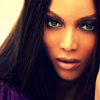
03. You could have used an "Overlay" layer on the black/white area, which gives a really fancy contrast to the colors. Or maybe a black/white layer (layers > new adjustment layer > black and white), so the hair wouldn't get so dark, but it gets more contrast.

And overall, lovely work, and I adore Tyra :D

Urban Legend
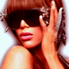
01. Maybe you could raise the amount of "greens" and "yellows" in selective coloring, or "cyans" within the "neutrals" section. I really like it though, and all the other ones are really pretty as well :)
 
Thanks for the advice guys, I did another icon with splash of colour and some other ones any improvement now?

8-1.png
2-1.png
1-1.png
 
I love #1 and #3, but I think maybe there's a bit more magenta in #2. Can you please PM me the link to the original image so I can make an icon? I can't really explain what my 'problem' is with it, so maybe I should make a tutorial and post it on my LJ :)
(BTW, don't listen to me, I'm the worst when it comes to critique. I criticize everything and everyone. I'm a Virgo, duh :D)
 
I love #1 and #3, but I think maybe there's a bit more magenta in #2. Can you please PM me the link to the original image so I can make an icon? I can't really explain what my 'problem' is with it, so maybe I should make a tutorial and post it on my LJ :)

So something like this:
2-2.png


IDK, I pm'd you the pic :).
 
Back
Top