Random Fanart Critique

Discussion in 'Miscellaneous' started by Urban Legend, May 14, 2009.

  1. happyharper13

    happyharper13 Pathologist

    Joined:
    Oct 9, 2008
    Messages:
    1,074
    Likes Received:
    0
    Selective coloring would be the first means I can think of, but, in lieu of that, you can add a darker texture or copied layer set to burn or multiply and then erase it over her face. You can also use the color replacement tool if you want to get rid of the tan coloring itself, to make it look closer to another color. You can also use the burn tool over her face. Also, playing around with the highlight colors on Color Balance might help. I've never worked with cartoon faces before, so I'm not entirely sure on the last one though.
     
  2. GregNickRyanFan

    GregNickRyanFan Holographic Moderator Moderator

    Joined:
    May 16, 2008
    Messages:
    18,941
    Likes Received:
    0
    Well, I tried selective coloring and color balance, but didn't try the other things you suggested. I'll give them a try next time. Thanks. :)

    How about these two:

    original coloring (slightly brightened & sharpened):

    [​IMG] Jem's Coloring looks dull, right?


    with selective coloring/color balances:

    [​IMG] more vibrant?
     
  3. GregNickRyanFan

    GregNickRyanFan Holographic Moderator Moderator

    Joined:
    May 16, 2008
    Messages:
    18,941
    Likes Received:
    0
    Which ones of these four looks the best?

    1) [​IMG]

    2) [​IMG]

    3) [​IMG]

    or

    four
     
  4. shazza_018

    shazza_018 A Daily Anthem Moderator

    Joined:
    Dec 1, 2007
    Messages:
    3,623
    Likes Received:
    0
    Thanks for all the help, advice and comments guys they really helped! :D

    ^GregNickRyanFan - I prefer the fourth one but it's still a little grainy, the softness on the first one is nice, keep working on it and I'm sure you'll get the hang on it. I would suggest not sharpening it too much and using the blur tool and sharp tool on LQ images, blurring the skin around the face and sharpening main features like the lips, eyebrows, nose etc.

    An icon and banner I made which I hate but I want ya'lls opinions.
    [​IMG] [​IMG]
     
  5. happyharper13

    happyharper13 Pathologist

    Joined:
    Oct 9, 2008
    Messages:
    1,074
    Likes Received:
    0
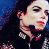
    GNRFan- Personally, I like the coloring on the first icon best. The men stand out the most there.

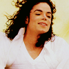
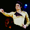
    Shazza- I really like the cleanness of both the icon and the banner. That said, I feel like both, particularly the icon, are just missing a certain 'umph', if that makes sense. Technically speaking, they are well executed, though I'm not so crazy about the crop on the icon. That said, everyone likes different kinds of crops, and I tend to go for the ones that are more extreme and that follow the rule of thirds. On that score, I'd recommend pushing Michael a little to either side, so that he finishes or starts at one third (horizontally) of the icon (hope that makes sense). I think it also might help if you cropped it differently so that it cuts off his hat, which, IMO, would help make his face stand out more.

    I think that part of the problem is that the black in his outfit sort of overwhelms his face, just because there's so much cloth. That said, it's Michael and it definitely makes sense to include as much of his body and movement as possible since his dance moves were a big part of who he was as an artist.

    I guess my big recommendation would be to find some way to push a bit more color into it. I feel like a more worn-out vintagy colored texture would work well at soft light over him. I'd recommend something by chaoticfae or spookyzangel (deviantart). A brush or text or some sort of zap of color (perhaps red) could also work.
     
  6. GregNickRyanFan

    GregNickRyanFan Holographic Moderator Moderator

    Joined:
    May 16, 2008
    Messages:
    18,941
    Likes Received:
    0
    Thanks for the feedback. :)

    Unfortunately, my Photoshop doesn't seem to have a sharp tool to where I can only sharpen one part of the icon individually. I can only sharpen the icon as a whole. I have Photoshop 7. I don't believe my PSP (Photo X2) has it either. Is there anything else I can do in those programs to accomplish the same thing?

    Shazza, I really like your icon and banner of Michael. I like how he's centered in the icon. The banner looks a tiny bit blurry to me, but its still great. :)
     
  7. Axelsonfire

    Axelsonfire Pathologist

    Joined:
    Oct 16, 2008
    Messages:
    1,348
    Likes Received:
    0
    Okay, I'd really like to know what you think of this banner and icon I made:

    [​IMG] [​IMG]
     
  8. GregNickRyanFan

    GregNickRyanFan Holographic Moderator Moderator

    Joined:
    May 16, 2008
    Messages:
    18,941
    Likes Received:
    0
    The coloring on both are awesome. The banner looks a tiny bit grainy, but other than that, they are both great. :) I love the coloring on the character's eyes on the banner. And the firey background works very well. :)
     
  9. Dawni

    Dawni CSI Level One

    Joined:
    Oct 20, 2007
    Messages:
    755
    Likes Received:
    0
    Never been in here before but I enjoy making sigs normaly mine are for bigger boards so sigs are larger. But would be intrigued to see what people think as to me I love both but still sometimes feels missing specially one the one i did yesterday the black and white but then i won't touch it cos i get to annoyed if its not right and annoyed cos i know is good how it is and doesnt need any more..

    both are thumbnails to go bigger click.

    [​IMG]

    [​IMG]
     
  10. shazza_018

    shazza_018 A Daily Anthem Moderator

    Joined:
    Dec 1, 2007
    Messages:
    3,623
    Likes Received:
    0
    Thanks for the feedback guys, thank you Harper - your advice is always so detailed and specific that really helps! :)

    Axelsonfire - love the first icon, the colouring is awesome, the banner is slightly blurry and grainy but I do love the colouring nice job. Use the blur and sharpen tool with LQ images when you can.

    Dawni - I really like those banner, very nice! I think if you use techniques like emboss or something on the text to make it stand out more that would really help!
     
  11. Urban Legend

    Urban Legend Captain

    Joined:
    Oct 16, 2006
    Messages:
    4,553
    Likes Received:
    0
    I've been on an icon making hiatus and would love to know what should be improved on these ... they're all icky :p

    [​IMG] [​IMG] [​IMG] [​IMG]
     
  12. shazza_018

    shazza_018 A Daily Anthem Moderator

    Joined:
    Dec 1, 2007
    Messages:
    3,623
    Likes Received:
    0
    Okay guys, I have something for you that might seem interesting, here are examples from my first set of icon ever working with a graphics making program (mine was GIMP):
    [​IMG] [​IMG] [​IMG]
    And some from a recent batch I made using Photoshop:
    [​IMG] [​IMG] [​IMG]

    What a difference, huh? :lol:
     
  13. Urban Legend

    Urban Legend Captain

    Joined:
    Oct 16, 2006
    Messages:
    4,553
    Likes Received:
    0
  14. SunsetBoulevard

    SunsetBoulevard moderator.exe Moderator

    Joined:
    Feb 19, 2006
    Messages:
    3,975
    Likes Received:
    1
    Sophia, for the gimp batch, i would say 3. The textures are too bright, so you can't really see the actual colors of the icon. The cropping is great, though. Now everyone can see that Photoshop is the goddess, right? :D

    Something_wicked, I would give you a 4 for those. I like them a lot, but the bright side of the face is too bright. If you use Photoshop, you can reduce that brightness by setting this: layer/new adjustment layer/selective coloring/whites/black: +40ish. it's up to the brightness of the base.
     
  15. Urban Legend

    Urban Legend Captain

    Joined:
    Oct 16, 2006
    Messages:
    4,553
    Likes Received:
    0

Share This Page