Random Fanart Critique

Discussion in 'Miscellaneous' started by Urban Legend, May 14, 2009.

  1. Urban Legend

    Urban Legend Captain

    Joined:
    Oct 16, 2006
    Messages:
    4,553
    Likes Received:
    0
    I picked this as a place to put this, I chose not to do this in This Thread because I felt it would become spammy and I didn't put it in the fanart section or make a new thread. I figured this would be the best bet :)

    - - - - -

    Rules:

    Post (no more than 3) icons/signatures (of other fandoms etc that do not pertain to csi) as images. If you're linking to anything over 220x75 please post a link.
    The next poster will rate them on a scale from 1-5 and give any construcive criticism

    - - - - -

    Art:

    [​IMG] [​IMG] [​IMG]
     
    Last edited by a moderator: Jun 8, 2009
  2. shazza_018

    shazza_018 A Daily Anthem Moderator

    Joined:
    Dec 1, 2007
    Messages:
    3,623
    Likes Received:
    0
    Re: Random Fanart Criticism

    Great idea Nikky :D.

    I give you a 4 :) - The colouring is awesome, I love the use of text on the first one. The crop on the third one is a little odd and also the colouring doesn't really work well in my opinion.

    Mine:
    [​IMG] [​IMG] [​IMG]
     
  3. Urban Legend

    Urban Legend Captain

    Joined:
    Oct 16, 2006
    Messages:
    4,553
    Likes Received:
    0
    Re: Random Fanart Criticism

    Thanks Sophia and actually that's a coloring that a lot of Supernatural fans use on some of their icons, I figured I'd give it a go :lol: and it's also the recommended type of crops that the 'elite' icon groups think is a must * shrugs *

    I'll give you a 4:

    The crop and coloring on the first is really nice, but the second is a little too centered. The last one has a really nice sharpness and coloring :)

    - - - -

    [​IMG] [​IMG] [​IMG]
     
  4. happyharper13

    happyharper13 Pathologist

    Joined:
    Oct 9, 2008
    Messages:
    1,074
    Likes Received:
    0
    Re: Random Fanart Criticism

    Are we allowed to post fanart that is from the CSI franchise here? (Please say the answer is yes :p)
     
  5. Urban Legend

    Urban Legend Captain

    Joined:
    Oct 16, 2006
    Messages:
    4,553
    Likes Received:
    0
    Re: Random Fanart Criticism

    Actually, there is a thread for that. I'd recommend that if you want to post your work anonymously. But I'd say yes, you can post :)
     
  6. happyharper13

    happyharper13 Pathologist

    Joined:
    Oct 9, 2008
    Messages:
    1,074
    Likes Received:
    0
    Re: Random Fanart Criticism

    I'd like to post stuff that I've already posted and that, as a result, wouldn't be anonymous. The only comparable thread I could find was the level thread and that was anonymous. But you're saying I can post stuff that's related to the franchise here?
     
  7. Urban Legend

    Urban Legend Captain

    Joined:
    Oct 16, 2006
    Messages:
    4,553
    Likes Received:
    0
    Re: Random Fanart Criticism

    Well when I first posted in the thread I did post not to put images of stuff releated to CSI :p but since post count doesn't go up using these threads, I don't see any harm in posting here :)
     
  8. happyharper13

    happyharper13 Pathologist

    Joined:
    Oct 9, 2008
    Messages:
    1,074
    Likes Received:
    0
    Re: Random Fanart Criticism

    Awesome! Thanks :)

    First, on rating the previous post --

    I'd give it a 4.

    I love the lettering on the first one, but it's a bit blurry. I also feel like the coloring on his face is too similar to the coloring on the background, which makes his face stand out less. I really like the second one, particularly with regards to the layout, crop and coloring, but I think the image (particularly Dean, who I'm guessing is the guy laying down) could be sharper or more contrasted. I really like the crop and layout on the last one, but I think he looks a bit too contrasted.

    I would love some concrit on these banners:


    [​IMG]

    [​IMG]
     
  9. GregNickRyanFan

    GregNickRyanFan Holographic Moderator Moderator

    Joined:
    May 16, 2008
    Messages:
    18,941
    Likes Received:
    0
    Re: Random Fanart Criticism

    I don't really know where else to put this.

    I don't want these rated, I just have questions that I need answered about them. :lol:

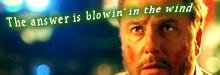
    For my Misc LIMS entry... some were saying there wasn't much color added (I actually worked on the coloring for nearly an hour, so there actually was color added, but my programs [all three of them] didn't want to cooperate apparently lol). Anyway, so I went back and remade the icon without coloring it at all to compare to the one that I entered.

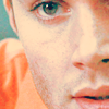
    This is the one I entered: [​IMG]

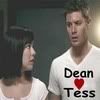
    here's the original as it was without any coloring at all (only made to icon size, added text/heart and cropped): [​IMG] 
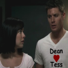
this one is slightly different cause I redid it from scratch, so the text it a bit different looking. I couldn't remember what text I used originally so I just used the default with this one.

    Someone said Dean's face was stretched in my entered icon. Don't know how that happened. Stretching makes something longer, but I cropped it to make it shorter, so I don't understand how it go stretched. How do I fix that? Is the darker image above less stretched? If so, that may be because it's a png and the other is jpg. I'm trying to figure out if that's what happened and if the stretching is due to the file type or if it's something that happened with the resizing site (for the entered icon I used resize2mail.com and for the darker icon I used iresize.com) or if the stretching is happening when I upload to photobucket.

    I made several versions of this trying to fix the coloring. But there are way too many to post here, so I'll just put it all up on my LJ and just post the link to that here if that's okay. :)

    I stressed myself out too much trying to fix this stupid icon. Next time I can't get the coloring to cooperate with me, I'm greyscaling it! :lol:

    ETA: All the supernatural icons are here at my LJ.

    Now I'm going to bed cause I'm falling asleep at the keyboard. :lol:
     
    Last edited: Jun 8, 2009
  10. _Hush_

    _Hush_ Winchester Inc.

    Joined:
    Jul 13, 2007
    Messages:
    1,460
    Likes Received:
    0
    Re: Random Fanart Criticism

    I think working with contrast would've helped your icon. Then it wouldn't have seemed a little faded.

    As for the stretching, are you sure you kept the proportions right? Because the darker icon indeed seems less stretched. I just use my photoshop to resize my icons, and have never had stretched ones. What program are you using?
     
  11. Adzix

    Adzix CSI Level Three

    Joined:
    Mar 16, 2006
    Messages:
    3,567
    Likes Received:
    0
    Re: Random Fanart Criticism

    to me both icons look stretched. it might have been just the pic that was like this from the beginning or, what sometimes happens to me, you didn't crop it to a perfect square and then resized it to 100x100 which changed the proportions.
     
  12. CSI_Kat

    CSI_Kat Addicted to Gutterville Moderator

    Joined:
    Mar 13, 2007
    Messages:
    5,337
    Likes Received:
    0
    Re: Random Fanart Criticism

    I have to agree with Hush and Adzix. I always use my photoshop to crop to a perfect square and resize my icons. I at one time used photobucket to resize my pics....and they never came out looking right (this was before the editing program came out). I am thinking the resizing program is not holding the proportions.
     
  13. Dragonfly

    Dragonfly ~Queen of Sarcasm~ Moderator

    Joined:
    May 26, 2006
    Messages:
    8,634
    Likes Received:
    0
    Re: Random Fanart Criticism

    What a great thread! I don't have time to add my thoughts at the moment, I'll have to come back later. But can I just ask... can we possibly change the thread name to Random Fanart Critique? It just sounds so much better than criticism to me :lol:
     
  14. _Hush_

    _Hush_ Winchester Inc.

    Joined:
    Jul 13, 2007
    Messages:
    1,460
    Likes Received:
    0
    Re: Random Fanart Criticism

    ^May I add to that, that this could very much be a Misc. thread, since the LIMS is also held in Misc.
    Maybe people will find their way here easier, can ask technical questions or asking, after the voting, like GNRF, what exactly went wrong and how to fix it.

    There something wrong with my English today and I have no idea what :shifty:
     
  15. GregNickRyanFan

    GregNickRyanFan Holographic Moderator Moderator

    Joined:
    May 16, 2008
    Messages:
    18,941
    Likes Received:
    0
    Re: Random Fanart Criticism

    I actually did work with the contrast. I worked with the contrast, brightener, hue saturation, etc. Every color thing on my PS7 and PSP Photo XI as well as Microsoft Picture It 99 and I just couldn't get it to add any decent color (on the 100x100 anyway) without it coming out looking really grainy.

    I didn't do anything to the porportions myself. All I did to the icon was the coloring (as best I could), the cropping and the text/heart adding and then of course the resizing with that website. :lol: I checked the props of the icon and the dpi number for horizontal and vertical resolution were the same. So, I'm thinking it's either the original cap was stretched (maybe it was from a widescreen copy or something possibly?) or the resizing site I was using (resize2mail.com) stretched it when I resized, or photobucket when I uploaded.

    I can't get Photoshop or PSP to resize properly. And Picture it won't resize anything at all I don't think. And at the time I originally made the icon, I don't think I had yet downloaded photoshine or face smoother (they will resize jpgs). Whenever I try to resize in PS or PSP, it won't make the proportions correct. I'll put in 100 for the width or height and then the other number changes to something like 81 and if I try to change it to 100 then the top number changes.

    It could have been the pic, I don't know. I did use the square crop on Photoshop though. :lol:

    I did use the square thing, but like I said PS won't let me resize for some reason. Photobucket resizing does the same thing to me that PS and PSP are doing. It never lets both numbers be even. It automatically changes the bottom number to something not in porportion with the top. It's weird. :lol:

    Anyway, I've now started to use iresize.com instead of resize2mail.com and have started making all my arts in png format so that hopefully they're a little clearer.

    :lol: I kind of agree with you on that. :lol:

    ETA: I had to correct something. I underlined what I corrected.
     
    Last edited: Jun 8, 2009

Share This Page