Shazza~
1: This piece looks gorgeous! I really like the subtle shading in the background. My one critique is that adding a curves layer for Adam's face to make it pop a bit more might help. It certainly doesn't fade into the background, but I think lightening it up might help a bit. Also, if there's any way you could amp up the blue on his eyes, I think that would help. The crop is fine. Although it's a tad off-centered, with his left arm closer to the edge of the crop than his right arm, it's not terribly noticeable. Personally, I would probably crop it so that part of him is cut off and he's starting in the crop (hope that makes sense), but your crop definitely works.
2: Awww they're adorable! He has such a nice smile. I like the fonts -- very LJ and purpose-appropriate. I can't quite decide if shifting the 'friends only' text a bit to the right would help, but your alignment definitely works. The curves and selective coloring comments still apply, but, overall, I think this header (I'm guessing that's what this is?) is gorgeous.
3:
First of all, I love the lyrics you used in the third piece (LJ banner, right? I'm still getting the hang of everything LJ). Perfect song.
That said, I think the lyrics might be better off in a different font. I think different fonts for both his name and the lyrics would help. It feels like something more glam would look better and a soft glow (the default lightish yellow one on CS3 and 4) might also help with that effect.
Also the lyrics aren't not centered, and they almost crash into Adam's jacket sleeve. I think it would look better if there was the same amount of space between Adam's elbow and the 'A' in 'And I'm feeling good' and the 'd' at the end of it. That said, that aspect of the text alignment isn't noticeable, but it's still there.
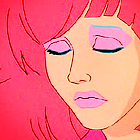
I like the coloring on Adam and I think that, were his eyes open, that would work well. However, given that the blue of his eyes isn't in this picture, I think you need more brightness and should choose a different color for the background. The combination of the black text and suit and the grey background makes it all a bit drearily colored. That said, Adam definitely stands out in it. Still, I think a dullish green or blue would work better behind him than the grey.
As for the coloring on Adam himself, it looks great (wouldn't have expected anything different from you ;P). And I love love love his expression. What a great cap to use.
Personally, I really like lining things up by thirds and I would recommend, if at all possible, that you try to make the text take up about a third of the space, or at least that you try to make it take up a comparable amount of space to each Adam.
Egeria~
1: I think adding a little more red to the hands in the first icon would help. I'm not sure which way you used to get the b&w effect, but I think using color balance and selective coloring to up the red in the hands would help and, once you've done that, bring down the saturation until the whole thing looks close enough to a greyscale. If you have CS4, the vibrance layer would work perfectly because you can amp up the vibrance all the way and then tone down saturation. Also, you can use the color replacement tool to get rid of the color in the rest of the icon (except the hand) so that the hand really stands out without looking too bright and red. Also, I do agree with you about the text. It would look better if you could get it to line up with the hand. Perhaps try to get it to align with a path.
2: I love the coloring on this one,and I love how smooth you've gotten his face. On a normal face, I would recommend making him look redder, but I'm guessing he's some kind of monster of some sort, since it looks like a horror movie, so I think the more yellowish tone to his skin works there as a result. I love the text and the crop here. Perfect font! Overall, I think your crops really rock on all three icons.
3: I like the crop and the overall coloring, but I don't really know what the lines on the side are or why they're there. I think the icon needs a bit more white and perhaps some other brush/text/effect instead of the lines.
My pictures:
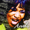
Aretha Franklin:
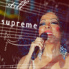
Diana Ross:
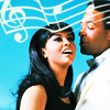
Marvin Gaye & Tammi Terrell:
I was especially worried about how to make Diana stand out more without making her look different.
")