LIMS Round 3:The Ultimate Test of Creativity-LIMS Winner Up!

Re: LIMS Round 3: The Ultimate Test of Creativity

Unfortunately no but submitting time is over :( So voting will be up Monday everyone!
---

I shall post the pretties before bed :p

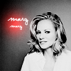
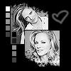
Challenge #2- Marg Helgenberger- VOTING

~ Unfortunately wibble and lifestyle have not sent an entry and shall be automatically eliminated :( Thanks for participating, guys!

~ Adzix is using their free pass for this round.

- Vote for top 3 of least quality. Include a valid reason for each vote, otherwise it won't be counted.
- Any member of this board may vote.
- The makers of the icons with the top 2 number of votes will be eliminated.

Examples of good reasons:
50: The text is oddly placed
68: The colouring is overpowering
72: The icon is oversharpened
56: The icon is too blurry

Examples of bad reasons:
50: I hate the colour pink. (Personal Preference)
78: The tiny text/decorative brush is unreadable. (Because they’re supposed to be that way.)

Please note when voting that all of these icons were made without the use of color layer(s), adjustive or otherwise (and I think we all know how important those are :lol: :p).

Voila! :D

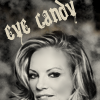
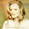
01.
marglims1.png
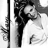
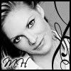
02.
marglims2.jpg
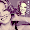
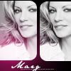
03.
marglims3.jpg
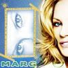
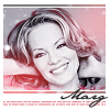
04.
marglims4.jpg
05.
marglims17.jpg
06.
marglims5.png
07.
marglims6.jpg
08.
marglims7.jpg

09.
marglims8.jpg
10.
marglims9.png
11.
marglims10.jpg
12.
marglims11.jpg
13.
marglims12.png
14.
marglims13.png
15.
marglims14.jpg
16.
marglims15.png
17.
marglims16.jpg
18.
marglims18.jpg


Important!- PM me immediately if you don't see your icon.
 
Re: LIMS Round 3: The Ultimate Test of Creativity

Wow, this is very tough because they are all fantastic! :)

16. Looks a little blurred
04. The colour and the texture is a little overpowering
09. Slightly unfavourable cropping and some empty space which could have been better utilised if the image had been differently cropped
 
Re: LIMS Round 3: The Ultimate Test of Creativity

4 Texture is overwhelming
1 The crop takes away a lot
5 A little too dark, maybe...Or it could be the contrast.
 
Re: LIMS Round 3: The Ultimate Test of Creativity

Wow this is hard :eek: Everyone did such a great job!

01: The cropping on this one seems to be a little off on this one. It seems like it should have been moved (in any direction, I think) just a little bit.
16: Image seems slightly blurred, and the subject seems too far away
09: Too much empty space, that could have been put to better use.
 
Re: LIMS Round 3: The Ultimate Test of Creativity

holy crap, mine sucks compared to all of yours! :eek: :lol: And Quoth....you said mine was good.... :p :lol:


8 - the little white *star* in the corner is distracting.

9 - too much empty space on the icon, could be put to better use. (I know it sounds like DFD's comment, but its what I was thinking)

5 - The icon is too sharp, which is distracting
 
Re: LIMS Round 3: The Ultimate Test of Creativity

04 - The texture is overpowering
05 - Image is too dark and too sharp
01 - The cropping seems odd

Wow this was hard to choose, they all look great ;)
 
Re: LIMS Round 3: The Ultimate Test of Creativity

Oh, this is hard! They all look great...
But I have to decide, haven't I.
So

4: the texture/color is overpowering
5: too much contrast/too dark
9: the cropping leaves too much space on the left side
 
Re: LIMS Round 3: The Ultimate Test of Creativity

#4 - texture is overpowering
#1 - odd crop
#5 - oversharpened
 
Re: LIMS Round 3: The Ultimate Test of Creativity

# 4: texture is a bit overpowering
# 9: the text is oddly placed wich leaves too much space on the left
# 7: the icon is too crowded, especially on the left side
 
Re: LIMS Round 3: The Ultimate Test of Creativity

04: The brush seems to oversharpen the icon, lessening it's quality.
01: The cropping is odd, the subject doesn't seem to be the main focus of the icon.
08: The subject seems too blurry and distant.

However, great job to everyone! :D
 
Re: LIMS Round 3: The Ultimate Test of Creativity

Gah! Brilliant icons - a really difficult choice!

01 - the odd cropping detracts from the overal icon

17 - appears a little blurry

16 - the texture 'washes out' Marg's features a little. Enhancing the features using selective colouring or contrast before applying the texture can avoid this
 
Re: LIMS Round 3: The Ultimate Test of Creativity

04-The texture is a little overpowering.
08-The image is blurred.
16-The image is a little blurred.
 
Re: LIMS Round 3: The Ultimate Test of Creativity

I'm so sorry guys, I've forgotten to post one more entry so if you could all stop voting for now that'd be appreciated ;) Feel free to edit your votes if you like after I receive it!


ETA: Thanks for the wait everyone! Everything's cleared up now, so resume voting! :D

And B_G I still like yours :p
 
Re: LIMS Round 3: The Ultimate Test of Creativity

It's hard, so hard...but well, we have to:

#16: odd cropping and a bit blurry
#01: again odd cropping, the text seems to be the main part this way
#04: too many different colors/uses of textures - draws off the attention from Marg


eta: sorry Ann, somehow I read over your request, but now I saw the missing icon, but though I will stick with my voting
 
Re: LIMS Round 3: The Ultimate Test of Creativity

4 - the coloring is overpowering
5 - too sharp and too dark
10 - too bright
 
Back
Top