Install the app
How to install the app on iOS
Follow along with the video below to see how to install our site as a web app on your home screen.
Note: This feature may not be available in some browsers.
You are using an out of date browser. It may not display this or other websites correctly.
You should upgrade or use an alternative browser.
You should upgrade or use an alternative browser.
Talk LIMS #7: FINAL RESULTS!
- Thread starter Dragonfly
- Start date
insertusername
Lab Technician
Re: Talk LIMS #7: Challenge 10 - Now Up!
I'm sorry to say I don't have an entry this week. My workload is just ridiculous right now and I had to start prioritizing. I still swear one of these days I'll be able to do a whole LIMS here at talk without life getting in the way of things. *sigh* maybe next time.
Good luck to the rest of you though! Hopefully I'll be back to vote.
I'm sorry to say I don't have an entry this week. My workload is just ridiculous right now and I had to start prioritizing.
I still swear one of these days I'll be able to do a whole LIMS here at talk without life getting in the way of things. *sigh* maybe next time.Good luck to the rest of you though!
Hopefully I'll be back to vote.Re: Talk LIMS #7: Challenge 10 - Voting!
Sorry I'm late!
LIMS 7 Challenge 10: Voting!
Unfortunately, we've had 2 people have to drop out this round, due to real life (that pesky thing!). That brings us down to 6 participants, which actually makes this our semi-final round
Daquien and roximonoxide, thanks so much for joining us, hope to see you again next time!
Voting Rules: (Please read, there's a slight change)
~ Absolutely anyone may vote! You don't have to be an 'expert'
~ Vote for the Top 2 of least quality, and the Top 2 of best quality.
~ Votes for least quality Must have a reason, or they will not be counted. Reasons for best quality are strongly encouraged
(the following examples may have been "borrowed" from other sources)
Good Examples:
34: Text is oddly placed
50: Icon is over sharpened
62: Image is too blurry
Poor Examples:
96: I don't like the colour (personal preference)
52: Tiny text/decorative brushes are unreadable (it's supposed to be that way)
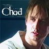
01
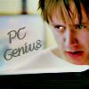 02
02
 03
03
04
 05
05
 06
06
Good luck!
Sorry I'm late!
LIMS 7 Challenge 10: Voting!
Unfortunately, we've had 2 people have to drop out this round, due to real life (that pesky thing!). That brings us down to 6 participants, which actually makes this our semi-final round
Daquien and roximonoxide, thanks so much for joining us, hope to see you again next time!
Voting Rules: (Please read, there's a slight change)
~ Absolutely anyone may vote! You don't have to be an 'expert'
~ Vote for the Top 2 of least quality, and the Top 2 of best quality.
~ Votes for least quality Must have a reason, or they will not be counted. Reasons for best quality are strongly encouraged
(the following examples may have been "borrowed" from other sources)
Good Examples:
34: Text is oddly placed
50: Icon is over sharpened
62: Image is too blurry
Poor Examples:
96: I don't like the colour (personal preference)
52: Tiny text/decorative brushes are unreadable (it's supposed to be that way)
01
04
Good luck!
Florry86
CSI Level Three
Re: Talk LIMS #7: Challenge 10 - Voting!
First of all I'm really sorry for those who had to leave b/c of RL
Second, I can't believe that it is almost over & OMG I can't believe that we have to vote in this round too. I really don't know what to vote
Least
06 - great texture, but the face has too much of magenta on it and it ruins the rest of the icon. Probably an eareser would have been perfect.
05 - it looks that not too much has been done on this icon except adding the text and those cute brushes.
Best
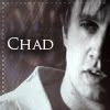
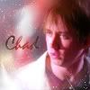
01 - fabulous colouring and great text :thumbsup:
03 - great colouring, texture and yeah great way to put the text on the icon
First of all I'm really sorry for those who had to leave b/c of RL
Second, I can't believe that it is almost over & OMG I can't believe that we have to vote in this round too. I really don't know what to vote
Least
06 - great texture, but the face has too much of magenta on it and it ruins the rest of the icon. Probably an eareser would have been perfect.
05 - it looks that not too much has been done on this icon except adding the text and those cute brushes.
Best
01 - fabulous colouring and great text :thumbsup:
03 - great colouring, texture and yeah great way to put the text on the icon
happyharper13
Pathologist
Re: Talk LIMS #7: Challenge 10 - Voting!
Sorry to see you guys go, Daquien and Roxi! Real life sucks sometimes
Least:
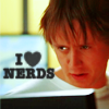
4. Looks over saturated. His face is too rosy and doesn't stand out. It also looks blurry.
1. It just doesn't look like a lot was done with this icon. I also don't think the font really fits.
Best:
2. Interesting crop, strong contrast, simple but effective border and textures.
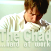
3. Very clean and crisp. I really like the overall layout here. It's a very cool effect with him working on top of the text. My one complaint is that the text is rather difficult to read.
Sorry to see you guys go, Daquien and Roxi! Real life sucks sometimes
Least:
4. Looks over saturated. His face is too rosy and doesn't stand out. It also looks blurry.
1. It just doesn't look like a lot was done with this icon. I also don't think the font really fits.
Best:
2. Interesting crop, strong contrast, simple but effective border and textures.
3. Very clean and crisp. I really like the overall layout here. It's a very cool effect with him working on top of the text. My one complaint is that the text is rather difficult to read.
cathwillows
CSI Level Three
Re: Talk LIMS #7: Challenge 10 - Voting!
Least
02 - The crop is too focused on his face IMO and which makes the border and texture(s) kinda distracting
05 - The icon looks pretty washed out. Seems as if not much coloring has been done. Maybe it's supposed to be that way, but still...The text looks grainy to me
Best
03 - The icon is crisp and clear and it's a very cool text effect
01 - Great coloring and a nice crop
H_Miami_fan
Police Officer
Re: Talk LIMS #7: Challenge 10 - Voting!
Least:
05. looks very plain like nothing has been done with it. Text is oddly placed.
04. A tad blurry and it's oversaturated.
best:
01 nice colorand crop, text is well placed.
03. love the whole composition of this icon. Nice color, crop and placing of text.
Least:
05. looks very plain like nothing has been done with it. Text is oddly placed.
04. A tad blurry and it's oversaturated.
best:
01 nice colorand crop, text is well placed.
03. love the whole composition of this icon. Nice color, crop and placing of text.
Miss_Undercover
Judge
Re: Talk LIMS #7: Challenge 10 - Voting!
Least:
4 - Chad's face is too red and orange, the icons looks a little blurry
6 - the icons is too red, the texture fits not good with the crooping of Chad, looks blurry
Best:
2 - like the black & white idea, it's simply but looks good
3 - great cropping and colouring, adore the text effect
Least:
4 - Chad's face is too red and orange, the icons looks a little blurry
6 - the icons is too red, the texture fits not good with the crooping of Chad, looks blurry
Best:
2 - like the black & white idea, it's simply but looks good
3 - great cropping and colouring, adore the text effect
nattybatty55
Nadalaholic
Re: Talk LIMS #7: Challenge 10 - Voting!
Least:
5- Half his face is in shadow and there doesnt seem to be much done to the pic
4- His face is a little too orange and the text draws attention from chad, but good idea
Best:
1- The text fits well
3- I brightness of colour is really good, considering how originally dark it was
Least:
5- Half his face is in shadow and there doesnt seem to be much done to the pic
4- His face is a little too orange and the text draws attention from chad, but good idea
Best:
1- The text fits well
3- I brightness of colour is really good, considering how originally dark it was
Re: Talk LIMS #7: Challenge 10 - Voting!
Least:
01 - Doesn't look like much has been done to icon except text has been added.
04 - He looks somewhat oversaturated.
Best:
03 - I love what's been done, the colouring works really well, and Chad really stands out of the background.
02 - I love the crop, overall the background texture works well.
cinegirl
Coroner
Re: Talk LIMS #7: Challenge 10 - Voting!
First of all: sorry you had to withdraw from the challenge, Daquien and roxi!
And now - voting? Seriously? Meh!
6 - very creative icon and a lovely idea with the texture, but as it's already been stated: you should've used the eraser tool in the area of Chad's face (he's looking a bit magenta-ish) and also perhaps soften the texture itself. It's a bit too bright in some areas what takes away the focus from the main subject (Chad).
4 - hmmm, I love the crop and the text, but his face is sadly just too orange-colored.
best
1 - Good crop and coloring = great work
5 - It's clear and sharp and I also like the simplicity. (Perhaps a bit more contrast next time)
First of all: sorry you had to withdraw from the challenge, Daquien and roxi!
And now - voting? Seriously? Meh!
6 - very creative icon and a lovely idea with the texture, but as it's already been stated: you should've used the eraser tool in the area of Chad's face (he's looking a bit magenta-ish
) and also perhaps soften the texture itself. It's a bit too bright in some areas what takes away the focus from the main subject (Chad). 4 - hmmm, I love the crop and the text, but his face is sadly just too orange-colored.
best
1 - Good crop and coloring = great work
5 - It's clear and sharp and I also like the simplicity. (Perhaps a bit more contrast next time
)csifann1
CSI Level Two
Re: Talk LIMS #7: Challenge 10 - Voting!
I stared at those icons for 1 day and I was really thinking not to vote in this ones 'cause it's incredible DIFFICULT :wtf:
Anyways...
Least:
06 - The texture is 'overkilling' Chad, you should erase the texture in his face, and it also has too much magenta.
05 - don't see any big difference from the original pic, only a little bit bright.
Best:
3 - Great cropping and where you put the text make the icon great!!
1 - Awesome coloring and crop!!!