Install the app
How to install the app on iOS
Follow along with the video below to see how to install our site as a web app on your home screen.
Note: This feature may not be available in some browsers.
You are using an out of date browser. It may not display this or other websites correctly.
You should upgrade or use an alternative browser.
You should upgrade or use an alternative browser.
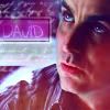
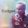
Talk LIMS #7: FINAL RESULTS!
- Thread starter Dragonfly
- Start date

Urban Legend
Captain
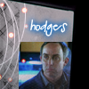
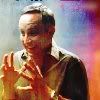
Re: Talk LIMS #7: Round 7 - Hodges
I'm sending mine in, textures are defiantly not one of my favorite things to work with though.
I'm sending mine in, textures are defiantly not one of my favorite things to work with though.
nattybatty55
Nadalaholic
Re: Talk LIMS #7: Round 7 - Hodges
I finally found a spare lil' bit of time to do mine although I should have been studying :lol:
Cant wait to see what we've all come up with....
I finally found a spare lil' bit of time to do mine although I should have been studying :lol:
Cant wait to see what we've all come up with....
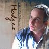
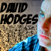
Re: Talk LIMS #7: Round 7 - Hodges ~ Now Up!
Apologies for this being late. I got distracted yesterday and, well, forgot :shifty:
LIMS 7 Round 7: Voting!
We have 2 people using their skips this round.
One person has had to withdraw from the challenge.
Two people have failed to submit entries.
Voting Rules:
~ Absolutely anyone may vote! You don't have to be an 'expert'")
~ Vote for the Top 3 of least quality, and the Top 2 of best quality.
~ Votes for least quality Must have a reason, or they will not be counted. Reasons for best quality are strongly encouraged
(the following examples may have been "borrowed" from other sources)
Good Examples:
34: Text is oddly placed
50: Icon is over sharpened
62: Image is too blurry
Poor Examples:
96: I don't like the colour (personal preference)
52: Tiny text/decorative brushes are unreadable (it's supposed to be that way)
01
 02
02
 03
03
 04
04
 05
05
06
 07
07
 08
08
 09
09
 10
10
11
 12
12
 13
13
If there are any problems, please let me know ASAP!
Apologies for this being late. I got distracted yesterday and, well, forgot :shifty:
LIMS 7 Round 7: Voting!
We have 2 people using their skips this round.
One person has had to withdraw from the challenge.
Two people have failed to submit entries.
Voting Rules:
~ Absolutely anyone may vote! You don't have to be an 'expert'
~ Vote for the Top 3 of least quality, and the Top 2 of best quality.
~ Votes for least quality Must have a reason, or they will not be counted. Reasons for best quality are strongly encouraged
(the following examples may have been "borrowed" from other sources)
Good Examples:
34: Text is oddly placed
50: Icon is over sharpened
62: Image is too blurry
Poor Examples:
96: I don't like the colour (personal preference)
52: Tiny text/decorative brushes are unreadable (it's supposed to be that way)
01
06
11
If there are any problems, please let me know ASAP!
luf100
Coroner
Re: Talk LIMS #7: Round 7 - Hodges ~ Now Up!
Least:
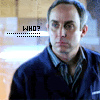
07: Hodges sort of gets lost in the texture. It'd be better if the texture was more transparent and he could be seen better.
13: The text makes up more of the icon than Hodges does. Too much of him is cropped out.
01: Plain. Doesn't look like much was done to the picture at all.
Best:
04: The black and white looks good with the greenish dot as the only colour, the initials are easy enough to see. Looks awesome.
08: The texture is obviously there but Hodges is also very apparent. Nice colouring.
Good job to everyone though. It's getting harder to vote every time.
Least:
07: Hodges sort of gets lost in the texture. It'd be better if the texture was more transparent and he could be seen better.
13: The text makes up more of the icon than Hodges does. Too much of him is cropped out.
01: Plain. Doesn't look like much was done to the picture at all.
Best:
04: The black and white looks good with the greenish dot as the only colour, the initials are easy enough to see. Looks awesome.
08: The texture is obviously there but Hodges is also very apparent. Nice colouring.
Good job to everyone though. It's getting harder to vote every time.
H_Miami_fan
Police Officer
Re: Talk LIMS #7: Round 7 - Hodges ~ Now Up!
Least:
05 A bit messy and hodges looks blurry.
01 Very pale and too blurry.
04 Really cool concept but hodges is oversharpened.
Best:
08 love the coloring and use of texture.
10 overall great, love it.
Least:
05 A bit messy and hodges looks blurry.
01 Very pale and too blurry.
04 Really cool concept but hodges is oversharpened.
Best:
08 love the coloring and use of texture.
10 overall great, love it.
Re: Talk LIMS #7: Round 7 - Hodges ~ Now Up!
Least:
01 - Doesn't look like much has been done to the icon.
12 - Hodges again is kinda lost in the texture.
07 - Hodges kinda gets lost in the texture.
Best:
05 - Love the use of the texture, overall great icon.
04 - Simple but effective, the colouring works well.
Least:
01 - Doesn't look like much has been done to the icon.
12 - Hodges again is kinda lost in the texture.
07 - Hodges kinda gets lost in the texture.
Best:
05 - Love the use of the texture, overall great icon.
04 - Simple but effective, the colouring works well.
egeria
This mod is Ready for the Laughing Gas!
Re: Talk LIMS #7: Round 7 - Voting!
Least
05. Too much going on, Hodges get lost in the busyness
12. Really pale icon, Hodges seems to be too faded.
01. More could have been done with the texture, it just looks too plain
Best
11. Love the crop and colouring. Font really catches my eye too.
08. Greatuse of blend modes on the textures. I wish I had made this!!
csifann1
CSI Level Two
Re: Talk LIMS #7: Round 7 - Voting!
Least:
07- The texture is kinda "killing" Hodges, it would be better if there wasn't texture õver Hodges.
13- the text is overkilling the icon, it should have more Hodges on it
01- Too plain, should have more differences from the original picture
Best:
04- It's so well done, the blue circle gives a magical touch to the icon, love it ♥
05- I just love that effect, great job!