Install the app
How to install the app on iOS
Follow along with the video below to see how to install our site as a web app on your home screen.
Note: This feature may not be available in some browsers.
You are using an out of date browser. It may not display this or other websites correctly.
You should upgrade or use an alternative browser.
You should upgrade or use an alternative browser.
Talk LIMS #7: FINAL RESULTS!
- Thread starter Dragonfly
- Start date
nattybatty55
Nadalaholic
Re: Talk LIMS #7: Challenge Six - Kendall
I love B/w icons but i dont know how it'll turn out, gotta find the time first")
I love B/w icons but i dont know how it'll turn out, gotta find the time first
Re: Talk LIMS #7: Challenge Six - Kendall
Mines in!!
Pumped to see the others!!
Mines in!!
Pumped to see the others!!
insertusername
Lab Technician
Re: Talk LIMS #7: Challenge Six - Kendall
I have a quick question I've never been quite sure about. Out of the provided caps can I use more than I in the same icon? Thanks.
I have a quick question I've never been quite sure about. Out of the provided caps can I use more than I in the same icon? Thanks.
nattybatty55
Nadalaholic
Re: Talk LIMS #7: Challenge Six - Kendall
Mines in
Mines in
Re: Talk LIMS #7: Challenge Six - Kendall
:lol: Well, I guess it's a bit late now, but for future reference, yes. Unless the rules specifically state otherwise, you can use two (or more?) images in one icon.
I have a quick question I've never been quite sure about. Out of the provided caps can I use more than I in the same icon? Thanks.
:lol: Well, I guess it's a bit late now, but for future reference, yes. Unless the rules specifically state otherwise, you can use two (or more?) images in one icon.
Re: Talk LIMS #7: Challenge Six - Voting!
Voting time! Here we go!
Voting Rules:
~ Absolutely anyone may vote! You don't have to be an 'expert'
~ Vote for the Top 3 of least quality, and the Top 2 of best quality.
~ Votes for least quality Must have a reason, or they will not be counted. Reasons for best quality are strongly encouraged
(the following examples may have been "borrowed" from other sources)
Good Examples:
34: Text is oddly placed
50: Icon is over sharpened
62: Image is too blurry
Poor Examples:
96: I don't like the colour (personal preference)
52: Tiny text/decorative brushes are unreadable (it's supposed to be that way)
We have one person using their free skip this round.
01
 02
02
 03
03
 04
04

05
 06
06
 07
07
 08
08
09
 10
10
 11
11
 12
12
13
 14
14
 15
15
 16
16

If there are any problems, please let me know!
Happy Voting
Voting time! Here we go!
Voting Rules:
~ Absolutely anyone may vote! You don't have to be an 'expert'
~ Vote for the Top 3 of least quality, and the Top 2 of best quality.
~ Votes for least quality Must have a reason, or they will not be counted. Reasons for best quality are strongly encouraged
(the following examples may have been "borrowed" from other sources)
Good Examples:
34: Text is oddly placed
50: Icon is over sharpened
62: Image is too blurry
Poor Examples:
96: I don't like the colour (personal preference)
52: Tiny text/decorative brushes are unreadable (it's supposed to be that way)
We have one person using their free skip this round.
01
05
09
13
If there are any problems, please let me know!
Happy Voting
egeria
This mod is Ready for the Laughing Gas!
Re: Talk LIMS #7: Challenge Six - Voting!
Least:
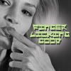
09: Drastic crop with hard to read text
10: the smaller picture in the circle is hard to make out and the text is unreadable.
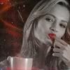
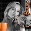
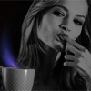
15: Icon is too dark, and the purple coming from the coffee mug seems out of place.
Best:
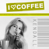
02: Beautiful crop with simple colouring, the icon stands out amongst the crowd
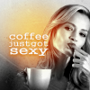
03: The yellow glow from the coffee warms up the icon, and the text goes perfectly with the image.
Least:
09: Drastic crop with hard to read text
10: the smaller picture in the circle is hard to make out and the text is unreadable.
15: Icon is too dark, and the purple coming from the coffee mug seems out of place.
Best:
02: Beautiful crop with simple colouring, the icon stands out amongst the crowd
03: The yellow glow from the coffee warms up the icon, and the text goes perfectly with the image.
Yumi696
Rookie
Re: Talk LIMS #7: Challenge Six - Voting!
Least:
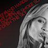
04- The crop and text seem out-of-place and they don't work well together.
09- The crop was too much, and the text doesn't work well with the overall image.
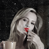
15- It's too dark, and the purple makes the drink look toxic.
Best:
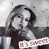
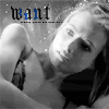
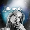
01- I like the old feel of the coloring, and the text is short and... well, sweet.
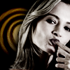
06- Good pose, great crop, and the text really goes well with the image.
(Not an expert, so I wasn't really sure of what to say, but... hope it works.)
Least:
04- The crop and text seem out-of-place and they don't work well together.
09- The crop was too much, and the text doesn't work well with the overall image.
15- It's too dark, and the purple makes the drink look toxic.
Best:
01- I like the old feel of the coloring, and the text is short and... well, sweet.
06- Good pose, great crop, and the text really goes well with the image.
(Not an expert, so I wasn't really sure of what to say, but... hope it works.
)