Install the app
How to install the app on iOS
Follow along with the video below to see how to install our site as a web app on your home screen.
Note: This feature may not be available in some browsers.
You are using an out of date browser. It may not display this or other websites correctly.
You should upgrade or use an alternative browser.
You should upgrade or use an alternative browser.
LIMS #6 Final Challenge!: 140x140 - Winners!
- Thread starter Adzix
- Start date
dopebabygirl
CSI Level Two
Re: LIMS #6 Challenge 5: No Layers! ~ Now Up!
i still have no idea want todo :/
i still have no idea want todo :/
nattybatty55
Nadalaholic
Re: LIMS #6 Challenge 5: No Layers! ~ Now Up!
Mines in
Mines in
Re: LIMS #6 Challenge 5: No Layers! ~ Now Up!
Mines in too!
Pumped to see the others!
Mines in too!
Pumped to see the others!
Miss_Undercover
Judge
Re: LIMS #6 Challenge 5: No Layers! ~ Now Up!
I have sent too my Icon !
I have sent too my Icon !
Re: LIMS #6 Challenge 5: No Layers! ~ Now Up!
Mine's sent in too.
Mine's sent in too.
Adzix
CSI Level Three
Re: LIMS #6 Challenge 5: No Layers! ~ Voting!
TalkCSI LIMS #6 Challenge 5: No Layers! ~ Voting!
No Free Passes were used for this challenge. Also, nobody failed to send their entry which means we've got them all. And to answer the question, nope, not every participant has to vote. It's encouraged, though.
Voting Rules:
~ Absolutely anyone may vote!
~ Vote for the Top 3 of least quality, and the Top 2 of best quality.
~ Votes for least quality Must have a reason, or they will not be counted. Reasons for best quality are strongly encouraged.
(the following examples may have been "borrowed" from other sources)
Good Examples:
34: Text is oddly placed
50: Icon is over sharpened
62: Image is too blurry
Poor Examples:
96: I don't like the colour (personal preference)
52: Tiny text/decorative brushes are unreadable (it's supposed to be that way)
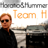
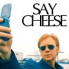
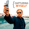
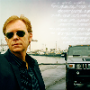
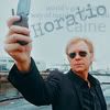
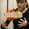
And now the icons:
01.
 02.
02.
 03.
03.
 04.
04.
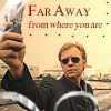
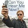
05.
 06.
06.
 07.
07.
 08.
08.
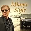
09.
 10.
10.
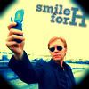
 11.
11.
 12.
12.

If there is anything wrong, let me know ASAP.
TalkCSI LIMS #6 Challenge 5: No Layers! ~ Voting!
No Free Passes were used for this challenge. Also, nobody failed to send their entry which means we've got them all.
And to answer the question, nope, not every participant has to vote. It's encouraged, though.Voting Rules:
~ Absolutely anyone may vote!
~ Vote for the Top 3 of least quality, and the Top 2 of best quality.
~ Votes for least quality Must have a reason, or they will not be counted. Reasons for best quality are strongly encouraged.
(the following examples may have been "borrowed" from other sources)
Good Examples:
34: Text is oddly placed
50: Icon is over sharpened
62: Image is too blurry
Poor Examples:
96: I don't like the colour (personal preference)
52: Tiny text/decorative brushes are unreadable (it's supposed to be that way)
And now the icons:
01.
05.
09.
If there is anything wrong, let me know ASAP.
Daquien
Coroner
Re: LIMS #6 Challenge 5: No Layers! ~ Now Up!
Haha, almost everyone using the same cap and cropping, I saw that coming...:lol:
LQ:
6- The icon is oversharpened, grainy.
8- The image appears blurry.
2- Dark and the font/text doesn't fit well.
BQ:
10- Nice colouring, text.
12- Nicely done and funny text.
Haha, almost everyone using the same cap and cropping, I saw that coming...:lol:
LQ:
6- The icon is oversharpened, grainy.
8- The image appears blurry.
2- Dark and the font/text doesn't fit well.
BQ:
10- Nice colouring, text.
12- Nicely done and funny text.
Re: LIMS #6 Challenge 5: No Layers! ~ VOTING!
Least
10 - too blurry
01 - coloring is too dark
09 - the blue is a little overwhelming and the black corners cuts off the text
Best
11
06
Least
10 - too blurry
01 - coloring is too dark
09 - the blue is a little overwhelming and the black corners cuts off the text
Best
11
06
Miss_Undercover
Judge
Re: LIMS #6 Challenge 5: No Layers! ~ VOTING!
Least
9 - too blurry, the background color is too flashy
10 - too bright, his face looks a little pale
2 - dark and blurry
Best
11 - very nice coloring and cropping, great text
5 - like the text and coloring
Least
9 - too blurry, the background color is too flashy
10 - too bright, his face looks a little pale
2 - dark and blurry
Best
11 - very nice coloring and cropping, great text
5 - like the text and coloring
Adzix
CSI Level Three
Re: LIMS #6 Challenge 5: No Layers! ~ VOTING!
*facepalm* haven't noticed. sorry about that.Whoops, Adzix, hon, your "location" is bursting the screen
Eve
Pathologist
Re: LIMS #6 Challenge 5: No Layers! ~ VOTING!
gosh, it is hard to pick on any icon... you're guys are just too good, seriously
but after all...
Least
04. Those glassy circles are diverting attention from Horatio and they are covering
his cell, making watcher wonder what H is holding
12. Too big contrast between the white background and colourful H (but the text really made my day!)
09. I don't like the efect of the circle and colouring is also odd, makes look H little bit too orange.
Best
08. I like the colouring and golden letters.
05. Nice colouring, I like this little something (is it brace maybe?) before the text and the text is also witty
cainesugar
Coroner
Re: LIMS #6 Challenge 5: No Layers! ~ VOTING!
Great icons everyone.
Least:
02- The icon is oversharpened, the text doesn't fit well
08- Also oversharpened at the edges
06- Also oversharpened, dark
Best
05- The coloring is beautiful, and the cropping works well
12: Funny text, great coloring
Great icons everyone.
Least:
02- The icon is oversharpened, the text doesn't fit well
08- Also oversharpened at the edges
06- Also oversharpened, dark
Best
05- The coloring is beautiful, and the cropping works well
12: Funny text, great coloring