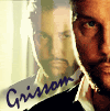
LIMS #6 Final Challenge!: 140x140 - Winners!

LIMS #6 Challenge 1: No Brushes ~Voting!

TalkCSI LIMS #6 Challenge 1: Voting

Unfortunately dstined4gr8ness failed to submit an entry and has been automatically eliminated from this round. Hope to see you next time :)

Also ILuvJonathanTogo and shazza_018 decided to use their free passes for this challenge.

Voting Rules:

~ Absolutely anyone may vote!
~ Vote for the Top 3 of least quality, and the Top 2 of best quality.
~ Votes for least quality Must have a reason, or they will not be counted. Reasons for best quality are strongly encouraged.

(the following examples may have been "borrowed" from other sources)

Good Examples:
34: Text is oddly placed
50: Icon is over sharpened
62: Image is too blurry

Poor Examples:
96: I don't like the colour (personal preference)
52: Tiny text/decorative brushes are unreadable (it's supposed to be that way)

And now the icons *angel choir*

01.
12.png
02.
11.png
03.
9.png
04.
18.jpg
05.
17.jpg
06.
16.jpg

07.
15.jpg
08.
14.jpg
09.
13.jpg
10.
10.jpg
11.
8.jpg
12.
6.jpg

13.
5.jpg
14.
3.jpg
15.
2.jpg
16.
1.jpg
17.
7.gif
18.
4.gif


If I forgot to post your icon or if there are any other problems, let me know ASAP.

Good luck all! :)
 
Re: LIMS #6 Challenge 1: No Brushes ~ Voting!

LQ:

15- Odd crop, too many empty space on the right.
13- Blurry.
12- Dark and blurry.

BQ:

1- Nice colouring.
2- Nice text and cropping.
 
Re: LIMS #6 Challenge 1: No Brushes ~ Voting!

Least

10- the facial color is a little to pink, the bckgrnd is nice

3- I love the icon, but their is a piece of his suit showing out of the icon. It kind of draws you to it.

2- Gorgeous icon, but I find the right side of the face a little to bright, kind of blends in with the right side yellow color

Best

18- I love everything about this icon, the double reflection, the lighting. It all blends beautifully

17- Goregous coloring, very clear, and great job with the text(Great Sexy Icon)I love that:)
 
Re: LIMS #6 Challenge 1: No Brushes ~ Voting!

This is harder than voting in the other challenges, but I like that we have to justify our picks (occupational hazzard, I suppose...too many years teaching Geometry where you have to justify everything).

Least

12: a little too dark
13: text is dificult to read
11: coloring is off, face is greenish while background is very bright

Best

2: simple design, excellent coloring
5: again, good coloring, especially on a dark cap
 
Re: LIMS #6 Challenge 1: No Brushes ~ Voting!

least

10 - face looks too pink
11 - the coloring of his face is off
13 - blurry and text is hard to read

best

1 - nice coloring
14 - blends well together
 
Re: LIMS #6 Challenge 1: No Brushes ~ Voting!

Least Quality
03 - The orange border is taking the focus off grissom (too bright)
08 - Image is oversharpened, jagged ends can be seen between the white shirt and the coat.
13 - Text is difficult to read, image is a bit blurry...

Best Quality
07 - I LOVE the simplicity of this icon, and how it just stands out. The background really suits the coloring. Well done!!!
14 - I dont know why but this icon caught my attention, the cropping is great as is the coloring! ;)
 
Re: LIMS #6 Challenge 1: No Brushes ~ Voting!

Great work everyone :D This is going to be a tough competition!

Least Quality:
13 - Blurry and hard to read
12 - Blurry and a bit dark
08 - Icon is over sharpened

Best Quality:
07 - Nice and simple, good colouring
01 - Nice colouring, good layout
 
Re: LIMS #6 Challenge 1: No Brushes ~ Voting!

Least Quality:
16 - Too dark
08 - Oversharpened
13 - Too blury

Best Quality:
01 - Nice cropping
04- Good use of textures/gradients
 
Re: LIMS #6 Challenge 1: No Brushes ~ Voting!

Least Quality:

13 - Too blurry
15 - The cropping is a little too severe
12 - Coloring is a little too dark, and looks a little blurry

Best Quality

01 - I like the coloring and simplicity
18 - I like the blending and text placement
 
Re: LIMS #6 Challenge 1: No Brushes ~ Voting!

LQ:

13: Too much space to the right
11: Colouring makes the face a green colour.
3: Lovely icon but the orange border over powers the icon and the face is a little blurred.

BQ:
5: Great colouring.
1: nIce colouring and text placement
 
Re: LIMS #6 Challenge 1: No Brushes ~ Voting!

Least Quality:
11 - Background a little too bright, puts off the face
13 - Text is difficult to read
15 - Too much empty space on right because of crop

Best Quality:

10 - I like the colouring and nice background
03 - I like the black and white colouring with the eye colour left in, works well with the border
 
Re: LIMS #6 Challenge 1: No Brushes ~ Voting!

Least:
#12: too dark and a bit blurry
#17: the text is distracting me from Grissom's face
#15: odd crop. It leaves to much empty space on the right

Best:
# 4: just perfect! :thumbsup:
#10: great colouring
 
Re: LIMS #6 Challenge 1: No Brushes ~ Voting!

Great Job all!

Least
13 Blurry and text is hard to read
12 little too dark and blurred
08 too sharpened and text is too far up

Best
02 cropped nicely done and text
05 nice crop, text and coloring

OOOPPS Sry about that!!!
 
Last edited:
Re: LIMS #6 Challenge 1: No Brushes ~ Voting!

^ Twiztid4Togo, you have to choose 3 of least quality icons for me to count your votes. :)

keep voting all! ;)
 
Re: LIMS #6 Challenge 1: No Brushes ~ Voting!

Least
16 - Overall the look and feel is grainy. Also Grissom's skin color is similar to that of the background causing him to blend in a bit.
13 - The text is hard to read and the overall icon has a blurry/movement feeling.
15 - Cropping is too severe, cutting off that much and not doing anything else to the icon leaves it unblanaced.

Best
9
1
 
Back
Top