Re: LIMS #6 Challenge 2: Movie Quote ~ Now Up! Wow, it was so hard to decide on an icon to send it :lol: I made like 8 different ones. I finally sent one in though :thumbsup:
Re: LIMS #6 Challenge 2: Movie Quote ~ Now Up! the voting will be up tommorow when i get my laptop back. if anybody haven't sent their entry yet, you better do it quick i'm fairly certain i might have them all, though.
Re: LIMS #6 Challenge 2: Movie Quote ~ Voting Open! TalkCSI LIMS #6 Challenge 2: Voting! This time everybody either submitted their entry or used a free pass so nobody gets disqualified 3 of all participants decided to use their free passes, and those are MacsLovlyAngl, vegaslights and speed_cochrane. Voting Rules: ~ Absolutely anyone may vote! ~ Vote for the Top 3 of least quality, and the Top 2 of best quality. ~ Votes for least quality Must have a reason, or they will not be counted. Reasons for best quality are strongly encouraged. (the following examples may have been "borrowed" from other sources) Good Examples: 34: Text is oddly placed 50: Icon is over sharpened 62: Image is too blurry Poor Examples: 96: I don't like the colour (personal preference) 52: Tiny text/decorative brushes are unreadable (it's supposed to be that way) And now the icons. I have to say I'm really pleased with the outcome. Everybody got super-creative! 01. 02. 03. 04. 05. 06. 07. 08. 09. 10. 11. 12. 13. 14. 15. *If there are any troubles, or I forgot to post your icon, let me know ASAP.*
Re: LIMS #6 Challenge 2: Movie Quote ~ Voting Open! Least: 5 - The text at the top is very hard to read. 11- Hodges' hand is covering part of the text, also making ti hard to read. 14 - There is more focus on the text then on the subject of the icon. Best: 4 8
Re: LIMS #6 Challenge 2: Movie Quote ~ Voting Open! Wow, these are all great, it took a while for me to chose.
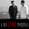
 Least 14 - The text takes away from the picture that's on the icon and covers to much of the picture 10 - To many different types of text on the icon, draws you away from the corner picture 
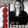
2 - I love the picture and coloring of this icon, but the top part of the text with the black going across is oddly placed
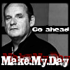
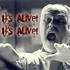
 Best 
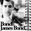
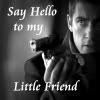
4 - The text, the color, it fits perfectly with the expression on the face 
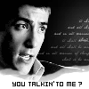
13 - I love the texture of the icon. The black shading background to the right, blends in perfectly with the face, almost shadow like, it draws you into the icon as a whole. Very good job. But you all did a great, *claps*
Re: LIMS #6 Challenge 2: Movie Quote ~ Voting Open! Least quality: 10 - Text is oddly placed and 'puts' is a little hard to read/understand 1 - Text is distracting from rest of icon 14 - Decoration on the left side of icon is a little unnecessary Best Quality: 4 - It goes together perfectly 7 - It makes me think that it actually is his precious because of his facial expression Everybody did so good... I feel bad putting 10, 1, and 14 up there. D:< They all rocked! <3
Re: LIMS #6 Challenge 2: Movie Quote ~ Voting Open! Wow, I agree Linda these are all so amazing! Least: 14 - There is more focus on the text then on the subject of the icon. 02 - the picture and colouring here is lovely but the text "Go Ahead" seems to me oddly placed! 10 - use of different fonts drws your attention to the text instead of the corner Best: 12 - I love this icon, the text, brush, cropping and colouring work well together amazing job!! 15 - I love the idea behind this icon!! Its very creative and overall a great icon!! Nice Job!! Everyone did amazing *claps*
Re: LIMS #6 Challenge 2: Movie Quote ~ Voting Open! Least: 13 - Too dark and the contrast is missing 9 - The image is too blurry and brightly and the effect on the right side is too much. The icon is too overcrowded. 10 - The font is hard to read, here and there a little unclear Best: 06 - Perfect cropping, text and coloring, very creative 01- The icon looks very good with the font in style of the movie * The Sixt Sense * and the black background for the text
Re: LIMS #6 Challenge 2: Movie Quote ~ Voting Open! hey shazza, did you by any chance mean #6 or #2, not #5?
Re: LIMS #6 Challenge 2: Movie Quote ~ Voting Open! I mean #2 I changed it! Sorry I'm such an idiot *slaps head*!
Re: LIMS #6 Challenge 2: Movie Quote ~ Voting Open! Maaaan this is tough! Erm... Least 09 - Seems too bright and the brush on the right is distracting from teh picture 10 - Too many different fonts distract from the picture 14 - Text kinda covers scene so you can't see what's going on Best 01 - Nice cropping and text 08 - The picture and quote matches well, good cropping as well
Re: LIMS #6 Challenge 2: Movie Quote ~ Voting Open! least 11-the different types of font, combined with the different colors is a bit distracting, and takes aways attention from the rest of the icon 10-the different fonts, particularly the baby one, looks a bit awkward. and the actual pic seems to be a little over sharpened. 9- the pic itself if a bit too lightened, and bright best 15- i love this icon, its simple, yet the choice of texture, and the use of the money brush works perfectly with both the pic and the quote, its all around excellent. 1-the cropping and the text(how you used red for dead) work perfectly together, and with the pic.