Re: LIMS #6 Challenge 1: No Brushes ~ Voting!
Least
12- Too dark which makes the overall icon unflattering. Also, the crop is odd. Perhaps cutting off a bit more of Grissom's face, or downsizing the image to fit better would make it more appealing.
03- Really unique but the center really could use a bit more sharpening and contrast. Also, I'm not sure if the large black border on the bottom is supposed to be that thick, but it looks like it just stops halfway up, making it a bit choppy. If that's part of the texture then not really your fault but yeah.
11- The colouring makes Grissom look a bit sickly. It's a strange combination of green and pink that doesn't compliment the icon.
Best
09- Lovely colouring! The crop and the text are placed perfectly and the background really draws one to the subject. Good job.")
10- Another lovely colouring. It's soft on the eyes and the faded text (not sure if it's part of a texture) adds that something extra.
Great job everyone.
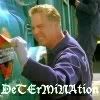
Least
12- Too dark which makes the overall icon unflattering. Also, the crop is odd. Perhaps cutting off a bit more of Grissom's face, or downsizing the image to fit better would make it more appealing.
03- Really unique but the center really could use a bit more sharpening and contrast. Also, I'm not sure if the large black border on the bottom is supposed to be that thick, but it looks like it just stops halfway up, making it a bit choppy. If that's part of the texture then not really your fault but yeah.
11- The colouring makes Grissom look a bit sickly. It's a strange combination of green and pink that doesn't compliment the icon.
Best
09- Lovely colouring! The crop and the text are placed perfectly and the background really draws one to the subject. Good job.
10- Another lovely colouring. It's soft on the eyes and the faded text (not sure if it's part of a texture) adds that something extra.
Great job everyone.