Re: LIMS #5: Challenge 5 ~ No Textures
LIMS #5: Challenge 5: No Textures
Last time, we had no layers, which many people find difficult, so this one (I think) is a bit easier. No textures are allowed! (This includes light textures)
The Caps:
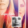
This round will feature the lovely Calleigh Duquesne. And yes, I realize that she's wearing black in every picture :lol:
Remember, you must use these caps and ONLY these caps to make your icon. Thanks to Modern Day Gallery for the caps!
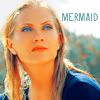
Option 1
Option 2
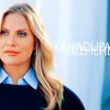
Option 3
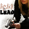
Option 4
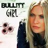
Option 5
Rules:
~ This is an anonymous challenge, so don't go posting your icon anywhere until this round is over.
~ Your icon must not exceed 100x100px. It should be in .jpg, .png or .gif format.
~ No animations will be permitted.
~ Submit your icon by sending me (DragonflyDreamer) a PM with the subject line LIMS Round 1 or similar.
~ You may submit only ONE icon
~ If you wish to use your free pass for this round, you MUST send me a PM to let me know. Otherwise it won't count, and you will be disqualified.
~ The deadline for submissions will be Monday March 31st. No extensions will be given.
Alright. I think that's everything, so go to it, and have fun")
LIMS #5: Challenge 5: No Textures
Last time, we had no layers, which many people find difficult, so this one (I think) is a bit easier. No textures are allowed! (This includes light textures)
The Caps:
This round will feature the lovely Calleigh Duquesne. And yes, I realize that she's wearing black in every picture :lol:
Remember, you must use these caps and ONLY these caps to make your icon. Thanks to Modern Day Gallery for the caps!
Option 1
Option 2
Option 3
Option 4
Option 5
Rules:
~ This is an anonymous challenge, so don't go posting your icon anywhere until this round is over.
~ Your icon must not exceed 100x100px. It should be in .jpg, .png or .gif format.
~ No animations will be permitted.
~ Submit your icon by sending me (DragonflyDreamer) a PM with the subject line LIMS Round 1 or similar.
~ You may submit only ONE icon
~ If you wish to use your free pass for this round, you MUST send me a PM to let me know. Otherwise it won't count, and you will be disqualified.
~ The deadline for submissions will be Monday March 31st. No extensions will be given.
Alright. I think that's everything, so go to it, and have fun
Last edited: