LIMS #5: Final Results Now Up!

Re: LIMS #5: ~Comeback Challenge~ Check it out!

YAY! I'm happy that I get a second chance and everyone else who got voted off. :thumbsup:
 
Re: LIMS #5: ~Comeback Challenge~ Check it out!

Great idea Meg! Will be interesting to see what you all come up with. :)
Good luck with the second chance! :D
 
Re: LIMS #5: ~Comeback Challenge~ Check it out!

Just a reminder, entries are due on Thursday. I currently have 4 icons, and I'd really like to get a few more.
 
Re: LIMS #5: ~Comeback Challenge~ Check it out!

i'm going to try i had to order a new power chord for my external cd drive. hopefully i'll get it in time to load my icon to photobucket...
 
Re: LIMS #5: ~Comeback Challenge~ Check it out!

Oh! ONLY for those who's been voted out. Oops! And here I thought I'd better hurry up and get mine in. Ah, it feels good to know I have a week off!
 
Re: LIMS #5: ~Comeback Challenge~ Check it out!

If anyone else is interested, you've still got about 7 hours to get something in :)
 
Re: LIMS #5: ~Comeback Challenge~ Voting!

Comeback Challenge Voting

Voting Rules:
~ Absolutely anyone may vote!
~ Please don't vote for your own icon.
~ Vote for the 3 icons of best quality
~ Reasons/Comments are highly encouraged :)
~ If you wish to leave constructive comments for those (or some of those) that you didn't vote for, you may do so.

1.
Flack01.jpg
2.
Flack02.gif
3.
Flack03.gif
4.
Flack04.png

5.
Flack05.jpg
6.
Flack06.jpg
7.
Flack07.jpg
8.
Flack08.png
 
Re: LIMS #5: ~Comeback Challenge~ Voting!

Okay, I'll go first then :lol: I'll try and offer constructive criticism where I can, but I'm no expert hehe.

4. I love the 'mirror effect' here and the 'block' in the middle. What's it supposed to say, though? I can't make it out :p

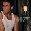
2. He's definitely 007 :lol: I like the brush and the crop. Try playing around with curves and colors to make it clearer.

1. Love the crop and the text; made me smile. Future? Maybe try making the font a little clearer? Maybe, use a font that is sharper once resized or one that has a 'deeper' color.

See, with all the '''s and 'made up' names .... sigh hehe.

Great job folks. I like 'em :D
 
Re: LIMS #5: ~Comeback Challenge~ Voting!

Luckily I read the rules, otherwise I would have voted for the icons of "least quality" :rolleyes: Thanks for pointing that out :)

5. I like the division of the icon and the fact that it's not a close close-up :lol: I hope that makes sense ;) The coloring is unique and eye-catching.
4. As adorelo already said, the mirror-effect is cool and the block in the middle fits that effect well. I also agree on the text comment, it is hardly readable.
2. Nice crop and the brush fits. And again, agreed! You should work with screen layers, curves, etc to "brighten" the icon.

Everyone did a great job and I hate that I can only choose 3 icons.
 
Re: LIMS #5: ~Comeback Challenge~ Voting!

Yay! Great job everyone. :)

05: The crop is wonderful and things don't feel too crowded. Also, the text really stands out and gives it a cuter touch, if that makes sense, lol.

04: The mirror effect is a nice touch and the colouring has a good tone to it. Like others have said though, the text is a little hard to make out. (It says 'peek-a-boo', right? :)) Perhaps making the text a bit darker would have helped.

06: I like the placement of everything and the crop takes up the perfect amount of room on the icon. The bluey-green background, in my opinion comes on a little bit strong but it seems to work well overall.
 
Re: LIMS #5: ~Comeback Challenge~ Voting Open!

I'd like to close voting on Tuesday, but I'll need a lot more votes to do so *offers cookies and a choice of milk or coffee*
 
Re: LIMS #5: ~Comeback Challenge~ Voting Open!

4- i love the mirror effect, and the coloring is nice and clear. the texture used as a background for the text is great too it fits the coloring scheme very well, the only sort of negative thing i have is the text, maybe if it was a bit darker then it would be easier to read.
5- i love that its not so close up, and the coloring is fantastic. and i like that you chopped it so the text could be clearly seen on the background(i also love the text too)
1- i love the crop and the coloring is simple but pretty at the same time.and the text, well its just awesome, it made me lol.
 
Re: LIMS #5: ~Comeback Challenge~ Voting Open!

This was a tough decison.

2 - I like the brush, tis very fitting. Try popping the subject more so it's the focal point.

3 - Again nice use of brushes and textures, just pop the subject more.

4 - The effect is nice. The test is hard to read at first glace, perhaps making it lighter.
 
Back
Top