Install the app
How to install the app on iOS
Follow along with the video below to see how to install our site as a web app on your home screen.
Note: This feature may not be available in some browsers.
You are using an out of date browser. It may not display this or other websites correctly.
You should upgrade or use an alternative browser.
You should upgrade or use an alternative browser.
LIMS #5: Final Results Now Up!
- Thread starter Dragonfly
- Start date
Re: LIMS #5: Challenge 9 ~ Logo ~ Now Up!
Wow, now this does sound like a very difficult challenge, good luck to all those taking part, lets hope the creative juices are flowing. :lol:
Wow, now this does sound like a very difficult challenge, good luck to all those taking part, lets hope the creative juices are flowing. :lol:
BonaTaylor
Pathologist
Re: LIMS #5: Challenge 9 ~ Logo ~ Now Up!
I am late, I know, but I just wanted to quickly drop my congrats to the winners!! Heads Up with Kat and Steffi in the final round??? OMG!! I can't believe it. Awesome work, girls!
So, good luck everyone with the theme. I totally love the theme and have some awesome ideas. I wish I could enter.... :lol:
I am late, I know, but I just wanted to quickly drop my congrats to the winners!! Heads Up with Kat and Steffi in the final round???
OMG!! I can't believe it. Awesome work, girls! So, good luck everyone with the theme. I totally love the theme and have some awesome ideas. I wish I could enter.... :lol:
cathwillows
CSI Level Three
Re: LIMS #5: Challenge 9 ~ Logo ~ Now Up!
OMG, got mine in as well My head's still hurting! That was a tough one.
I'm not going to be a danger guys! But I'm proud to be one of the final 4.
Good luck to all of you!
OMG, got mine in as well
My head's still hurting! That was a tough one.I'm not going to be a danger guys! But I'm proud to be one of the final 4.
Good luck to all of you!
BonaTaylor
Pathologist
Re: LIMS #5: Challenge 9 ~ Logo ~ Now Up!
Oh my... You are a Cylon????? Hang on... that were the Final Five! Phew... Sorry, couldn't resist! *points to banner* I am in a fever these days! :guffaw:
Good luck to all contestants!
But I'm proud to be one of the final 4.
Oh my... You are a Cylon?????
Hang on... that were the Final Five! Phew... Sorry, couldn't resist! *points to banner* I am in a fever these days! :guffaw:Good luck to all contestants!
Re: LIMS #5: Challenge 9 ~ Logo ~ Now Up!
LIMS 5: Final Voting!
The entries are all in, so I'm going to go ahead and open the voting. No point in making people wait
Voting Rules:
~ Absolutely anyone may vote!
~ Please vote for the top two of least quality, and the top one of best quality.
~ Votes for least quality Must have a reason, or they will not be counted. Reasons for best quality are strongly encouraged
(the following examples may have been "borrowed" from other sources)
Good Examples:
34: Text is oddly placed
50: Icon is over sharpened
62: Image is too blurry
Poor Examples:
96: I don't like the colour (personal preference)
52: Tiny text/decorative brushes are unreadable (it's supposed to be that way)
And just a note: I know that voting in the final round is hard. Believe me, I do. But it has to be done, so please help me out!
To our four finalists: You should not vote in this round, as you'd be voting for everyone but yourself :lol:
Best of luck to all of you!
01
 02
02
 03
03
 04
04

Last edited:
cathwillows
CSI Level Three
Re: LIMS #5: Challenge 9 ~ Logo ~ Now Up!
Awesome icons guys! Good luck to the three of you
:lol: I wouldn't have thought of that! *slaps head* I'm not a really fast thinker :lol:To our four finalists: You should not vote in this round, as you'd be voting for everyone but yourself :lol:
Awesome icons guys! Good luck to the three of you
BonaTaylor
Pathologist
Re: LIMS #5: Challenge 9 ~ Logo ~ Now Up!
Oh Gosh, I start this off... They are all fantastic and I do see the point of you guys still being in this competition.
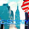
02 - The colour of the background matches too much the colour of the Logo. I like the American flag on the corner though! THAT's good colouring!
04 - Rather random icon which is technically well done. Too much sky here for my taste too.
01 - I totally LOVE the idea and concept of 03, but since I read the other complaints about the middle of the "A" being still white, I have to agree and need to unfortunately step down from this one as best, just because of this let's say technical glitch. There we have 01 in place, which was striking beautiful from the beginning and since it is also technically perfect, it got to be my #01.
Wow! This was hard. I hope anyways loads of ppl come in and vote! I am really looking forward on knowing the final results!!
ETA: I did change my vote regarding the new voting rules.
Oh Gosh, I start this off...
They are all fantastic and I do see the point of you guys still being in this competition. 02 - The colour of the background matches too much the colour of the Logo. I like the American flag on the corner though! THAT's good colouring!
04 - Rather random icon which is technically well done. Too much sky here for my taste too.
01 - I totally LOVE the idea and concept of 03, but since I read the other complaints about the middle of the "A" being still white, I have to agree and need to unfortunately step down from this one as best, just because of this let's say technical glitch. There we have 01 in place, which was striking beautiful from the beginning and since it is also technically perfect, it got to be my #01.
Wow! This was hard. I hope anyways loads of ppl come in and vote! I am really looking forward on knowing the final results!!
ETA: I did change my vote regarding the new voting rules.
Last edited:
Re: LIMS #5: Challenge 9 ~ Logo ~ Now Up!
Oh geez, this is tough.
Least
03: It's really neat, but for the last round, it's kind of plain. It's probably because of the amount of black in the background and also the 'A' in Miami is white inside and should be black.
02: Another lovely icon, but the CSI:NY blends too much into the surrounding buildings making it a bit hard to focus.
Best
04: Excellent colouring, good separation between top and bottom and the lettering matches the background excellently.
Great job everyone!
MelC
Police Officer
Re: LIMS #5: Challenge 9 ~ Logo ~ Now Up!
Wow... This is very tough...
Least quality:
02 - To me, the flag is a bit distracting. Also, the color of the text is too similar to the background.
03 - I like the idea very much, but the hole in the alphabet 'a' should be black, i think that would make the 'a' more clear.
Best quality:
04 - I really like the coloring and the text stands out... Great job!
In all fairness, you guys did a fantastic job!!!! I tried really really really hard to be picky to find reasons for least quality...