Install the app
How to install the app on iOS
Follow along with the video below to see how to install our site as a web app on your home screen.
Note: This feature may not be available in some browsers.
You are using an out of date browser. It may not display this or other websites correctly.
You should upgrade or use an alternative browser.
You should upgrade or use an alternative browser.
LIMS #5: Final Results Now Up!
- Thread starter Dragonfly
- Start date
roximonoxide
Lab Technician
Re: LIMS #5: Round 3
I'm in.
I'm in.
dstined4gr8ness
Police Officer
Re: LIMS #5: Round 3
I'm anxious to see what everyone did
I'm anxious to see what everyone did
roximonoxide
Lab Technician
Re: LIMS #5: Round 3
^ me too! Such great pictures this round, and considering how great the entries were LAST round, I bet these will be phenomenal.
^ me too! Such great pictures this round, and considering how great the entries were LAST round, I bet these will be phenomenal.
Re: LIMS #5: Round 3
Okay, here's the deal. Right now, I'm very, very tired. I don't feel like putting up the voting, so I'm going to do it in the morning.
So, those of you who don't have your icon in yet, are getting a bit of a break. You've got roughly 12 hours to get it to me.
Okay, here's the deal. Right now, I'm very, very tired. I don't feel like putting up the voting, so I'm going to do it in the morning.
So, those of you who don't have your icon in yet, are getting a bit of a break. You've got roughly 12 hours to get it to me.
Re: LIMS #5: Round 3 Voting Open!
Talk CSI LIMS #5: Round 03 Voting
Unfortunately, Distraction and that_girl1 have failed to submit entries. They will be disqualified from the challenge.
We also have one participant using her free skip.
Voting Rules:
~ Absolutely anyone may vote!
~ Vote for the Top 3 of least quality, and the Top 2 of best quality.
~ Votes for least quality Must have a reason, or they will not be counted. Reasons for best quality are strongly encouraged
**For THIS ROUND ONLY: the winner of the voter's choice will get to pick the subject (character) of the next round!**
(the following examples may have been "borrowed" from other sources)
Good Examples:
34: Text is oddly placed
50: Icon is over sharpened
62: Image is too blurry
Poor Examples:
96: I don't like the colour (personal preference)
52: Tiny text/decorative brushes are unreadable (it's supposed to be that way)
Now, the icons:
01.
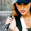 02.
02.
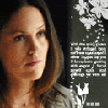 03.
03.
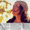 04.
04.
 05.
05.
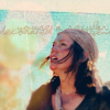
06.
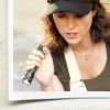 07.
07.
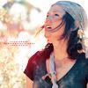 08.
08.
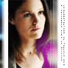 09.
09.
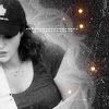 10.
10.

11.
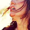 12.
12.
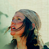 13.
13.
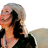 14.
14.
 15.
15.
*If there are any problems, please let me know ASAP!*
Good luck everyone!
Talk CSI LIMS #5: Round 03 Voting
Unfortunately, Distraction and that_girl1 have failed to submit entries. They will be disqualified from the challenge.
We also have one participant using her free skip.
Voting Rules:
~ Absolutely anyone may vote!
~ Vote for the Top 3 of least quality, and the Top 2 of best quality.
~ Votes for least quality Must have a reason, or they will not be counted. Reasons for best quality are strongly encouraged
**For THIS ROUND ONLY: the winner of the voter's choice will get to pick the subject (character) of the next round!**
(the following examples may have been "borrowed" from other sources)
Good Examples:
34: Text is oddly placed
50: Icon is over sharpened
62: Image is too blurry
Poor Examples:
96: I don't like the colour (personal preference)
52: Tiny text/decorative brushes are unreadable (it's supposed to be that way)
Now, the icons:
01.


06.


11.


*If there are any problems, please let me know ASAP!*
Good luck everyone!
Re: LIMS #5: Round 3 Voting Open!
Least:
02: Sara looks quite squished. The tiny text is a bit blurred. Overall the icon looks kind of dull due to no colouring or anything.
11: I like your cropping in this, however the fact that you cropped off half her face takes away from the effect of the icon.
14: I just don't think the bubble texture/brush fits the icon. It's kind of.. distracting.
Best:
10: Right when I saw this icon I loved it. The cropping, the texture, the brushes were all fantastic and the colouring is awesome =D
07: I love, love, love the colouring in this icon! You cropped Sara very nicely as well. Just an overall great icon.
fallenthrough
Rookie
Re: LIMS #5: Round 3 Voting Open!
Least:
14: The bubble texture looks very odd on the icon and just doesn't fit it.
02: The icon looks a bit grainy and the picture looks like it's been squished into the space
08: The white line on the left looks a bit out of place.
Best:
09: The crop is different and interesting and the black and white complements it well.
07: Everything about the icon goes so well. The coloring is gorgeous and it's not over the top.
starzsgirl
Captain
Re: LIMS #5: Round 3 Voting Open!
Least:
09: The crop took off most of the face and left the body. The proportions look very off.
02: Sara is squished and her face is grainy and blurry.
11: The crop makes the proportions of her face and the icon look strange.
Best:
14
6
Least:
09: The crop took off most of the face and left the body. The proportions look very off.
02: Sara is squished and her face is grainy and blurry.
11: The crop makes the proportions of her face and the icon look strange.
Best:
14
6
Re: LIMS #5: Round 3 Voting Open!
Least
02: Sara's face is squished inward and there's a lot of noise/grainynes to the icon.
03: The tiny text brush actually takes away from the icon. It separates it into two instead of blending.
15: Given we're voting for quality, I didn't find how the greyscale was used to be very effective.
Best
09: This, I found to be an effective use of greyscale. The bit of colour/light give it at extra bit of something and everything blends really well.
11: I actually thought this to be a really interesting crop. There's some really good colouring in it as well.
that_girl1
Coroner
Re: LIMS #5: Round 3 Voting Open!
Least
14-The bubble seems out of place
02-Her face looks squished
08-It would've looked better without the white lines
Best
11-I like the cropping since it creates a dramatic effect
6-The Polaroid frame is really nice
Least
14-The bubble seems out of place
02-Her face looks squished
08-It would've looked better without the white lines
Best
11-I like the cropping since it creates a dramatic effect
6-The Polaroid frame is really nice
Macayla
Captain
Re: LIMS #5: Round 3 Voting Open!
Least:
02: Overall the icon appears grainy and Sara looks squished
14: The bubble/circle doesn't fit the icon
08: The white line's are distracting, not very fitting
Best:
12: Love the crop and colouring
04: I like the colouring and the light effects
Least:
02: Overall the icon appears grainy and Sara looks squished
14: The bubble/circle doesn't fit the icon
08: The white line's are distracting, not very fitting
Best:
12: Love the crop and colouring
04: I like the colouring and the light effects
dstined4gr8ness
Police Officer
Re: LIMS #5: Round 3 Voting Open!
14. while i think the bubble effect is cool, it doesn't really mesh well with the icon.
8. the white line on the left looks as though it may have been moved by mistake..
11. the cropping is a tad unfortunate. with half of her face missing, it takes away the effect of the icon.
best
1. great coloring, great crop.
9. i love the greyscale and the crop and the color gives it a little something extra.
Awesome job everyone!!
