LIMS #5: Final Results Now Up!

Discussion in 'Fan Art' started by Dragonfly, Jan 3, 2008.

  1. cathwillows

    cathwillows CSI Level Three

    Joined:
    Jan 5, 2007
    Messages:
    3,990
    Likes Received:
    0
    Re: LIMS #5: Round 2 Voting!

    Least Quality
    19 - It is grainy around Aiden's face and the texture doesn't really fit the icon.
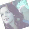
    17 - It is too "washed out". You can hardly see details of Aiden and her surroundings.
    03 - Not enough colour balance. There isn't enough contrast between the two Aidens, it seems as if both were fading.

    Best Quality
    20 - Great! Nice colours and a very cool effect. It looks kind of mysterious. Well done.
    01 - The effect around Aiden draws the attention to her and isn't distracting. Good colouring.
     
  2. adorelo

    adorelo CSI Level Two

    Joined:
    Aug 10, 2007
    Messages:
    1,591
    Likes Received:
    0
    Re: LIMS #5: Round 2 Voting!

    Least:
    01 - i love the circle, but i think the image looks a little dull and dark. Also, I found the text to large and distracting.
    17 - the image is very faint and bright, i can hardly see her there.
    19 - the texture appears too 'placed' it doesn't seem to fit.

    Top:

    12 - love the sparkles! She looks magical and very pretty.
    7 - Nice font and good crop
    13 nice crop and lovely color
     
  3. Macayla

    Macayla Captain

    Joined:
    Nov 1, 2005
    Messages:
    4,733
    Likes Received:
    0
    Re: LIMS #5: Round 2 Voting!

    17 - The colouring makes it look washed out, also the cropping and flipping of the picture looks odd.
    19 - The texture looks placed, it doesn't fit in nicely.
    07 - I like the crop, but Aiden is too yellow.
     
  4. Dragonfly

    Dragonfly ~Queen of Sarcasm~ Moderator

    Joined:
    May 26, 2006
    Messages:
    8,634
    Likes Received:
    0
    Re: LIMS #5: Round 2 Voting!

    I'd like to have at least as many votes as I have icons, and we're not quite there yet.

    If you entered an icon there is absolutely no reason for not voting.

    Please keep them coming!
     
  5. HellsBells

    HellsBells Tormenting Camp Counselors

    Joined:
    Feb 27, 2007
    Messages:
    1,049
    Likes Received:
    0
    Re: LIMS #5: Round 2 Voting!

    Least
    3. Her face is too washed out.
    19. The texture doesn't look right with the image.
    13. The coloring seems off.

    Best
    1. I like the effect of the circle around the image. The font is simple but nice.
    6. I like the text. It makes me laugh. The crop is simple and nice.
     
  6. cinegirl

    cinegirl Coroner

    Joined:
    May 22, 2006
    Messages:
    2,496
    Likes Received:
    0
    Re: LIMS #5: Round 2 Voting!

    Gosh, that's so hard! Some really great icons, guys! :)
    OK, I'll try...

    Least

    #17 - it's just too bright, no real contrast to the white background
    #19 - the texture doesn't fit plus it takes too much away from Aiden's face
    #03 - great idea, but the "original Aiden" is too dark, too much contrast, and the blending of the cloned one didn't work that well

    Best

    #01 - just perfect in my eyes: focus on Aiden, she's also very clear, great effect around her, text is perfectly placed - two thumbs up :)
    #02 - everything fits: cropping, the soft colors, the light and the text - again two thumbs up :)
     
  7. kinkapoodles

    kinkapoodles Judge

    Joined:
    May 30, 2005
    Messages:
    5,629
    Likes Received:
    1
    Re: LIMS #5: Round 2 Voting!

    Least
    17 - It's a bit washed out
    08 - The text seems to jump out at you. It's too big in comparison to Aiden
    09 - too dark and seems a big oversharpened

    Top
    20 - love the cropping and the texture. this icon just stands out
    01 - love the effect and the text fits perfect
     
  8. fo_poozle

    fo_poozle CSI Level Two

    Joined:
    Jun 4, 2006
    Messages:
    1,987
    Likes Received:
    0
    Re: LIMS #5: Round 2 Voting!

    least:
    17-it looks a little washed out, and the rotation of the pic leaves kind of an odd crop.
    19-the texture in the corner is a bit odd and out of place and doesn't really have a cohessiveness with the rest of the icon.
    3- the high contrast makes it look a little washed out. and the cloning, although i love the idea, doesn't seem to fit with the cropping, and it makes the icon look a little crowded.
    top:
    13- the coloring is absolutely beautiful and completely makes aiden pop out, and i love how it seems to be soften but not blurry.
    20. i love the cloning in black and white and the textures used in the background and then the purple stripe used to make it stand out more it beautiful.
     
  9. Dragonfly

    Dragonfly ~Queen of Sarcasm~ Moderator

    Joined:
    May 26, 2006
    Messages:
    8,634
    Likes Received:
    0
    Re: LIMS #5: Round 2 Voting!

    Voting will close Thursday, February 7th, 9pm GMT, if you haven't voted yet, please do so :)
     
  10. LivingEnd

    LivingEnd Lab Technician

    Joined:
    Aug 23, 2007
    Messages:
    532
    Likes Received:
    0
    Re: LIMS #5: Round 2 Voting!

    Least Quality:

    19 - The texture doesn't really fit and takes the focus away from Aiden
    17 - The icon is too bright
    3 - The image is grainy in a few spots and the overlay isn't really seamless

    Best Quality:

    13 - Nice cropping and a beautiful coloring :)
    1 - Beautiful icon, textures, text and cropping... Everything fits greatly :)
     
  11. Dragonfly

    Dragonfly ~Queen of Sarcasm~ Moderator

    Joined:
    May 26, 2006
    Messages:
    8,634
    Likes Received:
    0
    Re: LIMS #5: Round 2 Results!

    LIMS #5: Round 2: Results

    Once again, we must say goodbye to two of our iconists:
    [​IMG] by Happilyhappy
    [​IMG] by wolfesgamergirl

    Sorry to see you go :( Thanks for participating :)

    Voter's Choice award:
    [​IMG]
    Congrats!

    Mod's Choice award:
    [​IMG]
    A nice, simple icon, with beautiful colouring. It doesn't need any embellishments to make it work.

    How did your icon do?
    01: 14-2= +12
    02: +4
    03: -10
    04: 0
    05: -2
    06: +3
    07: 1-2= -1
    08: 1-5= -4
    09: -3
    10: 0
    11: 0
    12: +2
    13: 4-1= +3
    14: +1
    15: -3
    16: -1
    17: -19
    18: 0
    19: -15
    20: +10
     
  12. starzsgirl

    starzsgirl Captain

    Joined:
    Feb 6, 2007
    Messages:
    4,650
    Likes Received:
    0
    Re: LIMS #5: Round 2 Results!

    Well I'm fine with that, I have stuff to do anyways.

    Can't really say I'm sad to go, either. Since I really didn't like the icon I sent in anyway.

    So have fun with this and I'll be back to vote.
     
  13. fo_poozle

    fo_poozle CSI Level Two

    Joined:
    Jun 4, 2006
    Messages:
    1,987
    Likes Received:
    0
    Re: LIMS #5: Round 2 Results!

    sorry to see you go Happilyhappy and wolfesgamergirl! i hope you come back for the next round of lims
    and congrats Adzix! your icon is absolutely gorgeous!
    and thank you to everyone who voted for mine i truly appreciate it!!
     
  14. Adzix

    Adzix CSI Level Three

    Joined:
    Mar 16, 2006
    Messages:
    3,567
    Likes Received:
    0
    Re: LIMS #5: Round 2 Results!

    wow, i didn't think i'd a get the mod's choice award :) thank you very much DD, appreciate it. love the banner.

    congrats fo_poozle and everybody else who made it to the next challenge. also, sorry to see the two of you go, hope you'll come back next round.
     
  15. Finch

    Finch Funnier in Enochian Super Moderator

    Joined:
    Jul 30, 2005
    Messages:
    16,852
    Likes Received:
    1
    Re: LIMS #5: Round 2 Results!

    So very sorry to see you two go, Happilyhappy and wolfesgamergirl. :) You both did a fantastic job getting this far.

    Ashley and Adzix, well done on getting Mod/Voters choice! :D Y'alls icons were above superb.

    Can't wait to see what the next challenge will be!
     

Share This Page