Install the app
How to install the app on iOS
Follow along with the video below to see how to install our site as a web app on your home screen.
Note: This feature may not be available in some browsers.
You are using an out of date browser. It may not display this or other websites correctly.
You should upgrade or use an alternative browser.
You should upgrade or use an alternative browser.
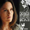
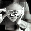
LIMS #5: Final Results Now Up!
- Thread starter Dragonfly
- Start date
Adzix
CSI Level Three
Re: LIMS #5: Round 3 Voting Open!
Lowest Quality
02 - you used too many brushes all in one spot
15 - the icon is too safe. it's basically only been cropped and desaturated. lacks a bit of creativity.
08 - there is too many things going on here, and they don't go together.
Highest Quality
09 - a structured professional work that requires higher level skills on PS. very, very pretty.
11 - you got my vote for your courage to submit an icon with such crop (it's LIMS after all") ) i like its originality and the coloring.
) i like its originality and the coloring.
Lowest Quality
02 - you used too many brushes all in one spot
15 - the icon is too safe. it's basically only been cropped and desaturated. lacks a bit of creativity.
08 - there is too many things going on here, and they don't go together.
Highest Quality
09 - a structured professional work that requires higher level skills on PS. very, very pretty.
11 - you got my vote for your courage to submit an icon with such crop (it's LIMS after all
) i like its originality and the coloring.cathwillows
CSI Level Three
Re: LIMS #5: Round 3 Voting Open!
02 - The picture looks grainy and squished and the b&w brush/texture? doesn't fit the icon.
14 - A bit grainy and the bubble texture doesn't go well with the icon. The added light effect is kind of distracting.
13 - I really like the colouring, but the icon appears to be oversharpened.
Best
07 - Great! Not too fancy and very effective.
09 - Different but very cool. The b&w effect fits the icon well.
CalleighD
Lab Technician
Re: LIMS #5: Round 3 Voting Open!
Least-
08: The line on the left looks out of place.
15: The black and white makes the icon look quite dull.
11- the crop takes a lot away from the icon.
Best-
09- This is beautiful and everything just fits so nicely.
07- The coloring on this is amazing
Least-
08: The line on the left looks out of place.
15: The black and white makes the icon look quite dull.
11- the crop takes a lot away from the icon.
Best-
09- This is beautiful and everything just fits so nicely.
07- The coloring on this is amazing
LivingEnd
Lab Technician
Re: LIMS #5: Round 3 Voting Open!
Least Quality:
02- The icon looks kind of grainy and Sara's face is squished
15- The icon is too plain and lacks contrast
14- The bubble texture somehow doesn't fit the icon
Best Quality:
11- I really like the cropping. It's different and interesting.
07- The coloring is just beautiful!
Least Quality:
02- The icon looks kind of grainy and Sara's face is squished
15- The icon is too plain and lacks contrast
14- The bubble texture somehow doesn't fit the icon
Best Quality:
11- I really like the cropping. It's different and interesting.
07- The coloring is just beautiful!
Re: LIMS #5: Round 3 Voting Open!
2 - looks blurry and kind of dark
8 - the line on the left looks like it does not belong
15 - it is dark and hard to tell who it is
Best -
6 - I love that brush you used and you cropped the pic great!
10 - overall I think this was done well - coloring, brushes, etc
2 - looks blurry and kind of dark
8 - the line on the left looks like it does not belong
15 - it is dark and hard to tell who it is
Best -
6 - I love that brush you used and you cropped the pic great!
10 - overall I think this was done well - coloring, brushes, etc
Re: LIMS #5: Round 3 Voting Open!
Least:
15: the b&w doesn't suit the image and makes the icon look a bit dull and unfocused
14: bubble brush is distracting and doesn't fit the overall look of the icon
2: image is squished and grainy
Best
7: coloring, crop, composition...great!
9: great b&w look with just that touch of color to grab your attention
Andreina
Lab Technician
Re: LIMS #5: Round 3 Voting Open!
Least
02-The icon looks squished and grainy since sara's face to the brushes.
14-It has a nice colouring but the bubble ruined it..it looks out of place it just doesn't work.
15-The icon looks plain without life with a little contrast it could have worked out.
Best
06-Lovely colouring not too bright not too dark..plus the brush totally worked it out.
09-Love the cropping..the textures,brushes..it all work it out they just complement.
twiztid4togo
Coroner
Re: LIMS #5: Round 3 Voting Open!
least
15 - The icon is plain and the grey scale makes it even duller. The the top seems a bit blurred from a frame or something.
8 - The lines on the left look out of place and the color by it looks like it was a mistake or something.
2 - Sara looks squished from the cropping and it's grainy.
Best
10 - I think the cropping is done perfect and the coloring. I love the brush used on it also, matches good.
1 - Again I think the cropping, and coloring on this was done perfect. I like the natural coloring of her skin.
insertusername
Lab Technician
Re: LIMS #5: Round 3 Voting Open!
Least
02. The image is pretty grainy and the brush doesn't seem to work with the rest of the icon.
03. While the coloring is nice, the image looks over sharpened and the tiny-text brush at the bottom takes away from the rest of it.
15. The application of greyscale doesn't seem to have worked well here. Perhaps the image needed some tinkering with contrast before turning it black and white.
Best
12. Great crop, great coloring and the color of the gradient or texture used in the bottom corner really suits the image.
04. Nice crop, and use of textures though I think I'd like it even more if the saturation was just a touch less, particularly on her lips.
Re: LIMS #5: Round 3 Results!
LIMS #5: Round 3: Results
Once again, we must say goodbye to two of our participants:
 by adorelo
 by dstined4gr8ness
Sorry to see you go, hope to see you around!
Voter's Choice award:
Macayla, you get to choose our next subject. It can be anyone from any of the 3 CSI shows. CSI, Lab tech, favorite bad guy, who ever. The only exceptions are the three that we've done already. Please PM me with your choice
Mod's Choice award:
Normally, I wouldn't do this, but they're both great, and I just couldn't choose, so we've got a tie:


Fantastic work ladies!
How did your icon do?
01: +2
02: -15
03: -3
04: +3
05: 0
06: +4
07: +7
08: -8
09: 8-1= +7
10: +3
11: 4-4= 0
12: +2
13: -1
14: 1-9= -8
15: -10
LIMS #5: Round 3: Results
Once again, we must say goodbye to two of our participants:
Sorry to see you go, hope to see you around!
Voter's Choice award:
Macayla, you get to choose our next subject. It can be anyone from any of the 3 CSI shows. CSI, Lab tech, favorite bad guy, who ever. The only exceptions are the three that we've done already. Please PM me with your choice
Mod's Choice award:
Normally, I wouldn't do this, but they're both great, and I just couldn't choose, so we've got a tie:
Fantastic work ladies!
How did your icon do?
01: +2
02: -15
03: -3
04: +3
05: 0
06: +4
07: +7
08: -8
09: 8-1= +7
10: +3
11: 4-4= 0
12: +2
13: -1
14: 1-9= -8
15: -10