Install the app
How to install the app on iOS
Follow along with the video below to see how to install our site as a web app on your home screen.
Note: This feature may not be available in some browsers.
You are using an out of date browser. It may not display this or other websites correctly.
You should upgrade or use an alternative browser.
You should upgrade or use an alternative browser.
LIMS #4 - The Ultimate Test of Creativity - Final Results Up
- Thread starter 4ENSIX
- Start date
ILuvJonathanTogo
Coroner
Re: LIMS #4 - The Ultimate Test of Creativity - Signups now
15- It's blurry
11- Its too bright
5- The coloring is odd, too much contrast
15- It's blurry
11- Its too bright
5- The coloring is odd, too much contrast
cainesugar
Coroner
Re: LIMS #4 - The Ultimate Test of Creativity - Signups now
7- oversharpened, grainy
15- blurry
11- too bright
Great job everyone!
7- oversharpened, grainy
15- blurry
11- too bright
Great job everyone!
Lizn8rFoxy
Lab Technician
Re: LIMS #4 - The Ultimate Test of Creativity - Signups now
5-color is really weird.
6-color too pale.
15-to blurry.
i hate voting for the "worst" ones...
5-color is really weird.
6-color too pale.
15-to blurry.
i hate voting for the "worst" ones...
Re: LIMS #4 - The Ultimate Test of Creativity - Signups now
07: A little bit oversharpened, which lowers the quality of the icon, making it difficult to see.
11: Not enough contrast, which whites-out most of the icon's subject.
15: Lovely colouring, but the icon's subject is a cropped inward, lowering the quality and the blurred effect would have been really great for the icon, had there been a little more sharpening and contrast.
dstined4gr8ness
Police Officer
Re: LIMS #4 - The Ultimate Test of Creativity - Signups now
15: Too blurry. Looks like the softening tool was used just a bit too much, instead of looking dreamy it looks unfocused.
11: Too light. The contrast isn't up to the same level as the lightness.
18: This has the potential of a fantastic icon, but the cropping is a bit...unfortunate... for lack of a better word. Her head seems to be sitting on the edge of the icon.
sorry guys. it was really hard to choose!
that_girl1
Coroner
Re: LIMS #4 - The Ultimate Test of Creativity - Signups now
7- Looks grainy.
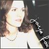
11-Too bright. It makes Jorja look really pale.
15-Really blurry, could've eased up on the blur tool.
7- Looks grainy.
11-Too bright. It makes Jorja look really pale.
15-Really blurry, could've eased up on the blur tool.
CSIVegasMiamiNY
Pathologist
Re: LIMS #4 - The Ultimate Test of Creativity - Signups now
ERgh, this is so hard to do! I feel so aweful! The icons are really beautiful though!
18-Marg's postioning is slightly...odd. It would ahve been better to maybe have her up a bit or something?
15- It's really quite blurry. Even though I think it was intentional, maybe if it wasn't quite so blurry, it be slightly...better, if that's the right word?
11-Jorja is quite bright, and it makes her kinda blend together and/or look a bit washed out.
ILuvJonathanTogo
Coroner
Re: LIMS #4 - The Ultimate Test of Creativity - Signups now
The suspence! Why do you do this do us? :lol:
The suspence! Why do you do this do us? :lol:
Wyoming
Head of the Graveyard Shift
Re: LIMS #4 - The Ultimate Test of Creativity - Signups now
15- I can see what kind of look you were going for here. And if it had been just a little less blurry, I think it would have been pulled off quite nicely. I think it was just blurred a little too much, but other than that everything looks good.
7- Black and white photos are very hard to work with. There isn't much that can be done except for sharpness/softness and brushes or textures. This one was oversharpened a bit, which makes the grainy look.
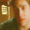
11- Too much contrast, and too much brightness. The combanation of the two don't go well together if there are too much of both. Jorja kinda looks like a big white blur. A little bit of a blue hue could have been added and maybe a sepia colored tone as well. The text was expertly placed, though
15- I can see what kind of look you were going for here. And if it had been just a little less blurry, I think it would have been pulled off quite nicely. I think it was just blurred a little too much, but other than that everything looks good.
7- Black and white photos are very hard to work with. There isn't much that can be done except for sharpness/softness and brushes or textures. This one was oversharpened a bit, which makes the grainy look.
11- Too much contrast, and too much brightness. The combanation of the two don't go well together if there are too much of both. Jorja kinda looks like a big white blur. A little bit of a blue hue could have been added and maybe a sepia colored tone as well. The text was expertly placed, though
Re: LIMS #4 - The Ultimate Test of Creativity - Signups now
Misery and Wyoming, your votes were not counted because they were posted after the voting was closed.
RESULTS
Thanks for a great turnout, everybody! Sadly, it is time to announce those icon-makers who will be leaving us this round...
 by Andreina and
 by gsrLOVE
I do hope to see you guys in the next one, though! Thanks for joining us!
And introducing...
THE GAH! AWARD
(Just ask Ann or Lilly - I say, "Gah!" all the time when I see a lovely icon)
Unfortunately, my Photobucket now thinks I'm the stupidest person alive and is retaliating by uploading everything I throw at it except the banner I made. So, until further notice, I apologize to all the winners of this prestigious ( :lol: ) award. I will make the banners, but I cannot guarantee that my Photobucket will like them. But anyway, the winner for this week is...
 by Hormiga
I thought this one was so lovely...I don't know of too many people who can achieve colouring like this, and those who can do it without layers are rarer still! Absolutely gorgeous, and also appeals to the font whore in me...I must know what it is! :lol: Excellent work, I think. Again, I apologize for not having a banner for you. I will as soon as possible.
Congratulations, everybody! I must now confess that I'll be out of town for two weeks and so LIMS will sadly be put on hold until I return, but rest assured that it is not over. As always, feel free to PM me if you have questions.
Misery and Wyoming, your votes were not counted because they were posted after the voting was closed.
RESULTS
Thanks for a great turnout, everybody! Sadly, it is time to announce those icon-makers who will be leaving us this round...
I do hope to see you guys in the next one, though! Thanks for joining us!
And introducing...
THE GAH! AWARD
(Just ask Ann or Lilly - I say, "Gah!" all the time when I see a lovely icon
)Unfortunately, my Photobucket now thinks I'm the stupidest person alive and is retaliating by uploading everything I throw at it except the banner I made. So, until further notice, I apologize to all the winners of this prestigious ( :lol: ) award. I will make the banners, but I cannot guarantee that my Photobucket will like them. But anyway, the winner for this week is...
I thought this one was so lovely...I don't know of too many people who can achieve colouring like this, and those who can do it without layers are rarer still! Absolutely gorgeous, and also appeals to the font whore in me...I must know what it is! :lol: Excellent work, I think.
Again, I apologize for not having a banner for you. I will as soon as possible.Congratulations, everybody! I must now confess that I'll be out of town for two weeks and so LIMS will sadly be put on hold until I return, but rest assured that it is not over.
As always, feel free to PM me if you have questions.