LIMS #4 - The Ultimate Test of Creativity - Final Results Up

Re: LIMS #4 - The Ultimate Test of Creativity - Signups now

Challenge #1- Anything and everything (except layers!) - VOTING

+Vote for the TOP 3 of least quality. Include a valid reason for each vote, otherwise it won't be counted.
+ANY member of this board may vote.
+The makers of the two icons with the highest number of votes will be eliminated from the challenge.
+When voting, keep in mind that these icons were made without layers.

Examples of good reasons (courtesy of Ann):
50: The text is oddly placed
68: The colouring is overpowering
72: The icon is oversharpened
56: The icon is too blurry

Examples of bad reasons:
51: I hate the colour pink. (Personal Preference)
78: The tiny text/decorative brush is unreadable. (Because they’re supposed to be that way.)

01.
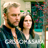
LIMS_01_01.png
02.
LIMS_01_02.jpg
03.
LIMS_01_03.png
04.
LIMS_01_04.png
05.
LIMS_01_05.jpg
06.
LIMS_01_06.jpg
07.
LIMS_01_07.jpg
08.
LIMS_01_08.png
09.
LIMS_01_09.jpg
10.
LIMS_01_10.png
11.
LIMS_01_11.jpg
12.
LIMS_01_12.png
13.
LIMS_01_13.jpg
14.
LIMS_01_14.png
15.
LIMS_01_15.png
16.
LIMS_01_16.png
17.
LIMS_01_17.png
18.
LIMS_01_18.png
19.
LIMS_01_19.png
20.
LIMS_01_20.jpg


Good luck everybody!

Important!: PM me, 4ENSIX, immediately if you don't see your icon
 
Re: LIMS #4 - The Ultimate Test of Creativity - Signups now

15-Blurry.
17-Dark.
7-Grainy.

Sorry guys. :(

Btw. 4ENSIX,may I know how do you count the votes? To know if we have to vote in order or it doesn't matter. Thanks. :)
 
Re: LIMS #4 - The Ultimate Test of Creativity - Signups now

11- washed out (not enough contrast),bringing up the brightness or gamma here definitely decreased your depth of color, and saturation.
15- blurry, though I think you were shooting for a kind of soft focus lens look.
07- grainy (over sharpened)

tough to choose though, jeeeeeez. :p
 
Re: LIMS #4 - The Ultimate Test of Creativity - Signups now

Oh, yeah, for sure! For now, I'll just count them as equal weighting, unless there's the case of a tie. If there's a tie, I'll go back to my point system (3 points for first place, etc.). In this case, the highest score will be eliminated. So yes, order matters. :)
 
Re: LIMS #4 - The Ultimate Test of Creativity - Signups now

15 too blurry
7 oversharpened, the blur tool might have helped
11 too bright and yeah, kinda washed out
 
Re: LIMS #4 - The Ultimate Test of Creativity - Signups now

15- The icon is blurry.
7 - Grainy.
5 - It's a little unfocused.
 
Re: LIMS #4 - The Ultimate Test of Creativity - Signups now

05-- Too much contrast made the icon look very unfocused and blurry around the face. The edges are a little oversharpened. The coloring makes it look very pale and odd.
11-- The brightness settings are overpowering.
19-- This is a great icon but it's really a little too bright. It makes Flack look blurry and the colors look a little washed-out.
 
Re: LIMS #4 - The Ultimate Test of Creativity - Signups now

15-blurry
11-too light, makes Jorja look pale
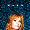
18-strange position of Marg's head and I find the background a little distracting.

Wow, this is hard. It's my first time voting on LIMS, so tell me if I did something wrong.
 
Re: LIMS #4 - The Ultimate Test of Creativity - Signups now

just something I thought of when switching from my laptop to my PC but has anyone else ever taken into account their own personal monitor settings? I mean, my laptop and my own PC vary GREATLY and it made me reconsider the appearance of things several times, just because they're different kinds of monitors. Color coordination settings tend to vary from brand, to monitor type (glass, lcd ect..) to personally altered screen settings... not that there's much to be done about it I suppose... just dawned on me.
 
Re: LIMS #4 - The Ultimate Test of Creativity - Signups now

Great work everyone!

15 - very blurry
18 - A nice icon, with unfortunate cropping. Would be better to see a bit more of Marg, or have her head/face take up a larger portion of the icon.
03 - Oversharpened in places.
 
Re: LIMS #4 - The Ultimate Test of Creativity - Signups now

15 - too blurry to tell the background from the person
11 - the brightness is up too far for the contrast to catch up
20 - the text is very hard to read and discern what exactly it is representing
 
Re: LIMS #4 - The Ultimate Test of Creativity - Signups now

#11 It's too bright and there's almost no contrast. You might want to play with the coloring a bit more and make it more vibrant.

#15 The icon is too blurry, and the ratio doesn't seem right. Try sharpening the icon and adjusting the ratio a bit. That shall make it more clear and Greg wouldn't seem like he has a long face.

#07 I like black and white, and that was a great pic. However, the icon looked a bit over-sharpened to me.
 
Back
Top