Install the app
How to install the app on iOS
Follow along with the video below to see how to install our site as a web app on your home screen.
Note: This feature may not be available in some browsers.
You are using an out of date browser. It may not display this or other websites correctly.
You should upgrade or use an alternative browser.
You should upgrade or use an alternative browser.
CSI: Miami Icons #7 - Showcase, Links and Requests
- Thread starter CSI_Kat
- Start date
Great icons everyone! 
Okay I'm new to photoshop so I was experimenting with this coloring tutorial by SunsetBoulevard. I want you guys to please tell me what you think about the icons, and if any improvements can be made how I would go about making those improvements. I'd really appreciate this thanks!

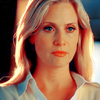
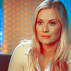
Enjoy!
Okay I'm new to photoshop so I was experimenting with this coloring tutorial by SunsetBoulevard. I want you guys to please tell me what you think about the icons, and if any improvements can be made how I would go about making those improvements. I'd really appreciate this thanks!
Enjoy!
csifann1
CSI Level Two
I think those icons are great, the coloring in nice, maybe less saturation would be better. When I first used photoshop, i followed exactly what the tutorial said, but my advised will be, the coloring depends of the image, I think you can follow the tutorial, but put the numbers of selective coloring, hue/saturation that stuff, how you think it's better for the image
But, still, that coloring is nice
And you'lll see that you'll get your own coloring soon
But, still, that coloring is nice
And you'lll see that you'll get your own coloring soon
Florry86
CSI Level Three
Thanks for the compliments everyone
csifann1 another great experiment, I really love Jonathan's face colour in this one :thumbsup:
Shazza_018 I'm not too fond of orange skins, but I really like these icons. I mean the colouring is really good though, I agree w/ csifann that you don't have to follow the tutorials step by step & literally also b/c, w/ this tutorial, Kate Walsh has red hair, I don't see it on Emily Procter & Eva La Rue :lol:.
It all depends on the image you have & the person you're manipulating
Ok I tried to do something w/ this tutorial too ( I had to experiment it :lol: ) & I came up w/ this:


happyharper13
Pathologist
Wow, Orla_Dark! Those are all gorgeous! I love how you colored them! So many, and all so beautiful!:thumbsup:
cathwillows
CSI Level Three
@ Shazz - I realy like coloring like that. I think the 3rd one turned out best. The color of the shadows in the other two is too intense IMO. You could try to work with Color Balance to compensate.
@ Orla_Dark - Great icons!!! The coloring is amazing
@ Orla_Dark - Great icons!!! The coloring is amazing


happyharper13
Pathologist
Those are gorgeous, Florry! I especially love the first one. Did you use a gradient of some sort there? The set of small boxes is a nice touch.
Florry86
CSI Level Three
Thank youThose are gorgeous, Florry! I especially love the first one. Did you use a gradient of some sort there? The set of small boxes is a nice touch.
Ok I didn't use a gradient there, I just duplicated the first layer & I put in on screen...then I played a little bit w/ selective colour, brightness/contrast, colour balance & a couple of textures so that I obtained the background colour (which is a little bit enlightened than it originally was in the cap) & that spotlight you can see on Calleigh's camera
As for the boxes, it's just a little brush & I played w/ its variations
Ok today I'm inspired & yeah s2 really kicked in :lol:
 my current avatar
  fallenforflack yeah I was thinking of you while making it
 Florry86
CSI Level Three
Thank you AnnaDelko
Great icons :thumbsup:. As for that brush in the second icon, I really love it (btw, can I ask you where did you take from? You can PM me or, even better, you can post it in the "fonts/caps..." thread :thumbsup, though I think the icon was good even w/o it
Great icons :thumbsup:. As for that brush in the second icon, I really love it (btw, can I ask you where did you take from? You can PM me or, even better, you can post it in the "fonts/caps..." thread :thumbsup
, though I think the icon was good even w/o it