Hip_hugga_lovah
Lab Technician
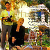
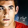
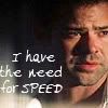
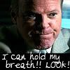
Awesome work on the icons guys!!! All the takes on Ryan look great!!!
Follow along with the video below to see how to install our site as a web app on your home screen.
Note: This feature may not be available in some browsers.
")


 . (BTW: Love your banner! Snagged, but of course I won't use it anytime soon... :lol: And will credit if I ever do)
cainesugar said:
Kit you are offically among my favorite icon makers.
cainesugar said:
Yes, I am silly, but I'll settle- ours are equal. Fair? :lol:
Anyway I dunno how I got it clear, but my process usually goes like this (and will vary)
-Crop and re-size canvas to y x y (as in, if one side is 400 and one is 450, I make it 400x400)
-Color adjustment, replacement, saturation, ect ect.
-Sharpening and blurring (I will re-size it to see how it looks, undo, and adjust)
-Layering (color burns, multiples, soft light, ect)
-Lighting effects- this might be it. I'll usually do three spotlights, make one light up the whole picture, and the others specific areas. Adjust the brightness, and set to metallic instead of plastic, and shiny instead of matte. It seems to make it come out crisper and cleaner.
-Brushes, (with brush effects and such) text, touch up blurring, often other effects.
So. Hope that helps. Love that first and third one, Stef, BN, mitzi and katbug your icons are wonderful, it seems everyone gets better every day in here. Hormiga the second one's brilliant, and Kit you are offically among my favorite icon makers. (Love your own icon BTW) Awesome work!
We use essential cookies to make this site work, and optional cookies to enhance your experience.