Ok I think I'm going to start with the Critique
 happyharper13
 you really did a great job with the cropping of the icons. Very cool and effective :thumbsup:
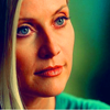
In the first icon, you should have probably used the ereaser so that Stella's face (especially the coloring you used on it) could come out in a better way. Some times the coloring you use on someone is just enough that you don't need to cover it with the texture.
I guess you used the "Multiply"/"Soft Light" layer option. I think that "Screen" or, even better, "Lighten" option (probably at 70%) would have been much better. I'm pretty sure that in this case you could even avoid the ereaser :thumbsup:
The second icon. Just perfect croppijng and perfect coloring. Greg's ear is a little bit orange and maybe you could have avoided this strange effect with a little bit more of "selective coloring" or "color balance", still it looks great.
I also would have put the brush in a higher postion. Probably, I'd change also the variation of the brush too b/c putting it above, it would be a little bit difficultier to read it. So I'd say select the bruss "invert" (image - adjustments - invert) and then "variations" (image - adjustments) so that you can choose the colour you want for the brush not to mention that you can read it better once on the icon

Now, the banner. IDK, the idea is damn good, but I guess you had a problem with the text on it since its last line ended on Warrick's body. Plus I'm not a fond of this font. The rest of it looks pretty good....the coloring and texture too. I'm sorry I'm not much of help as for the banner
 **please don't throw me bananas or any other kind of fruits**
 It's just that I find critique very useful sometimes especially when people give some hints on what to do the next time

Thanks so much! That was really, really helpful! I've never tried the 'variations' or 'invert' options, but I will definitely check those out. The word on the Greg icon was actually text rather than a brush as I am still rather baffled with regard to using brushes, but I think if I rasterize the text, I should still be able to do that.
You're welcome. Yeah I'm pretty sure you're gonna have fun with them

Ups I thought it was a brush because I could see some resemblance with one of my fav. :lol:
Anyway I've seen your second batch of fan art and all I can say is this:
While I really love the colorinf of the banner, I really have quite a hard time with the text. IMO, it's just in a odd postition which kinda ruins the the banner.
As for the coroing and the crop, they're just great. While I'm not too fond of the orange, I do think Gil's face matches perfectly with the rest of the banner...except the text

.
I don't know maybe a little brust or just "Gil/Grissom" would have been enough, IMHO...that is if you wanted to add something to the banner

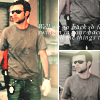
The first icon is great. Natalia's face coloring is just great, though her hair a little bit too blonde

. Yep I think that her hair distract us too much from the text which looks kind of unreadable.
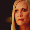
The third icon, for me, is just perfect. Great way to crop it and fantastic job with the coloring which is original and great to see. Not to mention that Stella's lips and eye are just perfect in this icon. Really great jon on this one :thumbsup:
csifann1 great icons as always :thumbsup:
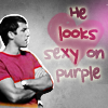
Ryan's one....while the idea is fantastic and the way it came out is great too, I kind of have a hard time with the texts, especially the part out of the heart. IDK I'm too perfection that if I want to make a text in a shape, I have to make it all in that shape w/ no pieces left out there. Still the icons is great and I love the pink both on Ryan and the text and the heart. The contrast with the B/W is just great :thumbsup:
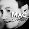
Mac's icon, the crop is a little bit ood for the same reason
Shazza mentioned and I have to be honest, but sometimes I don't like the idea of two different fonts on someone's face. I guess it depends on the person and, IMHO, Mac doesn't suit it

The banner, love the coloring and the font you used for the text. Probably I wouldn't have blended the text, but still I like it :thumbsup:
Shazza_018 great icons

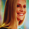
The first one is almost perfect. Probably I wouldn't have used that much of black right behind Calleigh's hair, but the coloring is amazing.
I really don't have any words for the second icon. Love the cropping, love the coloring especially on her eyes, lips and shirt. To me, it's perfect and awesome :thumbsup:
As for the third one, I just have to say that I love it. To me, it's perfect :thumbsup:
Ok ok yesterday I promised to post something
 **starts digging through her folders**


I use PS 7.0, which actually crashed few hours ago


