CSI Fan Art Critique

Discussion in 'Fan Art' started by CSI_Kat, Jun 8, 2009.

  1. CSI_Kat

    CSI_Kat Addicted to Gutterville Moderator

    Joined:
    Mar 13, 2007
    Messages:
    5,337
    Likes Received:
    0
    There is an awesome thread in the members lounge for this and there seemed to be some interest in doing it over here in the CSI area.

    Please follow these guidelines:
    Post (no more than 3) icons, banners or thumbnail link wallpapers images.
    If you want to post more - please post them as links.
    The next poster should provide constructive criticism and if possible suggestions on how to fix the issue or make it better.

    *important* Please provide good feedback and not just I really like this icon :thumbsup: This thread is to help our artists improve! Thanks so much! Happy posting.

    **Also - I think it would be helpful for the artist to state what program they are using when posting. This may help with comments. Like for me....I have PS elements so I dont have all the fancy bells and whistles many of you have...so for you to tell me to use selective coloring coloring, color balance or curves would be useless.
     
    Last edited: Jun 8, 2009
  2. happyharper13

    happyharper13 Pathologist

    Joined:
    Oct 9, 2008
    Messages:
    1,074
    Likes Received:
    0
    Ooh, I am very excited about this thread! Here are three that I would love feedback on. I have PS CS4 at the moment, at least until my free trial runs out.

    [​IMG]

    [​IMG]

    [​IMG]
     
  3. csifann1

    csifann1 CSI Level Two

    Joined:
    Jun 1, 2008
    Messages:
    1,899
    Likes Received:
    0
    This is gonna be awesome :D

    HappyHarper, I think the icons are awesome, the crop is amazing! The first icon is my fav, I really love the crop and the coloring. And that letter there fits good too. The greg icon is also very nice, but maybe if it had a little more of Greg's face would be better, but it still great. The banner is :eek: I love lvoe love it, the coloring and how you made it is absoluctely great! The text also fits so nicely :D great job!!

    Here's mine:
    [​IMG]
    [​IMG]
    [​IMG]
     
  4. Florry86

    Florry86 CSI Level Three

    Joined:
    Jul 16, 2007
    Messages:
    3,791
    Likes Received:
    0
    Ok I think I'm going to start with the Critique :p


    happyharper13 you really did a great job with the cropping of the icons. Very cool and effective :thumbsup:

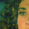
    In the first icon, you should have probably used the ereaser so that Stella's face (especially the coloring you used on it) could come out in a better way. Some times the coloring you use on someone is just enough that you don't need to cover it with the texture.
    I guess you used the "Multiply"/"Soft Light" layer option. I think that "Screen" or, even better, "Lighten" option (probably at 70%) would have been much better. I'm pretty sure that in this case you could even avoid the ereaser :thumbsup:

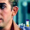
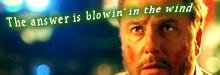
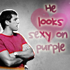
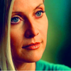
    The second icon. Just perfect croppijng and perfect coloring. Greg's ear is a little bit orange and maybe you could have avoided this strange effect with a little bit more of "selective coloring" or "color balance", still it looks great.
    I also would have put the brush in a higher postion. Probably, I'd change also the variation of the brush too b/c putting it above, it would be a little bit difficultier to read it. So I'd say select the bruss "invert" (image - adjustments - invert) and then "variations" (image - adjustments) so that you can choose the colour you want for the brush not to mention that you can read it better once on the icon ;)

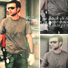
    Now, the banner. IDK, the idea is damn good, but I guess you had a problem with the text on it since its last line ended on Warrick's body. Plus I'm not a fond of this font. The rest of it looks pretty good....the coloring and texture too. I'm sorry I'm not much of help as for the banner ;)

    **please don't throw me bananas or any other kind of fruits** It's just that I find critique very useful sometimes especially when people give some hints on what to do the next time ;)

    csifann1 :eek: amazing stuff, as always. Only one thing, the text on last Calleigh's icon. It blends too much with Calleigh's white clothes :lol: (did I make sense?)

    I'm going to post some stuff tomorrow, I promise :D
     
  5. csifann1

    csifann1 CSI Level Two

    Joined:
    Jun 1, 2008
    Messages:
    1,899
    Likes Received:
    0
    oh thanks :) Yes you did :p

    oh c'mon, post something, I bet you have something in hands to post, please... :lol:
     
  6. cathwillows

    cathwillows CSI Level Three

    Joined:
    Jan 5, 2007
    Messages:
    3,990
    Likes Received:
    0
    Great thread idea!

    happyharper13 - Nice coloring on your icons. I second the others' opinion, the texture on Stella's face is kinda distracting and doesn't really fit. Furthermore, I am not a fan of cropping like that. I would have liked it much better if you'd selected a wider angle for the Stella icon. Also, the Greg one could have been moved a tiny bit farther to the right so that you can at least see part of his nose. The text could've been a tad bigger and positioned higher on the icon.
    As for the banner, you did that one nicely, although I prefer less text on such a small space ;)

    csifann1 - Very nice work!!! Your icons are almost perfect, IMO. The first one looks really classy, the text is positioned very well and the coloring is good. The second icon is really cool. One thing though, I would have chosen a different tiny text brush...maybe one that covers the whole middle part, you know? From left to right in a narrow line. Calleigh's a bit pale and blends in with the background in the last icon. And I agree that the text also blends in too much. And the upper left side of the icon looks rather grainy, but that could be my screen :lol:

    All in all, great work guys!
     
  7. happyharper13

    happyharper13 Pathologist

    Joined:
    Oct 9, 2008
    Messages:
    1,074
    Likes Received:
    0
    Wow! Thanks so much! :D

    Critiques:

    I love, love, love the first icon. My only critique is that I think it would have been better with a different picture of Calleigh, preferably one where she's smiling. That said, the picture you use makes it more interesting. I guess it's a different picture than I'd expect with the given lighting, coloring, crop and, especially, text, but that's not necessarily a bad thing. And I love how blue you got her eyes.

    The second one- I love the concept, but I think the lighting could have been stronger and with more contrast on the second one. For some reason, he looks a bit grainy. I think his face blends in a bit with the brick behind him. Also, I really like the idea of the grey-scale transition, but I feel like it ends up making the overall coloring on the icon seem more dull. I think if you made the grey parts blacker, it would make the whole thing look brighter.

    I love the third one! Beautiful coloring in the bottom half. I think if you upped the contrast and selective coloring on her face, it would help. I love the effect with the text. Gorgeous job, overall, on all of them!

    Thanks so much! That was really, really helpful! I've never tried the 'variations' or 'invert' options, but I will definitely check those out. The word on the Greg icon was actually text rather than a brush as I am still rather baffled with regard to using brushes, but I think if I rasterize the text, I should still be able to do that.

    I totally see what you mean about the text over Warrick's body. I hadn't thought about it before, as I'd really just pasted a picture of his head with a tiny bit of neck and shoulders and just blended the rest, so I didn't really think about where his body would be. But now I can definitely see how it looks like his body is going under the text. I really ought to find a way to fix that. In retrospect, I think I just didn't get the lighting on the Stella icon right at all. I was focusing a lot on bringing out her eye, rather than the rest of her face, which caused problems.

    I can definitely see what you mean about Stella's coloring. I think I got distracted by the eye (and trying to match the eye color with the background color next to the hair) at the expense of everything else in the icon. In retrospect, I can also now see how a larger crop really would have helped, as well as a lot lighter coloring. And I will probably go back and fix the text on the Greg icon now. In retrospect, it definitely is too small. I can also now see how a brighter color for the text would have worked better in terms of standing out. Ooh, and I agree about the text. I definitely generally like less text, just because it makes it harder to see. I spent a lot of time fiddling with the text, trying to make it legible without it overwhelming or covering the rest of the icon. I took the lyric part a bit too far, methinks.

    Thanks so much for the advice, guys :D It is really, really helpful!

    Is it alright if I post some more (provided it's in this post, of course)?
     
    Last edited: Jun 8, 2009
  8. CSI_Kat

    CSI_Kat Addicted to Gutterville Moderator

    Joined:
    Mar 13, 2007
    Messages:
    5,337
    Likes Received:
    0
    You may post anything you want! That's the purpose of this thread. Glad to see it getting used already!!
     
  9. happyharper13

    happyharper13 Pathologist

    Joined:
    Oct 9, 2008
    Messages:
    1,074
    Likes Received:
    0
    ^Sweet! Thanks ;)

    Icons:

    [​IMG]

    [​IMG]

    [​IMG]
     
  10. csifann1

    csifann1 CSI Level Two

    Joined:
    Jun 1, 2008
    Messages:
    1,899
    Likes Received:
    0
    :alienblush: Thank you!
    Also, thank you for the critique, it really helped :D

    Thank you thank you :)
    I'll try to get that better next time :D

    Thank you all :D

    Now, HappyHarper...

    Let's start with the banner, I think the coloring is nice, it has a little too much of orange, maybe with selective coloring or color balance you could fixes that. The text position is a little odd, IMO. Maybe if you made a paragraph and take part of the text of Gris' head, also the drop shadow with green, doesn't match very good with the coloring of the banner. But I think without those things, it's great! The crop and coloring :)
    The 1st icon has a great coloring, again a little too much orange, but in this one maybe if you put less yellow or red saturation it'd work I think, but anyways you have selective coloring and color balance that's also helps :p The text should have other color 'cause of Natalia's hair color, it's almost unreadble, maybe a drop shadow or outer glow would help. But the icon is pretty, the crop and coloring [w/t the orange/yellow problem.
    The second icon I can't say anything 'cause it's almost perfect :eek: In this case, if it had a little more of saturation it would be better, but it stills :eek: I love how you put her eyes green, her lips and cheeks with those colors, so beautiful :D

    [​IMG]
    [​IMG]
    [​IMG]

    I use photoshop CS3, btw :)

    Question - The stuff we post has to be new or it can be old?
     
  11. CSI_Kat

    CSI_Kat Addicted to Gutterville Moderator

    Joined:
    Mar 13, 2007
    Messages:
    5,337
    Likes Received:
    0
    It can be whatever you want - new or old!!
     
  12. csifann1

    csifann1 CSI Level Two

    Joined:
    Jun 1, 2008
    Messages:
    1,899
    Likes Received:
    0
    Alright, thank you :D
     
  13. shazza_018

    shazza_018 A Daily Anthem Moderator

    Joined:
    Dec 1, 2007
    Messages:
    3,623
    Likes Received:
    0
    Okay cool!

    csifann1 - I love the first icon, the b/w with a splash of colour works really well, and the heart adds a nice touch. The second icon the cropping is a little weird, I don't know if it's just me but it's seems a little too central to the face, also I feel there's too much contrast on the face, play around with the levels and brightness/contrast to fix this. On the I love the idea but imo the image is a little blurry, just sharp it a bit more or you the blur/sharpen tool if you are working with lower quality images, I don't think the text is the best to use but that's just my personal opinon.

    Okay here are mine:

    [​IMG] [​IMG] [​IMG]

    I used PS CS3 aswell fyi.
     
  14. Florry86

    Florry86 CSI Level Three

    Joined:
    Jul 16, 2007
    Messages:
    3,791
    Likes Received:
    0
    You're welcome. Yeah I'm pretty sure you're gonna have fun with them :D
    Ups I thought it was a brush because I could see some resemblance with one of my fav. :lol:

    Anyway I've seen your second batch of fan art and all I can say is this:

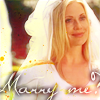
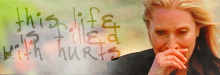
    While I really love the colorinf of the banner, I really have quite a hard time with the text. IMO, it's just in a odd postition which kinda ruins the the banner.
    As for the coroing and the crop, they're just great. While I'm not too fond of the orange, I do think Gil's face matches perfectly with the rest of the banner...except the text :p.
    I don't know maybe a little brust or just "Gil/Grissom" would have been enough, IMHO...that is if you wanted to add something to the banner ;)

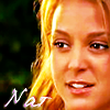
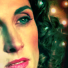
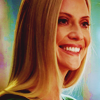
    The first icon is great. Natalia's face coloring is just great, though her hair a little bit too blonde :p. Yep I think that her hair distract us too much from the text which looks kind of unreadable.

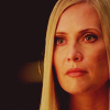
    The third icon, for me, is just perfect. Great way to crop it and fantastic job with the coloring which is original and great to see. Not to mention that Stella's lips and eye are just perfect in this icon. Really great jon on this one :thumbsup:


    csifann1 great icons as always :thumbsup:

    Ryan's one....while the idea is fantastic and the way it came out is great too, I kind of have a hard time with the texts, especially the part out of the heart. IDK I'm too perfection that if I want to make a text in a shape, I have to make it all in that shape w/ no pieces left out there. Still the icons is great and I love the pink both on Ryan and the text and the heart. The contrast with the B/W is just great :thumbsup:


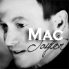
    Mac's icon, the crop is a little bit ood for the same reason Shazza mentioned and I have to be honest, but sometimes I don't like the idea of two different fonts on someone's face. I guess it depends on the person and, IMHO, Mac doesn't suit it :p

    The banner, love the coloring and the font you used for the text. Probably I wouldn't have blended the text, but still I like it :thumbsup:


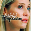
    Shazza_018 great icons :eek:

    The first one is almost perfect. Probably I wouldn't have used that much of black right behind Calleigh's hair, but the coloring is amazing.

    I really don't have any words for the second icon. Love the cropping, love the coloring especially on her eyes, lips and shirt. To me, it's perfect and awesome :thumbsup:

    As for the third one, I just have to say that I love it. To me, it's perfect :thumbsup:


    Ok ok yesterday I promised to post something :p
    **starts digging through her folders**

    [​IMG]

    [​IMG]

    [​IMG]

    I use PS 7.0, which actually crashed few hours ago :p
     
  15. happyharper13

    happyharper13 Pathologist

    Joined:
    Oct 9, 2008
    Messages:
    1,074
    Likes Received:
    0
    Shazza- I have to agree with Florry that, overall, these look perfect! Love the coloring and crops!

    The only suggestions I could come up with:
    -I think Calleigh's hair is, on its/TPTB's own accord, doing funny things in the second and third icons with the way it parts/falls. The side part makes her forehead look very angular in the third one and I think it would have been better if you found a way to crop it differently (probably cutting off more of the far side of her face) to de-emphasize this.

    Also, I'm personally a bigger fan of crops that adhere to the rule of thirds -- so either the subject ends at one third of the icon, or the background ends at one third. In the case of the third icon, I think it would have been better if you made her head take up less of the icon and then incorporated a brush or text or texture to make the background more interesting. Also, I think you could have brought out her eye color more in the third icon and just upped the selective coloring in general there.

    In the second icon, her hair looks a bit greyish/greenish, and I think you could fix that by using a color replacement tool on image once you flattened it. I also think using the color replacement tool to change the coloring on her shirt so it wasn't so similar to the background would have helped. In general, I think a small curves layer on top would have also helped to generally lighten up the images and make Calleigh pop more.

    Other than that, absolutely beautiful job. I am totally in awe of your coloring and the general sharpness of Calleigh in each. They all just have a certain very high quality edge to them that I can't quite define. Gorgeous work!

    Florry-

    I must say that I'm not super familiar with PS7, so I hope I get this right. I love the coloring on the Ryan icon. I can't quite decide if toning down the coloring would help or take off a certain glamorous edge it has. I do think that cropping it a bit higher/smaller so that the torso and shirt take up less of the icon might be helpful. The big thing I would fix is the text, which looks quite grainy. I'm not sure if PS7 has a rasterize option. If it doesn't I'd go with a brush. The text on the Natalia icon looks much better.

    For the Speed icon, I would recommend selective coloring to make his face stand out more from the background, glove and glasses. If you don't have selective coloring, then use curves or any similar brightening tool available to you on PS7 to make his face pop more and add a texture behind him that contrasts more with his face. Overall, I like the crop and the texture that you used.

    I love love love the coloring, lightening and general definition of the third icon. I can't quite decide how I feel about the crop. I always have the same problem with trying to capture the whole eye without having tiny pieces of nose in there distracting. Overall, I think you did a good job though. Maybe if you settled for getting half of the nose and mouth or rotating your crop more, it would help, but I'm not really sure. I think darkening the texture behind her would help a bit to make the text slightly more readable so it would stand out more, but it's definitely still legible, so that's not a big deal. Using curves or some other brightening tool to brighten Nat's face also. Normally, I feel like the standard is too make the face brighter than the background, but, then again, in this case, the coloring works quite well with Nat being darker than the background. Her face definitely still stands out, and I adore the lighting.
     

Share This Page