CSI Fan Art Critique

Discussion in 'Fan Art' started by CSI_Kat, Jun 8, 2009.

  1. happyharper13

    happyharper13 Pathologist

    Joined:
    Oct 9, 2008
    Messages:
    1,074
    Likes Received:
    0
    I've been switching back and forth between PS and Gimp, as I don't have my own copy of PS on my laptop any longer. There are a few useful tools for cropping and I actually preferred Gimp for it at first. I really like how it tells you exactly the dimensions when you're cropping without set limits. Also, if you're waiting for PS to be mailed, you might want to check out a free 30-day trial in the meantime. Technically, you don't even need the disc if you have the usercode from Adobe.

    As for the the "washed-out" look, I'd recommend using color balance. I got pretty good results with it in terms of making stuff not look too washed out. If you want to up the contrast more so it looks more similar to something that went through selective coloring, I'd recommend using red and yellow for the highlights and midtones and blue, cyan and either green or magenta (depends on the pic) for the shadows, to give the colors themselves more contrast. Hope that makes sense and helps ;)

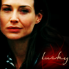
    To the icons themselves, I can see what you mean about the washed-out look. That said, they don't look bad. They have a unique style of coloring and lighting which doesn't necessarily seem good or bad. Almost a vintage look, I think. My only recommendation would be to use more color balance and curves to make their faces pop, along with some textures. When I used Gimp and when I just didn't understand Selective Coloring, I relied mostly on getting them to a reasonable, sufficiently natural color with color balance and, to a much lesser extent, brightness/contrast and curves, before really making them pop with textures, so I guess I'd recommend finding some good textures to make them pop.

    These are all icons I submitted for LJ contests, but none of them did as well as I'd expected. I would love any constructive criticism on what could be improved on in them. Thanks ;)

    Icons:

    [​IMG]

    [​IMG]

    [​IMG]
     
    Last edited: Jul 11, 2009
  2. Urban Legend

    Urban Legend Captain

    Joined:
    Oct 16, 2006
    Messages:
    4,553
    Likes Received:
    0
    ^ I love your icons! The cropping and coloring is goregous on the first and last one, but something's off in the second one I think it's in the sharpness of the subject's (Peyton's) face? Sorry if that's not who that is, I sort of drew a blank :lol:

    I'm hoping someone can help me with these, I've been told that I rely too much on textures and font to the point where I can't make a 'nice looking' plain icon. That's what I get for asking for help on Livejournal, everyone thinks your icons have to be superb :shifty:

    Here's the three icons:

    [​IMG] [​IMG] [​IMG]
     
  3. fo_poozle

    fo_poozle CSI Level Two

    Joined:
    Jun 4, 2006
    Messages:
    1,987
    Likes Received:
    0
    Something_wicked, i think your icons looks great, with or with out text. as for use of textures i don't think it matter if you use them a lot or not as long as the icon looks great(which yours alwasy do.) and the coloring on the sarah icon especially is just GORGEOUS!. its osft and bright, and to get that brightness out of csi caps is a pain, just because there colors are alwasy so muted and blue toned.
    and also in your other post, personally i really like the faded colors in the icons you posted. i think it really works on those, it gives it a bit of a soft look.

    happyharper13, i think your coloring is beautiful and i love the way you crop, especially in the 1st one. and i like the pop of color under the font to make it stand out. the only thing i maybe would suggest is sharpening a bit(usually i just duplicate the base and sharpen and lower the opacity to how i like it), but honestly i think they are fantastic.
     
  4. GeekLove<3

    GeekLove<3 Witness

    Joined:
    Sep 24, 2009
    Messages:
    127
    Likes Received:
    0
    ONE - I'm practicing coloring so that's why it's a pretty empty banner.

    TWO
     
    Last edited: Sep 30, 2009
  5. GeekLove<3

    GeekLove<3 Witness

    Joined:
    Sep 24, 2009
    Messages:
    127
    Likes Received:
    0
  6. happyharper13

    happyharper13 Pathologist

    Joined:
    Oct 9, 2008
    Messages:
    1,074
    Likes Received:
    0
    Thanks so much for the advice, Fo_poozle and Something_wicked!

    Something_wicked, I agree very much with what Fo_poozle said. Excellent work. That said, the idea of relying too much on textures seems rather absurd. Personally, I think of textures as something basic that you should pretty much have on every icon, even if they're simple lighting textures. Good textures, are, IMO, a lot of the time, the ones that you can't tell are actually there unless you look at the initial cap.

    Geeklove, those are all gorgeous! The coloring is excellent on all of them, and I love the elements you used to complete the banners/WP look for all of them. For the first one, I really like the coloring. My one suggestion would be to amp up the reds and yellows on their faces and possibly to add a bit more blues, purples and magentas, or just variety, to the background so that the turquoise doesn't all just blend together and so that their jeans stand out from the wall.

    I love the subtle incorporation of hearts in the second one. My one suggestion there would be to watch the pixel-aspect ratio, as it looks like they're a bit horizontally stretched. Also, it feels like the sky texture and text take up a bit too much space and attention in comparison to Griss and Sara.

    I absolutely adore the third one. My only advice there would be to get rid of the purplishness of Sara's hair in the first and third squares.
     
  7. shazza_018

    shazza_018 A Daily Anthem Moderator

    Joined:
    Dec 1, 2007
    Messages:
    3,623
    Likes Received:
    0
    Right I did some icons from the new episode of Miami, I try some different colouring but IMO it came out slightly crap, so some critique on what I can do to improve them would be useful thanks!

    [​IMG] [​IMG] [​IMG]

    (yes they're all Jesse icons cause they came out the worst I don't know why, maybe it has something to do with his skin colour ha).
     
  8. GeekLove<3

    GeekLove<3 Witness

    Joined:
    Sep 24, 2009
    Messages:
    127
    Likes Received:
    0
    Thanks Evil_Harmonica. :) My biggest mistake is stretching the images; I'm trying to work on that.


    ONE

    TWO

    ETA:

    Vampire:
    The coloring isn't that bad really. :) The first one is great. For the second two, his face looks a little yellow/orange. I snagged one of your icons and played around with it and I suggest playing around with the yellows and neutrals. When I did this his face ended up way less bright and yellow, and more natural looking. :)
     
    Last edited: Oct 23, 2009

Share This Page