What Category Do I Belong In? Find out here! [Please rate/comment!]

Re: What Category Do I Belong In? Find out here! [Please rate/comment!

E:

I would categorize the icons as Intermediate/Beginners. The textures sort of overwhelm the background of the icons, while it looks like nothing is done around the subject's face.

F:

Intermediate/Advanced. The text, brushes and textures used add a lot to the icons and go well with the subject and cropping used.
 
Re: What Category Do I Belong In? Find out here! [Please rate/comment!

*passes out cookies and milk*

Remember, you can always go back and comment on previous sets :)

Set G This artist is especially looking for constructive criticism
SetG03.png
SetG02.png
SetG01.png


Also, you can send in more icons/banners/wallpapers as often as you like ;)
 
Re: What Category Do I Belong In? Find out here! [Please rate/comment!

Hmm... How you mean, constructive criticism?
 
Re: What Category Do I Belong In? Find out here! [Please rate/comment!

Just comments how how the icons can be improved and such. The comments you've left previously are good ;)
 
Re: What Category Do I Belong In? Find out here! [Please rate/comment!

Can I take part in this discussion? It sounds really interesting & I do think it helps improving your artistic skills ;)

Set G: Beginner I think the ide of the cropping & the colouring is very good, but I think there was a problem w/ the textures & probably also w/ the text.
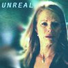
First one I do think you could have ereased Cath's face & body so that the effect w/ the texture would have been better. Also I think that the font is not that good ;)
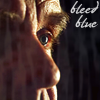
Second one The colouring of the face is perfect & I do think you could have made it stand out in a better way, if you hade used the ereaser. That is if you went on using this texture. Otherwise it all depends on the texture. Maybe you can use any kind of texture, but just set it on "screen" & erease the face, so that you shouldn't have any kind of problem in making the face standing out ;)
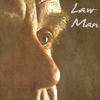
Third one Just erease the face & change the font, possibly putting it in a little bit lower position, & the icons is great :thumbsup:. Otherwise you can try w/ another kind of texture, as long as you erease the face ;)

Hope it was ok :)
 
Re: What Category Do I Belong In? Find out here! [Please rate/comment!

Set G:

Beginner The cropping is really good, but they would have all looked better if you used the eraser tool to erase the texture so it doesn't blind into the subject's face :)
 
Re: What Category Do I Belong In? Find out here! [Please rate/comment!

Ups I forgot to comment set G :rolleyes:
So here it goes:
Set G: Beginners
As it was already mentioned by someone else, the texture should be erase of the face, I don't know, it gives somehow a odd face to the icon, the font is also a little too vulgaris ;) My advise is to download more cool fonts, just google it :) But the rest is great, coloring and crop are nice :D

Set H
Beginners/Intermidate
I think this ones have the kind of problem as Set G, but the coloring and crop are nice, altough I think the first icon is a little dark.
Ok, so the first icon could be not that dark, you also should erase that tinny things of Nick's face, but I think the texture gives a very cool effect to the icon :D
The second icon has a nice coloring and crop, but that texture there doesn't really fits well on it, maybe if you erase it off Warick's face and that would be only a background and also, if it had other color, something more brighten :)
The third icon is nice, I think! Altough the texture is over Gil's, I think it doesn't look bad :)

Set I: Intermidate/Advanced
I love those icons, they are amazing. Crop+coloring= <3 :D
First icon, awesome coloring and crop, i love it, really"
Second icon, I think the crop is great and the coloring as well, but it is a little too much saturation, I think. but I really like it too.
Third icon, briliant for me :D Place of Flacks, the background color gives a cool tone to the icon, i just love it :D I think this ones wouldn't need to have textures, b/c the crop and coloring rock the wolrd :D But I'd like to see your texture's skill ;)
 
Re: What Category Do I Belong In? Find out here! [Please rate/comment!

Set H beginner
Same problem as the previous artist. Just earease the texture & it will be better.
Also the first one the cropping is a little bit unfortunate. If you like this cropping, you'd better add some brushes or texts on it.
The second one just erease the texture from the face & you should be ok.
As for the third one I'd just changed the texture since I'm not a fan of this kind of textures :p


Set I Intermediate/Advanced
I'd be for advanced, but the third icon left me a little bit confused. IDK there's too much unused space behind Flack's head, but hey it's just personal taste :p
The first one is great. Great colouring & cropping.
The second one is amazing! Love the texture on the second one :thumbsup:. It's not just the colouring, isn't it? :p
 
Re: What Category Do I Belong In? Find out here! [Please rate/comment!

Not asking for myself, but for any newbies who might want to find out what category they are in with their artwork, but : Is this thread included in the challenge break or is it still on?

I keep forgetting to do this and please bear with me cause I'm not sure I'm really good at this, but I will try:

Set B - Intermediate/Advanced - These are great icons. The coloring on the Stella one is absolutely gorgeous. The Speed one is very nice with the little square and the corners on it. The Adam one has very unique coloring and I'm not sure it really suits him, but I kind of like it at the same time.

Set C - Beginners- You're off to a good start here. The Stella icon is a bit grainy. I love the crop on the second icon. You might want to play around with the coloring on your program though and if you have a program with a sharp tool, you could try using that, it might help the grainy-ness.

Set D- Intermediate/Advanced- These icons are really nice and I love the text especially on the Danny one and the Sara one. I think you could maybe use the sharp tool on Danny's face a little though, but all in all, great icons.

Set E- Beginners/Intermediate- Nice icons and I love the text on the Jess one, it's just beautiful with the highlight behind it. You might want to try using the sharpen tool on them though, on their faces.

Set F- Intermediate/Advanced- Awesome icons. The coloring is crisp and beautiful. The text is perfect. And I especially love the Ryan one and that little heart brush is perfect for it. I love the text on the Natalia one and the texture is very fun.

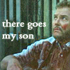
Set G- Beginners/Intermediate- Nice crops and the coloring on the first Brass one is nice. The coloring on the Cath one is good too. I love the sepia-ish look to the second Brass one. The Cath one looks a tiny bit grainy though, but I adore the text. I think it's perfect for her expression.

Set H - Beginners/Intermediate- Very nice crops and I love the little dots on the Nick one (there is a few of them on his face though). The texture on Warrick's one is a little distracting though, but I love the text. The Grissom one is nice, but the coloring is a little too light.

Set I - Intermediate/Advanced - Very nice crops and excellent coloring. I think the Stella one might need to be sharpened a little though. And the Flack one is a tiny bit too bright on his face, but the coloring itself is beautiful. Like someone else said, the Danny one is a bit too saturated.
 
Re: What Category Do I Belong In? Find out here! [Please rate/comment!

Not asking for myself, but for any newbies who might want to find out what category they are in with their artwork, but : Is this thread included in the challenge break or is it still on?

This thread is always open. In fact, this is a great time to send things in ;)
 
Re: What Category Do I Belong In? Find out here! [Please rate/comment!

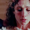
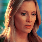
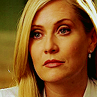
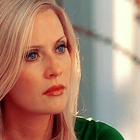
Here's a few icons for y'all. This artist is looking for constructive criticism/feedback, but not necessarily category/levels.

Set J
SetJ01.png
SetJ02.png
SetJ03.png
 
Re: What Category Do I Belong In? Find out here! [Please rate/comment!

Set J-

I love the last icon. The coloring is great. :thumbsup: Her eyes stand out and I just love it. :)

The first two are nice but they look pretty bleak. Maybe upping the exposure or playing around with selective coloring a little more would spruce them up a bit. Other than that I think they're really nice.
 
Re: What Category Do I Belong In? Find out here! [Please rate/comment!

I like the coloring, especially on the first and third, though I think the first and third could use a little more brightness (perhaps a bit more yellow via color balance, channel mixer and/or selective coloring, along with lightness via curves, levels or a screen level; ditto for the second icon, but with more pink rather than more yellow). The biggest thing would be to make them less sharpened. Also, I think some more interesting cropping would help. The crop should direct attention to a specific part of the icon, preferably of the subject. Adhering to the rule of thirds (where the subject cuts off at one or two thirds of the icon) also helps.
 
Re: What Category Do I Belong In? Find out here! [Please rate/comment!

Since we're taking a bit of a break from challenges, I though I'd just remind people that they can send their work in to me at any time, and I'll post it in here for you to get some feedback :)

Also just a thought, if people want to give their feedback anonymously, you can PM that to me as well, and I'll pass it along.
 
Back
Top