Install the app
How to install the app on iOS
Follow along with the video below to see how to install our site as a web app on your home screen.
Note: This feature may not be available in some browsers.
You are using an out of date browser. It may not display this or other websites correctly.
You should upgrade or use an alternative browser.
You should upgrade or use an alternative browser.
What Category Do I Belong In? Find out here! [Please rate/comment!]
- Thread starter CSI_Kat
- Start date
Re: In what category I belong? ~ New Rules Feb 14/09
Alright, here's the first set with the new rules. Remember, you can now send them in at any time. I highly recommend that anyone who participates in the intermediate category send something in.
Please rank either beginner, intermediate or advanced. Also - if you feel like 1 icon is beginner and another is intermediate - please note that as well. And please give some constructive criticism/feedback to help know what they are doing right/wrong.
Set A
nattybatty55
Nadalaholic
Re: In what category I belong? ~ New Rules Feb 14/09
Ive only just had time to get around to doing this:
Id say that these icons were Beginner. The images are very clear and not oversharpened or blurred. I would say this is edging towards intermediate if the artist takes time to look at textures and new fonts- to 'jazz' them up and to start to give the icons their own individual look..... I hoped that helped")
I really like the 3rd icon btw
Ive only just had time to get around to doing this:
Id say that these icons were Beginner. The images are very clear and not oversharpened or blurred. I would say this is edging towards intermediate if the artist takes time to look at textures and new fonts- to 'jazz' them up and to start to give the icons their own individual look..... I hoped that helped
I really like the 3rd icon btw
MarineGirl#1
CSI Level Three
Re: In what category I belong? ~ Always Open!
I only re-found this thread, and it's erm quit late / early here, almost 2am. but I will be back tomorrow with comments. :lol: I just need a bed first :alienblush:
I only re-found this thread, and it's erm quit late / early here, almost 2am. but I will be back tomorrow with comments. :lol: I just need a bed first :alienblush:
Re: In what category I belong? ~ Always Open!
So first let me stress to the maker this is just my opinion to help boost your level, don't take it personally and at the end of the day it's up to you what level you enter in. We're just here to advise you on that.
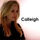
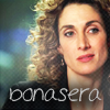
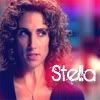
So far I'd say the artist is beginners I find the second and third icon slightly blurry. I also don't see much use of coloring and textures - that is needed to move up to intermediate, no worries I think you'll be intermediate in no time. Also work on the brightness and contrast of your icons. Your use of text is pretty good I must say, the cropping is fine too, it's just like on the first icon I can tell it's Calleigh but I can't see much of her face/features if you see what I mean, the second one the texture effect is really offputing and taking away from the subject of the icon. Third one I love the texture but in my opinon it's kinda blurry.
So first let me stress to the maker this is just my opinion to help boost your level, don't take it personally and at the end of the day it's up to you what level you enter in
. We're just here to advise you on that.So far I'd say the artist is beginners I find the second and third icon slightly blurry. I also don't see much use of coloring and textures - that is needed to move up to intermediate, no worries I think you'll be intermediate in no time. Also work on the brightness and contrast of your icons. Your use of text is pretty good I must say
, the cropping is fine too, it's just like on the first icon I can tell it's Calleigh but I can't see much of her face/features if you see what I mean, the second one the texture effect is really offputing and taking away from the subject of the icon. Third one I love the texture but in my opinon it's kinda blurry.MarineGirl#1
CSI Level Three
Re: In what category I belong? ~ Always Open!
As promised I'm back, and with a better vision :lol:
Overall I would category all 3 icons as Beginners.
To help the artist I'd got a few tips.
Sharpen the caps a little more and work with contrasts and brightness.
I'm okay with the choise of using text or not.
However, the use of backgrounds like in the 3rd one would make the icons a little more interesting.
Now this is just my opinion, but I hope it helps.


Re: In what category I belong? ~ Always Open!
I would say Intermediate/Advanced:
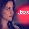
Your icons are clear and crisp, I love the first and last one. But the middle one needs a little work, the colouring is odd and doesn't really suit Adam at all. I would suggest sticking to using less colouring like in the first icon and keeping it simple, clear and crisp. You're not far off Advanced though I must say.
I would say Intermediate/Advanced:
Your icons are clear and crisp, I love the first and last one. But the middle one needs a little work, the colouring is odd and doesn't really suit Adam at all. I would suggest sticking to using less colouring like in the first icon and keeping it simple, clear and crisp. You're not far off Advanced though I must say
.


Re: In what category I belong? ~ Always Open!
Beginners:
I see no use of textures, or colouring but what I see it good. The icons are clear and crisp. The first one is grainy though, also the second and third have that white line which is distract, trying to experiment with your program and be creative and give your icons a unique style and 'x-factor'. Most of all practice, practice, practice. That is the key here. The more you practice the better you'll get. I hope my advice will help you in improve your icons.
Beginners:
I see no use of textures, or colouring but what I see it good. The icons are clear and crisp. The first one is grainy though, also the second and third have that white line which is distract, trying to experiment with your program and be creative and give your icons a unique style and 'x-factor'. Most of all practice, practice, practice. That is the key here. The more you practice the better you'll get. I hope my advice will help you in improve your icons
.
Last edited:
fatalze
Rookie
Re: What Category Do I Belong In? Find out here! [Please rate/comment!
Okay, time to stop being lazy. I'm not the best at judging these things, but I hope I can help a little bit.
Set B:
To be safe, I'd stick to intermediate with these. They are terrific; crisp, clear and well coloured. The crops are pleasant and attractive. The 2nd icon, featuring Adam, could use some tweaking.. I actually enjoy the pale green tint, however, when you brought that colour out, it also brought out little streaks of magenta in odd places, so it kind of ruins the effect. But this is a hard choice, a little more playing with the colour on the second icon, and you'll be close enough to place advanced without worry.
Set C:
First, I really like your eye for cropping. This is a basic and very important building block of any graphic art, and you seem to have it well trained. Next, I would recommend becoming familiar with whatever tools your graphic program has for Sharpening and Brightness/Contrast. Browse through livejournal and similar sites for tutorials on lightening an image/icon. Learn colour balance tools - these are far more useful than Selective Colouring or anything more advanced. The first two icons seem a little yellow to me - and it makes the skin look kinda.. pudding-ish? I have no words for this, just please humour me. Sometimes draining a little colour doesn't hurt. But again, tutorials are a great way to learn some tips and tricks. I spend some time every week browsing tutorials and learn new things all the time.
I would say these are definitely beginner, but you have the right idea, so just keep practicing.
Okay, time to stop being lazy. I'm not the best at judging these things, but I hope I can help a little bit.
Set B:
To be safe, I'd stick to intermediate with these. They are terrific; crisp, clear and well coloured. The crops are pleasant and attractive. The 2nd icon, featuring Adam, could use some tweaking.. I actually enjoy the pale green tint, however, when you brought that colour out, it also brought out little streaks of magenta in odd places, so it kind of ruins the effect. But this is a hard choice, a little more playing with the colour on the second icon, and you'll be close enough to place advanced without worry.
Set C:
First, I really like your eye for cropping. This is a basic and very important building block of any graphic art, and you seem to have it well trained.
Next, I would recommend becoming familiar with whatever tools your graphic program has for Sharpening and Brightness/Contrast. Browse through livejournal and similar sites for tutorials on lightening an image/icon. Learn colour balance tools - these are far more useful than Selective Colouring or anything more advanced. The first two icons seem a little yellow to me - and it makes the skin look kinda.. pudding-ish? I have no words for this, just please humour me. Sometimes draining a little colour doesn't hurt. But again, tutorials are a great way to learn some tips and tricks. I spend some time every week browsing tutorials and learn new things all the time. I would say these are definitely beginner, but you have the right idea, so just keep practicing.
csifann1
CSI Level Two
Re: What Category Do I Belong In? Find out here! [Please rate/comment!
I'm not an expert in this things, but let's see if I can help
Set B:
Intermidate/Advanced:
The first icon has a very nice coloring and crop, it's clear and crisp, it's great!! The second has kind of a weird coloring, it doesn't fit that well on Adam, maybe a little less of Magenta, but the rest of the icon is very nice. The third one is the best, for me. Coloring, effect/texture, crop, AMAZING!!!
Set C
Beginners:
The crop is nice, but you should have put some coloring like Brightness/Contrast or color balance, you could have give more bright to the icons and make them more live, you could also added some textures to it, you can find it all over the web, you can find some awesome stuff at DeviantArt Try to find some cool tutorials with coloring and original icons and then you just have to practice and have your own style I'm sure with practice in a while you'll be Advanced
I'm not an expert in this things, but let's see if I can help
Set B:
Intermidate/Advanced:
The first icon has a very nice coloring and crop, it's clear and crisp, it's great!! The second has kind of a weird coloring, it doesn't fit that well on Adam, maybe a little less of Magenta, but the rest of the icon is very nice. The third one is the best, for me. Coloring, effect/texture, crop, AMAZING!!!
Set C
Beginners:
The crop is nice, but you should have put some coloring like Brightness/Contrast or color balance, you could have give more bright to the icons and make them more live, you could also added some textures to it, you can find it all over the web, you can find some awesome stuff at DeviantArt
Try to find some cool tutorials with coloring and original icons and then you just have to practice and have your own style I'm sure with practice in a while you'll be Advanced Urban Legend
Captain
Re: What Category Do I Belong In? Find out here! [Please rate/comment!
Set B:
Intermediate/Advanced
I like your cropping like in the first icon and the texture used in the last. I think the second needs some work, try working on what font you use and how you used text.
Set C:
Beginners
You need to work on your coloring and text, the text looks just a little generic. Plus the cropping is nice, but the cropping on the first icon looks a little bit too much centered.
Hope I was any help


csifann1
CSI Level Two
Re: What Category Do I Belong In? Find out here! [Please rate/comment!
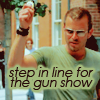
Set D
Intermidate/Advanced
Great coloring, crop, text and use of the texture. In first icon has such an amazing coloring, it fits good in the image, the crop is also good and the text it's hilarious :lol: In the second icon, the coloring is also nice and I love that texture there, the font is gorgeous, btw, the artist who made these could pretty please PM me and tell me where you got that texture and font if you know? I'd aprecciat it The third and last one, is hilarious :lol: gotta love it the crop is great!!!
Well done Set D's artist
Set E
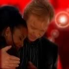
Intermidate or Beginner, more intermidate I think.
I think the basics of crop is learned, it's really nice, the coloring too. The first icon is a little too sharpened, but the crop, the text and the red effect are nice The second icon has also a great crop, text and red effect, the third is the same than others
I think you should do icons with different styles, not only with the red effect and that stuff, if you pratice you'll find out a lot of styles, your own styles, use of textures and brushes are really cool too, you should try it Maybe more color to the icons, more brightness/contrast Hope it helps and great work on the icons, keep it up
I'm not the best person for this, but I hope I was helpfull
Set D
Intermidate/Advanced
Great coloring, crop, text and use of the texture. In first icon has such an amazing coloring, it fits good in the image, the crop is also good and the text it's hilarious :lol: In the second icon, the coloring is also nice and I love that texture there, the font is gorgeous, btw, the artist who made these could pretty please PM me and tell me where you got that texture and font if you know? I'd aprecciat it
The third and last one, is hilarious :lol: gotta love it the crop is great!!! Well done Set D's artist
Set E
Intermidate or Beginner, more intermidate I think.
I think the basics of crop is learned, it's really nice, the coloring too. The first icon is a little too sharpened, but the crop, the text and the red effect are nice
The second icon has also a great crop, text and red effect, the third is the same than others I think you should do icons with different styles, not only with the red effect and that stuff, if you pratice you'll find out a lot of styles, your own styles, use of textures and brushes are really cool too, you should try it
Maybe more color to the icons, more brightness/contrast Hope it helps and great work on the icons, keep it up I'm not the best person for this, but I hope I was helpfull