The photos of the day!

wolfesgamergirl

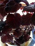
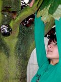
+I really like how the lights show the details of the leaves from behind, it's sort of a stanined glass effect and it's really nice.
- There's a completely black spot in the top right and it's a tad distracting, but that's probably more to do with the arrangement of the flowers :)

My pic for today is an old one, taken in about October last year. We took advantage of the shiny thing someone had blue-tacked to the tree lol.
 
CalleighD
+ Interesting subject, imaginative idea.
- No real focal point so the eye keeps wandering around the picture and the picture is blurry, there is no paint that is in focus.

Mine for today. This is the last Zoo picture that I have before I go back to some flowers. Well here goes.

 
Amy777
+ I love how you capture the proud Cheetah survaying the domain.
- The sun is washing the white fur out a bit, but then again that's nature for you.

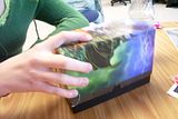
Another random one form me today. My friend was playing with her Magic card box and it seemed like an interesting photo.

 
wolfesgamergirl
+ Interesting box and nice camera angle.
- The hand is sort of...I dunno...awkward slightly and the cut off body takes the focus away from the box. It's also too blurry.

Here's mine for today: Another sand dune

 
Gaelen
+ Interesting composition and lighting.
- The dune is a bit plain, the river off in the corner is more intersting.

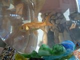
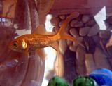
I was taking random photos around the house and this one is of my fish.

 
Gaelen
+ The colours, lighting, pattern/gradient and the composition is excellent. I love this picture.
- The top right corner is distracting ... it's busy and the colours don't mesh too well. I wish you had panned a little further to the left and cut that bit out entirely.

Wolfesgamergirl
+ The fish is well focused
- The colour is a bit dull and the composition is somewhat lacking. A quick crop and upping the saturation a bit could fix this.

 
Showtime
+ Nice nature shot, the framing works well.
- The shadow in the lower left corner distracts from the brightness of the overall photo.

 
wolfesgamergirl
+I really like the angle of the shot
-It's a bit dark making it hard to see what it is

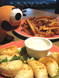
Haven't posted here in a while. Here's one of Jesse Monster eyeballing a meal :p
 
WhosLaughingNow
+ I like the lighting. Yay for Jesse Monster!
- The composition would have been better if you had panned out slightly; cropping off the top (the carpet is distracting) and including more of the bottom (which is too obviously cut off.)

Here's another desert picture:

 
Gailen
+ I’m likening the desert pictures. The patterns are interesting especially to someone who has never seen it in real life. Colors are wonderful; the contrast between the light and shadow is really good.
- I think if the footprints took up slightly more of the picture it would be better.
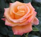
Mine for today, I said no more animals so now to some more flowers. I took this one a couple of years ago in a show rose garden not too far from where I live. I can’t wait for spring again so I can take more pictures of flowers; I have missed the flowers this winter.


Sorry for the long address, I could not fingure out how to do the thumbnail thing. If any of you out there are more computer savey than I am could tell me how to do this with the new posting please tell me. I spent about an hour trying to figure it out and could not.
 
Last edited:
Amy777, as far as I know the way to post thumbnails hasn't changed. Click on the photo's box in Photobucket and then hit "Generate HTML and IMG code". There should be a code for "clickable thumbnails for message boards". Just copy that into onto here and presto :)

Now for your photo:
+ Quite clear and the contrast between background and flower is good.
- One side of the background is brighter than the other. Eliminating that would have made the flower pop even more.

Mine for today, yet another desert picture:

 
Gaelen
+ Nice use of the sign and the dessert. Plays well off each other.
- Since the sign is in the exact middle there is a lot of negative space on each side. And the power lines, as slight as they are detract form the overall photo.

Another fish photo.

 
future_cop
+ I like how you captured the child's happiness and innocent. A very 'everyday' composition.
- The picture isn't focused very well; it's quite blurry. The rock (?) that is cut off on the left is also distracting to the eye.

And mine is a show of what happens when you're bored at the beach :p

 
Gaelen
+ I really like the shadow that the shape made on the ground (Charlie's Angels right :p) Neat idea!
- The shadow itself is a bit uneven, especially near the bottom.

This is one from when I was in Europe.
 
Back
Top