TalkCSI LIMS . Round 2 . Challenge #8. FINAL RESULTS ARE IN

Re: TalkCSI LIMS ~ Round 2

FINALLY sent mine in! Haha I'm such a procrastinator. :p Even though mine's so simple, it took me forever to make cause I couldn't figure out what I wanted it to look like... I'm sure all your icons are great! I'm not so sure about mine either, but I'm keeping my fingers crossed! :) Aww I'm sorry about your colds Nim and Macayla... I had one a couple weeks ago that I just couldn't get rid of! :( Hope you both feel better soon. We're sorry to see you go Saranna! Hope you'll join us next round. :)
 
Re: TalkCSI LIMS ~ Round 2

Challenge #4 - Eric Szmanda - VOTING

* Lost2MuchSpeed and CrimeShark are taking their bye pass for this round.
* Saranna has failed to submit an entry and is automatically eliminated. Hope to see you in the next round! :)

- Vote for top 3 of least quality. Include a valid reason for each vote, otherwise it won't be counted.
- Any member of this board may vote.
- The makers of the icons with the top 2 number of votes will be eliminated.

Examples of good reasons:
50: The text is oddly placed
68: The colouring is overpowering
72: The icon is oversharpened
56: The icon is too blurry

Examples of bad reasons:
50: I hate the colour pink. (Personal Preference)
78: The tiny text/decorative brush is unreadable." (Because they’re supposed to be that way.)

These are really good icons. I can't believe the makers hate them so much. :lol:

01
da600234-1.png
02
da600234-3.jpg
03
sherlockanne2.png
04
da600234-2.jpg
05
da600234-1.jpg

06
da600234.jpg
07
1a696d30-2.jpg
08
1a696d30-1.jpg
09
1a696d30-1.png
10
1a696d30.png

11
1a696d30.jpg


*PM me if you don't see your icon.
 
Re: TalkCSI LIMS ~ Round 2

6. The image of him in the small square is too blurry.
11. The crop in the circular section is cuts off his head, which ruins it.
7. The crop left too much open space.

Great icons ya'll.
 
Re: TalkCSI LIMS ~ Round 2

08: Very plain, and the colouring is overpowering.
06: A lot of blank space. Also, the small box on the bottom is disproportionate to the rest of the icon. - Looks a little squished.
07: Odd crop.

However, great job everyone! Well done. :)
 
Re: TalkCSI LIMS ~ Round 2

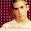
1 - the picture is blurry. his eyes and lips look odd. and the overlay of the small squares is distracting
11 - the icon is too busy, and the circle crop cuts off his head which looks odd.
8 - the colour loooks wrong and blurrs the image.


hope i did that right, first time i voted :p
 
Re: TalkCSI LIMS ~ Round 2

Jeez, this was a really hard decision.

6- Eric looks a little blurry and the copy in the square is too hard to see.
4- The background doesn't really go with the pic.
5- Contrast could be sharpened a little more and colors enhanced. Saturation might also make it look a bit more colorful.

They were all awesome guys, they honestly were. It was really, really hard to choose. :)
 
Re: TalkCSI LIMS ~ Round 2

08 - The pink colour is a bit too overwhelming
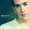
03 - Too plain
02 - Large brush/texture is a bit distracting

Difficult choice!
 
Re: TalkCSI LIMS ~ Round 2

#5 whole icon including the face looks green-ish
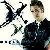
#3 what´s that black stuff on the left suppossed to be ?
#8 too much pink
 
Re: TalkCSI LIMS ~ Round 2

01 - Eric isn't very clear, maybe too sharpened
08 - too much pink, the color is overpowering
11 - odd crops, too much confusion

Wooo, very hard this time... :) cofi is right ;)
 
Re: TalkCSI LIMS ~ Round 2

11- the cropping is off. Part of the head is gone.
8- color is too strong.
6- too much empty space
 
Re: TalkCSI LIMS ~ Round 2

Love all the Eric icons everyone... :D

01 - The texture of the small squares is distracting and Eric's eyes are slightly distorted.
08 - The pink color is overpowering and the borders are uneven.
06 - Too much blank space, and the small crop of him in the corner looks odd.

Great job and good luck everyone!
 
Re: TalkCSI LIMS ~ Round 2

01 - too sharp
11 - the Eric in the circle hasn't got any hair (it's cut off)
08 - the color is too strong

Great job, guys!
 
Re: TalkCSI LIMS ~ Round 2

# 08: The color pink is overpowering
# 01: Too sharp
# 11: Odd crop and a little bit too busy

This was very hard. Everyone did a great job!!!!
 
Back
Top