Install the app
How to install the app on iOS
Follow along with the video below to see how to install our site as a web app on your home screen.
Note: This feature may not be available in some browsers.
You are using an out of date browser. It may not display this or other websites correctly.
You should upgrade or use an alternative browser.
You should upgrade or use an alternative browser.
Talk LIMS #7: FINAL RESULTS!
- Thread starter Dragonfly
- Start date
Axelsonfire
Pathologist
Re: Talk LIMS #7: Challenge One Up!
Mine's in and I'm pretty happy with it~
Can't wait to see them all.
Mine's in and I'm pretty happy with it~
Can't wait to see them all.
nattybatty55
Nadalaholic
Re: Talk LIMS #7: Challenge One Up!
Yep, one of those are mine, it will be in by the tomorrow night though :shifty:
Yep, one of those are mine, it will be in by the tomorrow night though :shifty:
Miss_Undercover
Judge
Re: Talk LIMS #7: Challenge One Up!
I have finally to sent mine entry for a few seconds !
Can't wait of the voting and to see the others icons !!
I have finally to sent mine entry for a few seconds !
Can't wait of the voting and to see the others icons !!
ILuvJonathanTogo
Coroner
Re: Talk LIMS #7: Challenge One Up!
Mine's in, cant wait to see everyone elses.
Mine's in, cant wait to see everyone elses.
nattybatty55
Nadalaholic
Re: Talk LIMS #7: Challenge One Up!
Mine is also in")
Mine is also in
dopebabygirl
CSI Level Two
Re: Talk LIMS #7: Challenge One Up!
Mine is in
Mine is in
Re: Talk LIMS #7: Challenge One Up!
Enough waiting, let's do this
Talk LIMS #7: Challenge 1 Voting
~Two people have failed to submit an entry. One person unfortunately had to withdraw due to that thing called Real Life~
Voting Rules:
~ Absolutely anyone may vote! You don't have to be an 'expert'
~ Vote for the Top 3 of least quality, and the Top 2 of best quality.
~ Votes for least quality Must have a reason, or they will not be counted. Reasons for best quality are strongly encouraged
(the following examples may have been "borrowed" from other sources)
Good Examples:
34: Text is oddly placed
50: Icon is over sharpened
62: Image is too blurry
Poor Examples:
96: I don't like the colour (personal preference)
52: Tiny text/decorative brushes are unreadable (it's supposed to be that way)
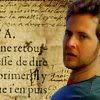
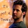
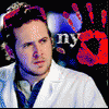
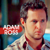
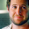
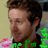
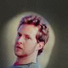
01
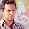 02
02
 03
03
 04
04
 05
05
06
 07
07
 08
08
 09
09
 10
10
11
 12
12
 13
13
 14
14
 15
15
16
 17
17
 18
18
 19
19
 20
20
21
 22
22
 23
23
 24
24
 25
25
26
 27
27
*If there are any problems, please PM me immediately*
Enough waiting, let's do this
Talk LIMS #7: Challenge 1 Voting
~Two people have failed to submit an entry. One person unfortunately had to withdraw due to that thing called Real Life~
Voting Rules:
~ Absolutely anyone may vote! You don't have to be an 'expert'
~ Vote for the Top 3 of least quality, and the Top 2 of best quality.
~ Votes for least quality Must have a reason, or they will not be counted. Reasons for best quality are strongly encouraged
(the following examples may have been "borrowed" from other sources)
Good Examples:
34: Text is oddly placed
50: Icon is over sharpened
62: Image is too blurry
Poor Examples:
96: I don't like the colour (personal preference)
52: Tiny text/decorative brushes are unreadable (it's supposed to be that way)
01
06
11
16
21
26
*If there are any problems, please PM me immediately*
lusiana88
CSI Level One
Re: Talk LIMS #7: Challenge One ~ Voting!
Ops, looks like I'm the first! It wasn't simple to chose which one I was gonna vote! No hard feelings... Good job everyone!
LEAST QUALITY
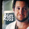
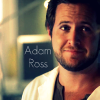
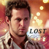
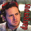
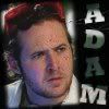
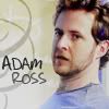
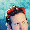
14 - Adam looks a bit smashed (I don't know if it's the right word, sorry!), maybe from when you scaled the pic, and too yellow for that background. Anyway great font!
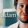
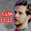
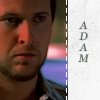
10 - The text is oddly placed and Adam has no light, he seems just background.
27 - Adam is oddly placed, it could have been better if he was a little higher in the icon, using better the space.
BEST
02 - I like this icon because it's simple but still really nice. The image is well placed and the blur used on the background gives great contrast to the text.
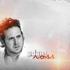
01 - The colors are amazing, simple and stylish!
Ops, looks like I'm the first! It wasn't simple to chose which one I was gonna vote! No hard feelings... Good job everyone!
LEAST QUALITY
14 - Adam looks a bit smashed (I don't know if it's the right word, sorry!), maybe from when you scaled the pic, and too yellow for that background. Anyway great font!
10 - The text is oddly placed and Adam has no light, he seems just background.
27 - Adam is oddly placed, it could have been better if he was a little higher in the icon, using better the space.
BEST
02 - I like this icon because it's simple but still really nice. The image is well placed and the blur used on the background gives great contrast to the text.
01 - The colors are amazing, simple and stylish!
ILuvJonathanTogo
Coroner
Re: Talk LIMS #7: Challenge One ~ Voting!
Oh man, all the icons are so so good, this took me a long time.
Least:
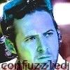
10- it appears grainy and the text is a little hard to read.
14- the image appears stretched out and grainy.
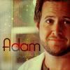
18- since his name is so small, the extra space of the box is distracting and makes the overall icon a little dull.
Best:
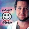
25- I really like the coloring and the overall icon is really cute.
21- I like what you did with the coloring and the textures and also the font. Really good job.
Oh man, all the icons are so so good, this took me a long time.
Least:
10- it appears grainy and the text is a little hard to read.
14- the image appears stretched out and grainy.
18- since his name is so small, the extra space of the box is distracting and makes the overall icon a little dull.
Best:
25- I really like the coloring and the overall icon is really cute.
21- I like what you did with the coloring and the textures and also the font. Really good job.
cathwillows
CSI Level Three
Re: Talk LIMS #7: Challenge One ~ Voting!
This is hard...so many great icons...
Least
10 - Adam should have been highlighted, if you know what I mean. He kinda melts into the background. And the text is really hard to read.
14 - Adam is squished and too pale
22 - The background and Adam are almost the same color. This draws the attention away from him.
Best
26 - I LOVE it! I am such a fan of that kind of icons.
01 - Absolutely adore it!!! It's clear and the coloring is great.
Re: Talk LIMS #7: Challenge One ~ Voting!
Least
14: Adam's stretched outward and his contouring is really pixely, which blends poorly with the background. Perhaps lightly blurring around his edges may have further improved the quality of the icon?
10: The text is oddly placed. Maybe cropping Adam differently (bringing him up a little if at all possible?) may have allowed for more room to be used to add some more clarity to the text.
18: Adam is a little dark and becomes slightly overpowered by the white on the side.
Best
08: Beautiful colouring, excellent crop and text placement. It's one of those 'eye catchers'.
26: Wonderfully creative style with the perfect amount of colour to bring it all together.
Really great job everyone!
Axelsonfire
Pathologist
Re: Talk LIMS #7: Challenge One Up!
Least Quality:
14 - Adam is stretched a little too wide
10 - The text is oddly placed.
26 - There just seems to be too much empty space.
Highest Quality:
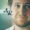
19 - I love the look of a bubble in the icon.
4 - Simple, yet eye catching. Plus, I love the font.
Least Quality:
14 - Adam is stretched a little too wide
10 - The text is oddly placed.
26 - There just seems to be too much empty space.
Highest Quality:
19 - I love the look of a bubble in the icon.
4 - Simple, yet eye catching. Plus, I love the font.
Re: Talk LIMS #7: Challenge One ~ Voting!
Least:
18- kind of dark
22- the darkness of the bg kind of makes it difficult to see the text
27- Adam looks a little bit blurry
Best:
25- very cute icon, love the smilie
19- very nice, the swirls of light is a nice touch
Least:
18- kind of dark
22- the darkness of the bg kind of makes it difficult to see the text
27- Adam looks a little bit blurry
Best:
25- very cute icon, love the smilie
19- very nice, the swirls of light is a nice touch