Install the app
How to install the app on iOS
Follow along with the video below to see how to install our site as a web app on your home screen.
Note: This feature may not be available in some browsers.
You are using an out of date browser. It may not display this or other websites correctly.
You should upgrade or use an alternative browser.
You should upgrade or use an alternative browser.
Misc LIMS #3-Challenge 6-Decades. Final Challenge-VOTING!
- Thread starter Urban Legend
- Start date
Urban Legend
Captain
Re: Misc LIMS #2: Zac Efron!
Just remember to read this, it's just easier for me to send a pm when I get the voting up.
You'll have until 11 pm gmt -4 tomorrow to get them in.
I've gotten the entries, just wanted everyone to know I'm a little low on time at the moment so I'll be sending PM's when I get voting up")
Just remember to read this, it's just easier for me to send a pm when I get the voting up.
You'll have until 11 pm gmt -4 tomorrow to get them in.
Urban Legend
Captain
Re: Misc LIMS #2: Challenge 1 - Zac Efron Voting Up!
MISC LIMS 2 Challenge 1 No Text "Zac Efron" Voting!
Voting Rules: (Please read)
~ Absolutely anyone may vote! You don't have to be an 'expert'
~ Vote for the Top 2 of least quality, and the Top 2 of best quality.
~ Votes for least quality Must have a reason, or they will not be counted. Reasons for best quality are strongly encouraged
(the following examples may have been "borrowed" from other sources)
Good Examples:
34: Text is oddly placed
50: Icon is over sharpened
62: Image is too blurry
Poor Examples:
96: I don't like the colour (personal preference)
52: Tiny text/decorative brushes are unreadable (it's supposed to be that way)
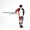
01:
 02:
02:
 03:
03:
 04:
04:
 05:
05:
 06:
06:
 07:
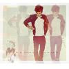
07:

08:
 09:
09:
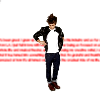
 10:
10:
 11:
11:
 12:
12:
 13:
13:
 14:
14:

15:
 16:
16:
 17:
17:
 18:
18:
 19:
19:
* Total Number of Entries 19/20
* 1 Skip Used
* 1 Withdraw
If there's any mistakes let me know
MISC LIMS 2 Challenge 1 No Text "Zac Efron" Voting!
Voting Rules: (Please read)
~ Absolutely anyone may vote! You don't have to be an 'expert'
~ Vote for the Top 2 of least quality, and the Top 2 of best quality.
~ Votes for least quality Must have a reason, or they will not be counted. Reasons for best quality are strongly encouraged
(the following examples may have been "borrowed" from other sources)
Good Examples:
34: Text is oddly placed
50: Icon is over sharpened
62: Image is too blurry
Poor Examples:
96: I don't like the colour (personal preference)
52: Tiny text/decorative brushes are unreadable (it's supposed to be that way)
01:
08:
15:
* Total Number of Entries 19/20
* 1 Skip Used
* 1 Withdraw
If there's any mistakes let me know
Re: Misc LIMS #2: Zac Efron-VOTING UP!
Least:
03 - Too much green, it's really overpowering.
10 - The effect makes Zac himself look grainy, it would possibly have worked better just in the backgound?
Best:
17 - Altogether great icon, really like the style and the colouring is gorgeous!
13 - Adore the effect you've used, great icon.
Least:
03 - Too much green, it's really overpowering.
10 - The effect makes Zac himself look grainy, it would possibly have worked better just in the backgound?
Best:
17 - Altogether great icon, really like the style and the colouring is gorgeous!
13 - Adore the effect you've used, great icon.
Last edited:
Re: Misc LIMS #2: Zac Efron-VOTING UP!
Least:
10- A little too grainy on his face.
15- A little too much brightness on his face, he looks a tad bit blurry.
Best:
16- nice crop, framing and bg texture
12- very crisp, clear and the coloring is great.
Nice job, everyone!
Least:
10- A little too grainy on his face.
15- A little too much brightness on his face, he looks a tad bit blurry.
Best:
16- nice crop, framing and bg texture
12- very crisp, clear and the coloring is great.
Nice job, everyone!
Last edited:
Axelsonfire
Pathologist
Re: Misc LIMS #2: Zac Efron-VOTING UP!
Least:
03 - The green in the icon is overpowering
10 - The picture is a little grainy
Best:
02 - You picked a great texture. The colours in the texture match the colours in his shirt perfectly
07 - The colouring is great.
Least:
03 - The green in the icon is overpowering
10 - The picture is a little grainy
Best:
02 - You picked a great texture. The colours in the texture match the colours in his shirt perfectly
07 - The colouring is great.
Re: Misc LIMS #2: Zac Efron-VOTING UP!
Least:
10 - very grainy imo
03 - too much green - it's overpowering
Best:
17
12
Least:
10 - very grainy imo
03 - too much green - it's overpowering
Best:
17
12
Wolverine_Eagle
Prime Suspect
Re: Misc LIMS #2: Zac Efron-VOTING UP!
Worst:
03-too green, quite distracting
05- the picture looks oversharpened
Best-
17
12
Worst:
03-too green, quite distracting
05- the picture looks oversharpened
Best-
17
12
cathwillows
CSI Level Three
Re: Misc LIMS #2: Zac Efron-VOTING UP!
Least
03 - way too much green
10 - too grainy
Best
17 - When the results are up, I really need to know how you achieved that coloring
02
Least
03 - way too much green
10 - too grainy
Best
17 -
When the results are up, I really need to know how you achieved that coloring 02
happyharper13
Pathologist
Re: Misc LIMS #2: Zac Efron-VOTING UP!
Least:
5: The coloring is really nice, both on him and in the way he looks against the texture, which is well chosen, but he looks too grainy.
17: It's a cool idea, but he looks too magenta in the rectangles. The selective coloring is way too extreme, particularly with the greens and magentas. His shirt and the magentas are the only things that really stand out. Also, the rectangles are too big and overwhelm the central image, confusing the focus of the icon.
Best:
9: Very nice coloring, lighting and crop.
13: Strong and very pretty composition. Nice coloring as well, and good work using the whole image.
Re: Misc LIMS #2: Zac Efron-VOTING UP!
Least:
10 - I like the background texture, but it doesn't look right on his image.
15 - The face is too bright along with the yellow background.
Best:
12 - I really like the background and the colors especially go well with the image.
4
Least:
10 - I like the background texture, but it doesn't look right on his image.
15 - The face is too bright along with the yellow background.
Best:
12 - I really like the background and the colors especially go well with the image.
4