Urban Legend
Captain
Re: Misc LIMS #1: ' Challenge 11-Star Wars Voting Up '
Voting Rules: (Please read)
~ Absolutely anyone may vote! You don't have to be an 'expert'")
~ Vote for the Top 2 least quality sets (the ones which you feel needs improvement) and the Top 2 sets which you feel are best quality.
~ Votes for least quality Must have a reason, or they will not be counted. Reasons for best quality are strongly encouraged
(the following examples may have been "borrowed" from other sources)
Good Examples:
Text is oddly placed
Icon is over sharpened
Image is too blurry
Poor Examples:
I don't like the color (personal preference)
Tiny text/decorative brushes are unreadable (it's supposed to be that way)
As this has been an issue in the past, refrain from saying anything with how someone votes. If it falls under the poor examples criteria, either me or Jacquie will step in and address the voter.
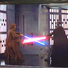
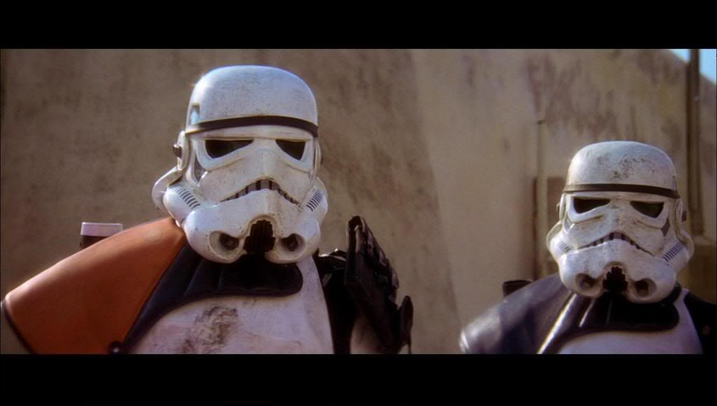
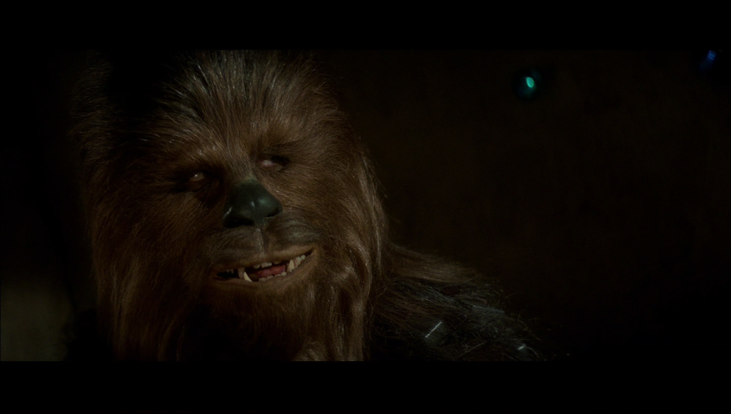
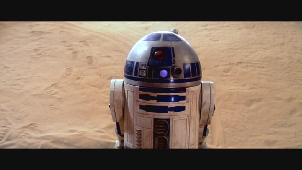
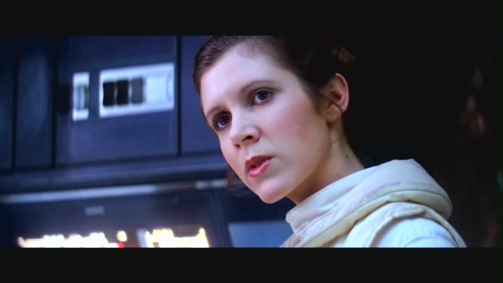
The Sets (click the icon to see the cap used):
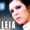
Set 01:

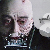
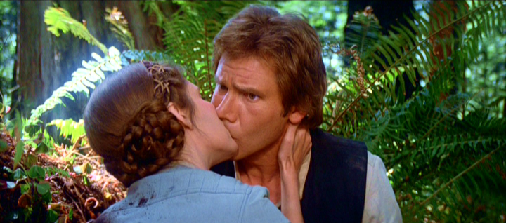
Set 02:

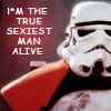
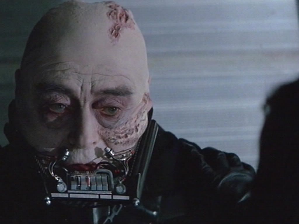
Set 03:

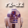
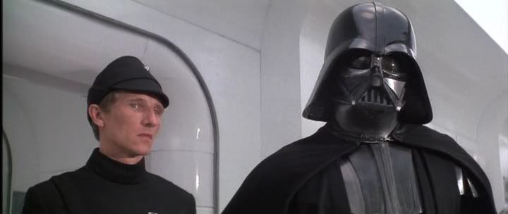
Set 04:
Set 05:


Voting Rules: (Please read)
~ Absolutely anyone may vote! You don't have to be an 'expert'
~ Vote for the Top 2 least quality sets (the ones which you feel needs improvement) and the Top 2 sets which you feel are best quality.
~ Votes for least quality Must have a reason, or they will not be counted. Reasons for best quality are strongly encouraged
(the following examples may have been "borrowed" from other sources)
Good Examples:
Text is oddly placed
Icon is over sharpened
Image is too blurry
Poor Examples:
I don't like the color (personal preference)
Tiny text/decorative brushes are unreadable (it's supposed to be that way)
As this has been an issue in the past, refrain from saying anything with how someone votes. If it falls under the poor examples criteria, either me or Jacquie will step in and address the voter.
The Sets (click the icon to see the cap used):
Set 01:

Set 02:
Set 03:
Set 04:

Set 05:

Last edited: