Install the app
How to install the app on iOS
Follow along with the video below to see how to install our site as a web app on your home screen.
Note: This feature may not be available in some browsers.
You are using an out of date browser. It may not display this or other websites correctly.
You should upgrade or use an alternative browser.
You should upgrade or use an alternative browser.
LIMS Round 3:The Ultimate Test of Creativity-LIMS Winner Up!
- Thread starter quoth_the_raven
- Start date
quoth_the_raven
Corpse
Re: LIMS Round 3: The Ultimate Test of Creativity
Ahh Adz I wouldn't be that cruel to you guys :lol: Although that would've been a very interesting challenge now that you mention it... :lol:
Ahh Adz I wouldn't be that cruel to you guys :lol:
Although that would've been a very interesting challenge now that you mention it... :lol: cainesugar
Coroner
Re: LIMS Round 3: The Ultimate Test of Creativity
^ But how would you be able to tell if they looked at it or not? :lol: That would be interesting though! Can't wait to see what everyone comes up with, great challenge Ann (may I call you that?)
^ But how would you be able to tell if they looked at it or not? :lol: That would be interesting though! Can't wait to see what everyone comes up with, great challenge Ann (may I call you that?)
quoth_the_raven
Corpse
Re: LIMS Round 3: The Ultimate Test of Creativity
Oh I have my ways :devil: :lol: Nah, I trust all you guys But if the icon looked especially clean, crisp and perfect I'd start to get suspicious :lol:
Of course cainesugar It's the name on the birth certificate afterall :lol: (just don't call me Annie, that urks me :lol
Oh I have my ways :devil: :lol: Nah, I trust all you guys
But if the icon looked especially clean, crisp and perfect I'd start to get suspicious :lol:Of course cainesugar
It's the name on the birth certificate afterall :lol: (just don't call me Annie, that urks me :lolquoth_the_raven
Corpse
Re: LIMS Round 3: The Ultimate Test of Creativity
^ Blending pictures is allowed but this icon challenge already had sign-ups when it started a few months ago so in order to participate I'm afraid you'll have to wait until the next one
^ Blending pictures is allowed but this icon challenge already had sign-ups when it started a few months ago so in order to participate I'm afraid you'll have to wait until the next one
Adzix
CSI Level Three
Re: LIMS Round 3: The Ultimate Test of Creativity
lol.
well, i just submitted my entry and i gotta tell y'all it was hard. i mean, really. i made a gazillion icons until i finally decided which one to choose. and i NEVER make many icons, usually one or two
can't wait to see them all!
do not.even.try.Ahh Adz I wouldn't be that cruel to you guys Although that would've been a very interesting challenge now that you mention it...
lol.
well, i just submitted my entry and i gotta tell y'all it was hard. i mean, really. i made a gazillion icons until i finally decided which one to choose. and i NEVER make many icons, usually one or two
can't wait to see them all!
mitzi962000
CSI Level Two
Re: LIMS Round 3: The Ultimate Test of Creativity
cant wait to see wot you guys come up with and i hope that i be able to join next time..
cant wait to see wot you guys come up with and i hope that i be able to join next time..
quoth_the_raven
Corpse
Re: LIMS Round 3: The Ultimate Test of Creativity
Oh Adz don't give me ideas :lol: Voting time!
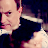
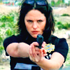
Challenge #8- Gun!Porn - VOTING
- Vote for top 3 of least quality. Include a valid reason for each vote, otherwise it won't be counted.
- ANY member of this board may vote.
- The makers of the icons with the top 2 number of votes will be eliminated.
Examples of good reasons:
50: The text is oddly placed
68: The colouring is overpowering
72: The icon is oversharpened
56: The icon is too blurry
Examples of bad reasons:
50: I hate the colour pink. (Personal Preference)
78: The tiny text/decorative brush is unreadable. (Because they’re supposed to be that way.)
Please note that the following icons were made without the use of decorations, including decorative brushes, textures and fonts. I'd like to note that "The icon is too plain" is counted as a bad reason for a vote this round.
Here are the pretties
01.
 02.
02.
 03.
03.
 04.
04.
 05.
05.

Important!- PM me immediately if you don't see your icon.
Good luck everyone! I'd like everyone to know that tomorrow I am going on vacation for about a week so I'll try and have the results for this one up by Tuesday or Wednesday next week when I come back. I also just got a new computer so I don't have Photoshop yet so I need to get that so the banners don't suck more than usual :lol:
Oh Adz don't give me ideas :lol: Voting time!
Challenge #8- Gun!Porn - VOTING
- Vote for top 3 of least quality. Include a valid reason for each vote, otherwise it won't be counted.
- ANY member of this board may vote.
- The makers of the icons with the top 2 number of votes will be eliminated.
Examples of good reasons:
50: The text is oddly placed
68: The colouring is overpowering
72: The icon is oversharpened
56: The icon is too blurry
Examples of bad reasons:
50: I hate the colour pink. (Personal Preference)
78: The tiny text/decorative brush is unreadable. (Because they’re supposed to be that way.)
Please note that the following icons were made without the use of decorations, including decorative brushes, textures and fonts. I'd like to note that "The icon is too plain" is counted as a bad reason for a vote this round.
Here are the pretties
01.
Important!- PM me immediately if you don't see your icon.
Good luck everyone!
I'd like everyone to know that tomorrow I am going on vacation for about a week so I'll try and have the results for this one up by Tuesday or Wednesday next week when I come back. I also just got a new computer so I don't have Photoshop yet so I need to get that so the banners don't suck more than usual :lol: Re: LIMS Round 3: The Ultimate Test of Creativity
05. I think the "dreamy/swirly" effect was out of place.
01. I like the colouring, but I dislike the cropping in this one. Maybe if it was more to the left, or centered
02. I like your cropping. I think you could've used a lighter color to make it stand out a bit more.
This was SO hard. Seriously, I was torn for like five minutes on figuring out what to vote for and what to say.. Very tough choice, very nice icons you guys!
(Psst: 04, I love the idea of the "mirroring" Stella)
05. I think the "dreamy/swirly" effect was out of place.
01. I like the colouring, but I dislike the cropping in this one. Maybe if it was more to the left, or centered
02. I like your cropping. I think you could've used a lighter color to make it stand out a bit more.
This was SO hard. Seriously, I was torn for like five minutes on figuring out what to vote for and what to say.. Very tough choice, very nice icons you guys!
(Psst: 04, I love the idea of the "mirroring" Stella
)Re: LIMS Round 3: The Ultimate Test of Creativity
04: The colouring is a bit bland, and it's tough to see the Stella echo at first glance.
05: The blurred thing around the edges is nice, but maybe a little too big considering the size of the icon...maybe a square would have been better than a circle?
02: The crop detracts from Mac, since the gun (the focal point of the icon) is blurry. It makes us look at the blurry gun rather than at the nice clear Mac, which lowers the overall quality of the icon.
Really really great icons! It was very hard to choose, and I'm not just saying that. Good luck to everybody!
Re: LIMS Round 3: The Ultimate Test of Creativity
Dang, this is getting hard!
4: While I love the idea of the smaller image in the back, it just doesn't seem to be working here. The icon is also very dark.
5: The swirl effect around the icon seems out of place.
2: While Mac's face is perfectly in focus (which is important), the rest of the icon is blurry and out of focus, which takes away from the larger picture.
Elsie
Shopaholic
Re: LIMS Round 3: The Ultimate Test of Creativity
04 - Too dark, and could have been a little sharper. (although I think the duplicate was successful)
05 - The radial blur is too strong and unfortunately is distracting rather than enhancing the icon.
02 - The black mass of the gun draws the attention away from Mac's face and makes the icon too dark.
That was really difficult! Well done every one.