Install the app
How to install the app on iOS
Follow along with the video below to see how to install our site as a web app on your home screen.
Note: This feature may not be available in some browsers.
You are using an out of date browser. It may not display this or other websites correctly.
You should upgrade or use an alternative browser.
You should upgrade or use an alternative browser.
LIMS #6 Final Challenge!: 140x140 - Winners!
- Thread starter Adzix
- Start date
nattybatty55
Nadalaholic
Re: LIMS #6 Challenge 4: The Hotness! ~ Now Up
.........That would be mine, My Laptop died on me the other day and I have no way of making an icon, it was fun though and will be voting
.........That would be mine, My Laptop died on me the other day and I have no way of making an icon, it was fun though and will be voting
Adzix
CSI Level Three
Re: LIMS #6 Challenge 4: The Hotness! ~ Voting!
TalkCSI LIMS #6 Challenge 4: The Hottness! ~ Voting!
No Free Passes were used for this challenge. Also, nobody failed to send their entry which is marvellous
Voting Rules:
~ Absolutely anyone may vote!
~ Vote for the Top 3 of least quality, and the Top 2 of best quality.
~ Votes for least quality Must have a reason, or they will not be counted. Reasons for best quality are strongly encouraged.
(the following examples may have been "borrowed" from other sources)
Good Examples:
34: Text is oddly placed
50: Icon is over sharpened
62: Image is too blurry
Poor Examples:
96: I don't like the colour (personal preference)
52: Tiny text/decorative brushes are unreadable (it's supposed to be that way)
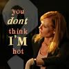
Here are the pretties:
01.
 02.
02.
 03.
03.
 04.
04.
 05.
05.
06.
 07.
07.
 08.
08.
 09.
09.
 10.
10.
11.
 12.
12.
 13.
13.
 14.
14.
Any problems? Let me know ASAP.
TalkCSI LIMS #6 Challenge 4: The Hottness! ~ Voting!
No Free Passes were used for this challenge. Also, nobody failed to send their entry which is marvellous
Voting Rules:
~ Absolutely anyone may vote!
~ Vote for the Top 3 of least quality, and the Top 2 of best quality.
~ Votes for least quality Must have a reason, or they will not be counted. Reasons for best quality are strongly encouraged.
(the following examples may have been "borrowed" from other sources)
Good Examples:
34: Text is oddly placed
50: Icon is over sharpened
62: Image is too blurry
Poor Examples:
96: I don't like the colour (personal preference)
52: Tiny text/decorative brushes are unreadable (it's supposed to be that way)
Here are the pretties:
01.
06.
11.
Any problems? Let me know ASAP.
Re: LIMS #6 Challenge 4: The Hotness! ~ Now Up
Very nice work everyone!
Least:
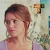
11: Blurry, and Ryan's face is very red.
10: A bit too dark, and Ryan seems to be off-coloured a bit.
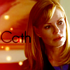
01: Over sharpened, and Cath is too red
Best:
12: Absolutely beautiful all around! Colour, crop, everything just works.
08: I don't know what it is about this one, but I keep getting drawn to it, so you're getting my vote :lol: Nice work.
Very nice work everyone!
Least:
11: Blurry, and Ryan's face is very red.
10: A bit too dark, and Ryan seems to be off-coloured a bit.
01: Over sharpened, and Cath is too red
Best:
12: Absolutely beautiful all around! Colour, crop, everything just works.
08: I don't know what it is about this one, but I keep getting drawn to it, so you're getting my vote :lol: Nice work.
Deirdre
Coroner
Re: LIMS #6 Challenge 4: The Hotness! ~ Voting Open!
Least:
4 - it's too blurry, especially Ryan's face
11 - blurry, too intensive colour of Ryan's face
10 - blurry, too dark
Best:
8 - beautiful colours, cropping, really good one
13 - very nice cropping and colours
Great job everyone!:thumbsup:
Least:
4 - it's too blurry, especially Ryan's face
11 - blurry, too intensive colour of Ryan's face
10 - blurry, too dark
Best:
8 - beautiful colours, cropping, really good one
13 - very nice cropping and colours
Great job everyone!:thumbsup:
Re: LIMS #6 Challenge 4: The Hotness! ~ Voting Open!
Least:
06 - it's a little bit too bright- love the pic tho
11- A little too blurry, but nice tie-in with theme
10- A tad bit too blurry, however I love the green background and how it blends with the green in his shirt.
Best:
04 - Love this one, the coloring, the text, the pic, all of it.
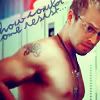
14- This one is very cute. I love how it looks like Cath's looking at that big question mark. Nice job!
All of the icons were lovely and it was hard to find flaws. I literally had to stare at the icons for several minutes in order to pick the ones of "least quality"... although like I said, they were all great. I also had a hard time choosing just two that I liked the best. :lol: Great job, everyone!
Least:
06 - it's a little bit too bright- love the pic tho
11- A little too blurry, but nice tie-in with theme
10- A tad bit too blurry, however I love the green background and how it blends with the green in his shirt.
Best:
04 - Love this one, the coloring, the text, the pic, all of it.
14- This one is very cute. I love how it looks like Cath's looking at that big question mark. Nice job!
All of the icons were lovely and it was hard to find flaws. I literally had to stare at the icons for several minutes in order to pick the ones of "least quality"... although like I said, they were all great. I also had a hard time choosing just two that I liked the best. :lol: Great job, everyone!
MacsLovlyAngl
Head of the Graveyard Shift
Re: LIMS #6 Challenge 4: The Hotness! ~ Voting Open!
Least
#6- over sharp
#4- little blurry
#09- not enough color
Best
#14- I love the coloring, and the icon itself. everything fits nicely
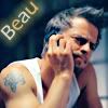
#3 - love the overall picture, and the lettering the background fits nicely with the pic of Danny
Least
#6- over sharp
#4- little blurry
#09- not enough color
Best
#14- I love the coloring, and the icon itself. everything fits nicely
#3 - love the overall picture, and the lettering the background fits nicely with the pic of Danny
ILuvJonathanTogo
Coroner
Re: LIMS #6 Challenge 4: The Hotness! ~ Voting Open!
Least:
6- Oversharpened
10- discolored/too dark. A little blurry also.
8- Oversharpened
Best:
12
3
Least:
6- Oversharpened
10- discolored/too dark. A little blurry also.
8- Oversharpened
Best:
12
3
dopebabygirl
CSI Level Two
Re: LIMS #6 Challenge 4: The Hotness! ~ Voting Open!
LQ:
01: Over sharpened, and too red
10: little bit dark and blurry
11: blurry
Best:
5
3
LQ:
01: Over sharpened, and too red
10: little bit dark and blurry
11: blurry
Best:
5
3
cathwillows
CSI Level Three
Re: LIMS #6 Challenge 4: The Hotness! ~ Voting Open!
Least
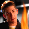
11 - blurry, the flame doesn't really fit (maybe if it was smaller or had another shape) and Ryan's face is too red
06 - oversharpened, maybe because it is too much of a close-up
02 - the white box around the text doesn't fit well and somehow the icon seems blurry and oversharpened at the same time
Best
12 - Great! The icon seems so soft, the colors are great and the text goes well with the icon.
13 - nice bruch or texture in the background. The coloring is very nice!
Least
11 - blurry, the flame doesn't really fit (maybe if it was smaller or had another shape) and Ryan's face is too red
06 - oversharpened, maybe because it is too much of a close-up
02 - the white box around the text doesn't fit well and somehow the icon seems blurry and oversharpened at the same time
Best
12 - Great! The icon seems so soft, the colors are great and the text goes well with the icon.
13 - nice bruch or texture in the background. The coloring is very nice!
Macayla
Captain
Re: LIMS #6 Challenge 4: The Hotness! ~ Voting Open!
Least:
11 - Blurry and Ryan's face is too red, the flame is distracting.
09 - Very plain coloring and a bit oversharpend
10 - Too dark and blurry, not a very good coloring
Best:
05 - Nice coloring and texture's
03 - Good coloring and I like the word effect, Fits nicely.
Least:
11 - Blurry and Ryan's face is too red, the flame is distracting.
09 - Very plain coloring and a bit oversharpend
10 - Too dark and blurry, not a very good coloring
Best:
05 - Nice coloring and texture's
03 - Good coloring and I like the word effect, Fits nicely.