Install the app
How to install the app on iOS
Follow along with the video below to see how to install our site as a web app on your home screen.
Note: This feature may not be available in some browsers.
You are using an out of date browser. It may not display this or other websites correctly.
You should upgrade or use an alternative browser.
You should upgrade or use an alternative browser.
LIMS #6 Final Challenge!: 140x140 - Winners!
- Thread starter Adzix
- Start date
vegaslights
Brute
Re: LIMS #6 Challenge 3: Red and Blue ~ Now Up!
My entry is in. It was a hard, though!
My entry is in. It was a hard, though!
Re: LIMS #6 Challenge 3: Red and Blue ~ Now Up!
Ha, sent mine in!") It was a great theme I definately had fun with it!
It was a great theme I definately had fun with it!
Pumped to see what everyone else comes up with!
Ha, sent mine in!
It was a great theme I definately had fun with it! Pumped to see what everyone else comes up with!
SpeedsDaughter
CSI Level One
Re: LIMS #6 Challenge 3: Red and Blue ~ Now Up!
I'm working on mine; been busy so I'll get it in ASAP.
I'm working on mine; been busy so I'll get it in ASAP.
nattybatty55
Nadalaholic
Re: LIMS #6 Challenge 3: Red and Blue ~ Now Up!
Im running outta time but I really want to enter this one
Im running outta time but I really want to enter this one
Adzix
CSI Level Three
Re: LIMS #6 Challenge 3: Red and Blue ~ Voting!
TalkCSI LIMS #6 Challenge 3 Red&Blue: Voting!
Free Passes: dopebabygirl, nattybatty55, Dragonfly_Dreamer, SpeedsDaughter, FieldMouse. Quite a few. And I thought this was suppossed to be an easy challenge
Voting Rules:
~ Absolutely anyone may vote!
~ Vote for the Top 3 of least quality, and the Top 2 of best quality.
~ Votes for least quality Must have a reason, or they will not be counted. Reasons for best quality are strongly encouraged.
(the following examples may have been "borrowed" from other sources)
Good Examples:
34: Text is oddly placed
50: Icon is over sharpened
62: Image is too blurry
Poor Examples:
96: I don't like the colour (personal preference)
52: Tiny text/decorative brushes are unreadable (it's supposed to be that way)
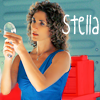
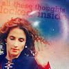
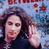
The Icons:
01.
 02.
02.
 03.
03.
 04.
04.
05.
 06.
06.
 07.
07.
 08.
08.
09.
 10.
10.
 11.
11.

Problems? Questions? Give me a shout.
TalkCSI LIMS #6 Challenge 3 Red&Blue: Voting!
Free Passes: dopebabygirl, nattybatty55, Dragonfly_Dreamer, SpeedsDaughter, FieldMouse. Quite a few. And I thought this was suppossed to be an easy challenge
Voting Rules:
~ Absolutely anyone may vote!
~ Vote for the Top 3 of least quality, and the Top 2 of best quality.
~ Votes for least quality Must have a reason, or they will not be counted. Reasons for best quality are strongly encouraged.
(the following examples may have been "borrowed" from other sources)
Good Examples:
34: Text is oddly placed
50: Icon is over sharpened
62: Image is too blurry
Poor Examples:
96: I don't like the colour (personal preference)
52: Tiny text/decorative brushes are unreadable (it's supposed to be that way)
The Icons:
01.
05.
09.
Problems? Questions? Give me a shout.
CSISneaky
Police Officer
Re: LIMS #6 Challenge 3: Red and Blue ~ Voting!
I don't like going first but here goes lol
Least:
04 - If this is wrong, my bad i will correct it, but isnt this chal supposed to be blue and red mainly, i dont see these colours in this one. Plus the cropping cuts off half of Eric's head
06 - Its a bit too blurry
03 - Too bright, both of their complexions look odd
Best:
07 - Good cropping and i like the background
08 - The same as above!
vegaslights
Brute
Re: LIMS #6 Challenge 3: Red and Blue ~ Now Up!
Least:
03 - Oversharpened
09- Too blurry
02- Too blurry
Best:
01- Good cropping
07- Good cropping
Least:
03 - Oversharpened
09- Too blurry
02- Too blurry
Best:
01- Good cropping
07- Good cropping
ILuvJonathanTogo
Coroner
Re: LIMS #6 Challenge 3: Red and Blue ~ Now Up!
Least:
4- I really dont see how you incorporated the theme. It doesn't look like anything has been done. Also, the crop isn't well done.
3- Looks a little oversharpened and the coloring in their faces/hair looks odd.
9- Looks blurry, and Stella's coloring is odd.
Best:
8
11
Least:
4- I really dont see how you incorporated the theme. It doesn't look like anything has been done. Also, the crop isn't well done.
3- Looks a little oversharpened and the coloring in their faces/hair looks odd.
9- Looks blurry, and Stella's coloring is odd.
Best:
8
11
Last edited: