Install the app
How to install the app on iOS
Follow along with the video below to see how to install our site as a web app on your home screen.
Note: This feature may not be available in some browsers.
You are using an out of date browser. It may not display this or other websites correctly.
You should upgrade or use an alternative browser.
You should upgrade or use an alternative browser.
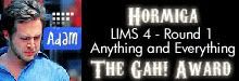
LIMS #4 - The Ultimate Test of Creativity - Final Results Up
- Thread starter 4ENSIX
- Start date
Re: LIMS #4 - The Ultimate Test of Creativity - Ch #2 Now Up
 I didn't forget! I've sent it in, and for once I'm actually kind of please with what I came up with. Not that I ever really use selective colouring anyway...
4ENSIX said:
Alright, as long as you don't forget.
I didn't forget! I've sent it in, and for once I'm actually kind of please with what I came up with. Not that I ever really use selective colouring anyway...cathwillows
CSI Level Three
Re: LIMS #4 - The Ultimate Test of Creativity - Ch #2 Now Up
glad that you're back Chloe.
just sent in my icon. i'm sure all the others are great! can't wait to see them.
glad that you're back Chloe.
just sent in my icon. i'm sure all the others are great! can't wait to see them.
BlueStarlight
Rookie
Re: LIMS #4 - The Ultimate Test of Creativity - Ch #2 Now Up
Hi! I just send my icon, but I forgot to write in PM that I changed username from LoveCSI to BlueStarligt. So don’t disqualify me (please), just change my name in list. Sorry for making problem.
Hi! I just send my icon, but I forgot to write in PM that I changed username from LoveCSI to BlueStarligt. So don’t disqualify me (please), just change my name in list. Sorry for making problem.
Re: LIMS #4 - The Ultimate Test of Creativity - Ch #2 Now Up
Ahh, okay, BlueStarlight! No worries, I'm not going to boot you out. (And thanks for your entry )
ETA: Sorry to butt in again, but I just wanted to say that Photobucket finally stopped hating me, so I have Hormiga's Gah! Award banner...
Ahh, okay, BlueStarlight!
No worries, I'm not going to boot you out. (And thanks for your entry )ETA: Sorry to butt in again, but I just wanted to say that Photobucket finally stopped hating me, so I have Hormiga's Gah! Award banner...
Re: LIMS #4 - The Ultimate Test of Creativity - Ch #2 Now Up
Alrighty, people...I've got thirteen icons and two passes so far, which means *does impressive mental math* that I'm still missing three entries! You've still got a decent amount of time, so don't fret too much yet, but just make sure you don't forget.
Alrighty, people...I've got thirteen icons and two passes so far, which means *does impressive mental math* that I'm still missing three entries! You've still got a decent amount of time, so don't fret too much yet, but just make sure you don't forget.
insertusername
Lab Technician
Re: LIMS #4 - The Ultimate Test of Creativity - Ch #2 Now Up
we have til the 26th right? Cause i DO plan on entering, just been a busy week away from my pc.
we have til the 26th right? Cause i DO plan on entering, just been a busy week away from my pc.
Re: LIMS #4 - The Ultimate Test of Creativity - Signups now
Challenge #2 - No Selective Colouring - VOTING
+Vote for the TOP 3 of least quality. Include a valid reason for each vote, otherwise it won't be counted.
+ANY member of this board may vote.
+The makers of the two icons with the highest number of votes will be eliminated from the challenge.
+When voting, keep in mind that these icons were made without the use of selective colouring.
Examples of good reasons (courtesy of Ann):
50: The text is oddly placed
68: The colouring is overpowering
72: The icon is oversharpened
56: The icon is too blurry
Examples of bad reasons:
51: I hate the colour pink. (Personal Preference)
78: The tiny text/decorative brush is unreadable. (Because they’re supposed to be that way.)
The following participants are using their free passes for this round:
+ dstined4gr8ness
+ ILuvJonathanTogo
+ roximonoxide
+ CSI_Kat
As well, it is time to say goodbye to chocolate_bunnys, who has decided to drop out of LIMS in order to better focus on schoolwork. Thank you for participating in the last round, and good luck with your schooling!
01.
 02.
02.
 03.
03.
 04.
04.
 05.
05.
 06.
06.
 07.
07.
 08.
08.
 09.
09.
 10.
10.
 11.
11.
 12.
12.
 13.
13.

Good luck everybody!
Important!: PM me, 4ENSIX, immediately if you don't see your icon!
Challenge #2 - No Selective Colouring - VOTING
+Vote for the TOP 3 of least quality. Include a valid reason for each vote, otherwise it won't be counted.
+ANY member of this board may vote.
+The makers of the two icons with the highest number of votes will be eliminated from the challenge.
+When voting, keep in mind that these icons were made without the use of selective colouring.
Examples of good reasons (courtesy of Ann):
50: The text is oddly placed
68: The colouring is overpowering
72: The icon is oversharpened
56: The icon is too blurry
Examples of bad reasons:
51: I hate the colour pink. (Personal Preference)
78: The tiny text/decorative brush is unreadable. (Because they’re supposed to be that way.)
The following participants are using their free passes for this round:
+ dstined4gr8ness
+ ILuvJonathanTogo
+ roximonoxide
+ CSI_Kat
As well, it is time to say goodbye to chocolate_bunnys, who has decided to drop out of LIMS in order to better focus on schoolwork.
Thank you for participating in the last round, and good luck with your schooling!01.
Good luck everybody!
Important!: PM me, 4ENSIX, immediately if you don't see your icon!
quoth_the_raven
Corpse
Re: LIMS #4 - The Ultimate Test of Creativity - Signups now
Gosh, it's still so hard! :lol: Great icons everyone, but I have to vote, so...
10-- It's a little blurry around Stella's face
05-- The colors look a little washed out and pale and the text is a little difficult to read in contrast to Calleigh
13-- It's a little too dark and the colors are a little rough and overpowering
Re: LIMS #4 - The Ultimate Test of Creativity - Signups now
Best of luck with your school work chocolate_bunnys.
Yikes, these icons are amazing this time around but alas...
13: Too much contrast and it's a little on the dark side. (That sounded so Darth Vader :lol
10: Stella's features could use more sharpening.
03: The text is oddly placed which separates the icon's subject in two -- Perhaps placing it further from the middle would deem easier to focus on the icon as a whole instead of just the text.
dstined4gr8ness
Police Officer
Re: LIMS #4 - The Ultimate Test of Creativity - Signups now
10-stella could use a little more sharpening, and it seems that the image is skewed a bit.
13- the contrast is a little overpowering- it could use a little more brightness to balance it out. Also the text kind of blends into the background and makes it difficult to read.
3- the placement of the text takes away from the icon, i think that maybe it was placed there because it was hard to read anywhere else, but putting a little darker background behind the text would have made it a little more aesthetically pleasing.
Wyoming
Head of the Graveyard Shift
Re: LIMS #4 - The Ultimate Test of Creativity - Signups now
5- I think I might understand what you went for here. The antique look? Unfortunately, it doesn't really work for this icon, and the text is a bit boring.
9- Color is too orangish, and it's hard to see Danny's face.
11- Very plain, the grey makes the icon look boring. I like the effects on the outside of the circle, though.
Everyone did a great job here