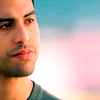
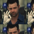
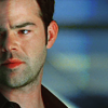
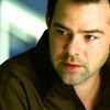
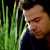
Fo_poozle- Oh my goodness. Those are amazing. In general, I hate the pastoral/landscape backgrounds that have been working their way around LJ, but I love how you use them so differently here (I'm assuming those are textures behind him in icons 1 and 3, right?). The clouds behind him in the third one are bright and pretty, but still give it a dreamy, reflective mood which works very well with his expression. And the text is whimsical, fun and fitting. Making the texture (as well as him) black and white in the first one also gives it an interesting feel. It reminds me of a movie and a magazine ad simultaneously. The balance of whites, greys and blacks, particularly in the addition of the text, is really cool too. I love the crop on the second icon and the way his lips stand out. There's a really cool dark-and-mysterious and not-quite-in-motion vibe to it from the combination of the coloring and crop.
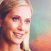
Shazza- I love the Calleigh icons, particularly the second batch. I feel like coloring Calleigh is always difficult because her hair and face end up looking too similar because they have such a similar light color. I could be wrong, but I feel like playing around with the color balance tends to work best to distinguish the two colors so that her face looks sufficiently pink without her hair looking pink too, or the other way around with her hair looking yellow without making her face look yellow too. Still, I think the coloring itself in your icons is quite bright and pretty. I love the crop on the first one and the use of a wider crop on the third. I also love the coloring and crop on the first icon in the first batch. The first icon there has such unusual and gorgeous coloring. I feel like the use of orange and green in it gives it a really cool distinct, almost western feel to it.
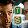
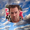
Ch3r12y- Those are gorgeous! I feel like I don't see very many splitscreen icons on Talk, and it's really nice to see some! Yours are very creative! I especially adore the third one. The close crops on both of them are gorgeous, and the use of textures blows me away. It's such a unique and creative icon! The combination of the colors -- the hints of deeper purples and greens and the brighter yellows -- is absolutely stunning. Not only does it look pretty, but it creates a distinct mood. Love, love, love it! The fourth one with the two ships next to each other is also very nice and super creative. Your use of color and juxtaposition gives the icon more to say and brings it to a whole different level. My one complaint is that it's harder to make out the faces, especially on Eric and Natalia, when the icon is tilted. Not sure if that was intentional. Regardless, gorgeous work! So creative and lovely!
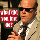
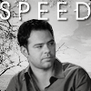
FallenForFlack- I love the pretty, bright colors in your Speed Stills-winning icon! Their faces are nice and bright, and I love the juxtaposition of their facial expressions and body language. Horatio's reflective, melancholy bearing and Speed's more laid-back, cavalier one makes the words all the more poignant. Given the melancholy feeling of the icon, the colors, which are bright, but not too bright, fit very well with the icon's mood. At the same time, every element in the icon is still bright, and the gorgeous green of the background still doesn't overwhelm either subject. The crop is also interesting and I always admire makers who can get a wide crop like this without losing too much detail on the subjects' faces. Awesome job.
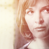
Lady I- The coloring here is so pretty! Your icons have a bright and still distinct color to them, kind of like they fit together. Your use of crops is also intriguing. The hand-holding icon makes me smile. The crop speaks for itself, and the use of the orangey light texture over them lights it up even more. I adore the crop on the first icon and how close you cut Natalia without losing her. I love me a good close crop
")
Also, the text is very fun. It makes Eden feel like such a fun couple
Looking at you and Ch3r12y's icons is intriguing because you guys show the same ship in dramatically different yet still both gorgeous coloring and moods, and the combination is making me fall a little bit in love with this ship.
I have a few new icons up on my LJ, including these three. I'm kind of worried about how red the sides of Calleigh's face are
There are more CSI:Miami icons, including Ryan, on my livejournal post, which is
here. Constructive criticism and comments are always appreciated by my inner comment-whore