Wow everyone's icons from the challenge = awesomeness!
Kat - Do I even have to say how much I love your icons?!
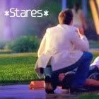
Linda - Amazing job I love the Tripp one but the Natalia ones are amazing too!! Lovely colouring!
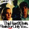
Nat - I LOVE, love, love that Natalia icon the colouring is awesome and the b/w with orange effect works really well I love the cropping on all the icon!
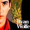
dongpeiyen1000 - I love your Ryan icons they're soooooooooo amazing!! My fav is the first one!! That effect is sooo awesome!! Fantastic work!!
Geni - I love your Nat icon!! The colouring sooo fantastic!! Thanks for your comment I appreciate it!!
Luf100 - Amazing icons!!! I love the middle one!! That effect one of my favourites!! Nice job!! I also love the other icons you post!!
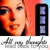
Missee - Amazing icons! I love the last one!! I love when people do icons that just focus on eyes and the b/w with orange has an amazing effect!! Nice job!!!
Okay mine from the challenge!! (snaggable as always):
Enjoy!!!
Kat - Do I even have to say how much I love your icons?!
Linda - Amazing job I love the Tripp one but the Natalia ones are amazing too!!
Lovely colouring! Nat -
I LOVE, love, love that Natalia icon the colouring is awesome and the b/w with orange effect works really well I love the cropping on all the icon! dongpeiyen1000 - I love your Ryan icons they're soooooooooo amazing!! My fav is the first one!! That effect is sooo awesome!! Fantastic work!!
Geni - I love your Nat icon!! The colouring sooo fantastic!!
Thanks for your comment I appreciate it!!Luf100 - Amazing icons!!! I love the middle one!! That effect one of my favourites!! Nice job!! I also love the other icons you post!!
Missee - Amazing icons! I love the last one!! I love when people do icons that just focus on eyes and the b/w with orange has an amazing effect!!
Nice job!!! Okay mine from the challenge!! (snaggable as always):
Enjoy!!!