Thanks,
Des! :lol:
")
That's just one of these 'little' things that I guess will never cease to amaze me about the show, because however disappointing the storyline might be -and let's admit it, it has happened a few times, well, there's always the visuals to hang on to, you know? I mean, that's something I know I can always count on, something I know will never ever disappoint me. One of the show's constants.
Have you noticed how CSI has evolved visually? Comparing the first three seasons with the rest, it is obvious -when you pay attention, that the show progressively developed a style of its own, which then became a trademark -and I am not talking about the 'CSI shots' here, but everything else that you might see on your screen during the course of an episode.
I'd say the cinematography has grown bolder, but also darker and more colorful at the same time -and yes, bluer
I mean, cinematography is an art. Compositing shots, finding the right light ...
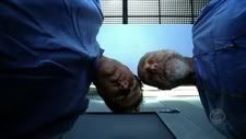
Take
Living Doll (724) for example ...
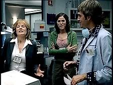
Evidence room
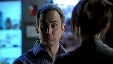
"Sara?"
Face
And the sepia tones of Grissom's flashback
1 2 3