The photos of the day!

Wolfesgamergirl:

+ Beautiful shot, your attention is really drawn to the wreath because of the light.
- The light reflecting off the snowflakes is a little distracting, but obviously you couldn't do anything about that.

Turning off flash and cranking the ISO (to prevent noise) or putting the camera on a flat, steady surface (to prevent blurriness) would have done the job for the negative. I'm a fan of the composition, anyway - you just might want to try that for next winter.

Adorable_Crazy
+ fantastic composition and placement in the photo - not taking it from dead on or a completely straight side angle was wise. awesome shot.
- the colours of the car and background are fairly similar so the subject doesn't really *pop*. shooting from a lower angle may have helped this (looking "up" to the car, pushing the wall further into the background and drawing the eye away from the lines on the ground).

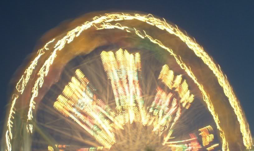
Long exposure night shot from Nanaimo

 
Showtime:

+ Fabulous shot, the distant skyline really helps draw your attention to the the rocks.
- The little strip of orange in the sky is a little distracting, because most of the rest of the picture is dull greys, the orange draws your attention, distracting you from the main focus.

Flowers and The Sheraton Hotel, Niagara Falls, Canada:


Adorable_Crazy
+I really like the colors and the sharpness of the flowers in the foreground.
- The hotel in the backgroung distracts from the flowers, you wanted to focus on (I think).

A Matryoshka, I found:
 
AnJella:
+ I like how the Matryoshka was the sharpest thing in this photo, and that everything else blended into the background.
- Maybe a portrait shot would have been better, to really get the whole detail of the doll.

I took this four years ago, in Iceland:
Picture10-1.png
 
Kinda slow here huh!?

@Kazalene
+ I love landscapes and I just like the scenery.
- Photo is a bit small to notice anything but all the basic lines are not redirecting to anything. All a bit unorganized in any way.

Mine for now. A portrait...
A newly made photo
 
BlueCurl
+It's easy to say what you want to focus on and the symmthry works also really well.
-I'm not sure, but it could've turned out better in color?!

A rock in France where I was during my holidays:
 
AnJella.

+ You have used the rule of thirds well in this pic, with each having an even section (grass, rock and sky) in the pic which looks great.
- Maybe upping the contrast a little would make the colours 'pop'.

Overall. Fabulous pic.

CN Tower, Toronto, On, Canada.

 
Adorable_Crazy
+Love how you focused on the tower. The leaves make it look really real.
-but somehow they also distract from the tower plus you could've met more colour. Well, but the weather was bad...
Though a really good shot

"L'arc de Thriomphe" in Paris:
 
AnJella
+ I like the black and white tendencies that the photo gives off.
- Perhaps try cropping in the sides a bit more as the buildings in the background are a bit distracting.

One of many photos from a summer vacation this year.

 
Wolfesgamegirl:

+ Great shot, I really like how the trees close in the path. The colouring looks great too.
- The gate post is a little cut off on the left, which is a little distracting.
Fabulous shot. :D

The Toronto Skyline from the Toronto Islands.
 
Adorable_Crazy
+ The composition works very well.
- There is a small something in the bottom left that is distracting to the overall photo. Also try cropping in a bit more otherwise the eye is wandering all over.

A random pic from the County Fair, also done as an experiment.

 
If you're referring to the blurred lights, that was supposed to be like that, hence the explanation of being an experiment. :)

BlueCurl
+ Great use of the rule of thirds as well as the framing. The lighting helps to add texture.
- A bit dark, hard to discern what the subject is.

Another random photo from vacation.


Ack, hope it's okay to join in the fun. :)

wolfesgamergirl
+ Catches the attention right away, a wonderful contrast between light and dark. (Ie: framing the sunset - it's a sunset, right? - with the trees/grass)
-The sky certainly does take up a lot of the photo--not sure if cropping it differently would have actually helped though, as the water may have been a bit lost with the ground being raised...if that makes sense. And the sky is obviously the focal point of the picture, so again, it may have taken away from that if done differently. (I'm not an expert, ha)

Took this on vacation a few weeks ago.

 
Speed_Cochrane:

+ Great shot, it looks great how the bridge is in the centre, you're focus draws to it, and helps you to focus on the mountains, which works well. :D
- Maybe upping the contrast a little would really help make the colours pop?

Niagara Falls (American) Taken from The Maid Of The Mist (Boat trip):

 
Back
Top