Install the app
How to install the app on iOS
Follow along with the video below to see how to install our site as a web app on your home screen.
Note: This feature may not be available in some browsers.
You are using an out of date browser. It may not display this or other websites correctly.
You should upgrade or use an alternative browser.
You should upgrade or use an alternative browser.
TalkCSI LIMS . Round 2 . Challenge #8. FINAL RESULTS ARE IN
- Thread starter cofi_shot
- Start date
Nienna Berylla
CSI Level Two
Re: TalkCSI LIMS ~ Round 2
can i still be in here i like to do it to and find out how bad i am. hihi
can i still be in here i like to do it to and find out how bad i am. hihi
sherlockanne
Lab Technician
Re: TalkCSI LIMS ~ Round 2
FINALLY sent mine in. I spent a while on it but I'm not sure if it's original enough... You guys are so creative!") Good luck everyone! I'm so excited to see all the icons!
Good luck everyone! I'm so excited to see all the icons!
FINALLY sent mine in. I spent a while on it but I'm not sure if it's original enough... You guys are so creative!
Good luck everyone! I'm so excited to see all the icons!Lost2MuchSpeed
Pathologist
Re: TalkCSI LIMS ~ Round 2
yay i sent mine in
i'm a tad excited to see them all now!
yay i sent mine in
i'm a tad excited to see them all now!
Re: TalkCSI LIMS ~ Round 2
Challenge #1 - Gary Dourdan - VOTING
*ziggystarduzt is taking the bye pass for this round.
- Vote for top 3 of least quality. Include a valid reason for each vote, otherwise it won't be counted.
- Any member of this board may vote.
- The makers of the icons with the top 2 number of votes will be eliminated.
Examples of good reasons:
50: The text is oddly placed
68: The colouring is overpowering
72: The icon is oversharpened
56: The icon is too blurry
Examples of bad reasons:
50: I hate the colour pink. (Personal Preference)
78: The tiny text/decorative brush is unreadable." (Because they’re supposed to be that way.)
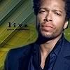
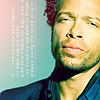
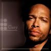
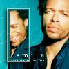
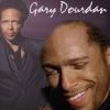
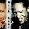
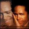
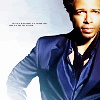
Here are the pretties
01
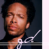 02
02
 03
03
 04
04
 05
05

06
 07
07
 08
08
 09
09
 10
10
11
 12
12
 13
13
 14
14
 15
15

16
 17
17
 18
18
 19
19
 20
20
21
*PM me if you don't see your icon.
Challenge #1 - Gary Dourdan - VOTING
*ziggystarduzt is taking the bye pass for this round.
- Vote for top 3 of least quality. Include a valid reason for each vote, otherwise it won't be counted.
- Any member of this board may vote.
- The makers of the icons with the top 2 number of votes will be eliminated.
Examples of good reasons:
50: The text is oddly placed
68: The colouring is overpowering
72: The icon is oversharpened
56: The icon is too blurry
Examples of bad reasons:
50: I hate the colour pink. (Personal Preference)
78: The tiny text/decorative brush is unreadable." (Because they’re supposed to be that way.)
Here are the pretties
01
06
11
16
21
*PM me if you don't see your icon.
Re: TalkCSI LIMS ~ Round 2
Have I mentioned that I love Gary? How can an icon featuring him NOT be wonderful?
But, after much consideration, here's what I've come up with:
12: Blue background is overpowering
08: Bright circle behind name is distracting
17: Lines at top (border) is oddly placed (did I explain this one right? I'm not sure)
Wonderful work, everyone!